One of the most common questions all of us get asked; “should I add dropshadows?”… to elements, papers, photos. My answer 99% of the time is YES.
It is all a matter of personal opinion, so take my point of view with a big grain of salt, but I feel shadows add that “pop” to your layouts. Shadows transform a flat layout to a more dimensional layout that draws the eye and makes it linger. Shadows are an art form, and as with all art that are many different tastes. Some prefer bold, dark shadows, others have a light touch that is barely noticeable. I’m somewhere in between.
I like a shadow to be seen, to be noticeable, but not so dark that the shadow is what you see. It can be a fine line to draw. I usually set my shadows on “linear burn” vs. the more popular “multiply”. I think linear burn gives a little more realistic variation to the end result.
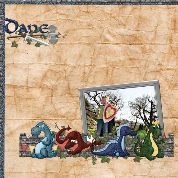
Take a quick look at the same layout down with, and without, shadows:
Without Shadows:
With Shadows:
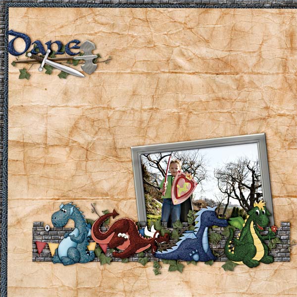
Kit: Dragonheart by Deli Scraps by Min
The settings I used, for most of the layout, are:
Blend Mode: Linear Burn
Opacity: 48%
Angle: -169
Distance: 13px
Spread: 0%
Size: 32px
I left both contour & noise at the default settings.
I’m also impatient. I don’t have much time to scrap, and while I love the look of shadows on layouts, I don’t like to spend hours getting them just right. I usually use a the same set of shadows for all my layouts in a book. I make a style set and save those so that I have 1-click shadowing. For this particular layout I used my commercial use style set: PS Shadow Styles 01. I mostly used the “medium frame dropshadow”, with a little variation. Another benefit to using a style set (your own, or a purchased set) is that you can guarantee that the light direction is coming from one source. There is nothing as distracting in a layout as shadows visually jumping discordantly.
You can download a free sample style along with a copy of my layout (minus “Dane”) as a free quickpage HERE. Just click to download & enjoy.

Thanks for this tutorial & the freebies…I’m excited to give your “pre-set” shadows a try!
[…] Should you Shadow? – 1 freebie(s) […]
Thank you very much for this great QP and the tutorial on shadows.
[…] Should you Shadow? – 1 freebie(s) […]