I have always liked using “things,” any things, in ways that are different from their intended use. For example, my nightstand is an antique children’s school desk. When the word “repurposing” entered the main-stream vocabulary a few years ago, I thought… “Hey! I’ve been doing that for years!”
My interest in “repurposing” includes my scrapbooking efforts, and involves trying to discover different ways to use products I own. Learning to stretch my digi-stash, has been a fun challenge for me!
Many designers include pre-made Borders in their Kits or Collections. Today let’s take a look at how we might “repurpose” those!
1. Use a Border as intended…. as a page border!
Premade borders are designed to help scrappers create a layout quickly and easily.
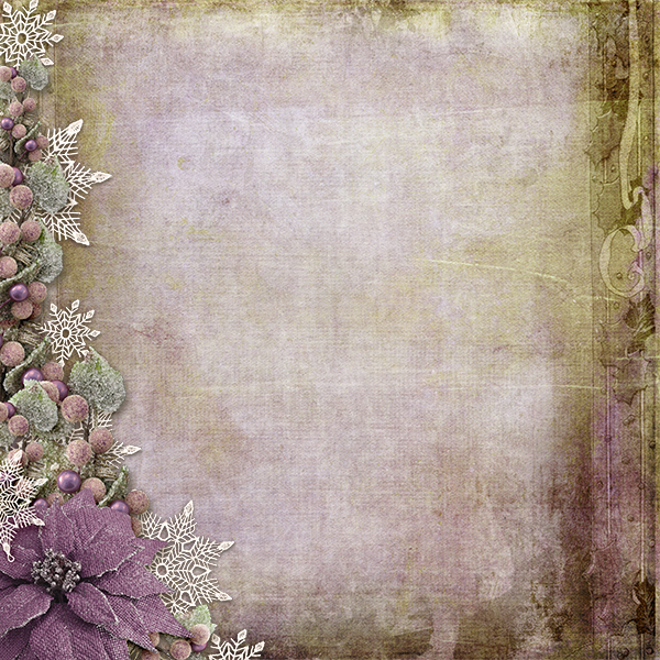
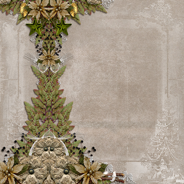
Here is a Deck the Halls Kit paper, along with a Deck the Halls Border. By simply placing the Border on the Paper, I have a great start on a layout.
I can make the layout as simple or as intricate as I like, based on what I decide to add.
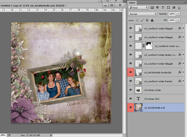
Using the paper and border as a base, I created a layout in about 8 minutes (and I’m not a fast scrapper!) I added a frame from the kit, along with my photo and a date. I could have left the page alone at that point, but I decided to add a few elements to the top of the frame. Quick. Easy. Done.
2. Resize a border and clip it to a journal card or tag.
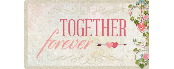
In the image below I have resized a Follow Your Heart Border and clipped it to a journal card. This is a great way to stretch your stash, using both items.
3. Resize a border and use it as a design element in word art (either word art that is pre-made or that you design).
Here is a Woodland Winter Border and Woodland Winter Word Art Graphic positioned on a 12X12 transparent background.
We could drop a background paper behind the border and graphic and have a nice beginning to a layout; however, let’s resize that border and see what we can do.
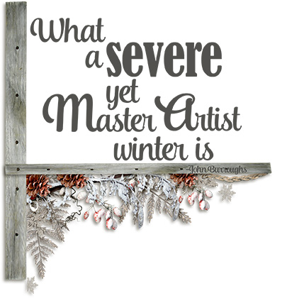
In the image below I brought into my document the strip of wood that was included in the kit. I duplicated and rotated that piece. Next I resized the border to fit underneath the horizontal wood piece, and positioned the word art graphic above it. Quick and easy!
3. Resize a Border and tuck it underneath or on top of a photograph or frame.
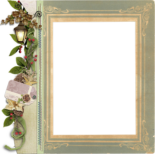
Pictured below is frame from the Long Road Home Kit, and a Long Road Home Border. I resized the border to match the size of the frame, placing the frame under the border. That was it.
4. Blend Borders into papers to give a unique look, specific to your needs.
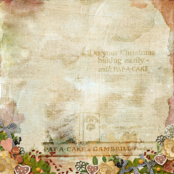
Here is a paper from Oven Lovin‘ along with an Oven Lovin’ Border. I like the contrast of the brighter border against the shabby paper. However, in the creation of a layout, we would be aware of the visual weight of the border and would need to take that into consideration as we designed our page.
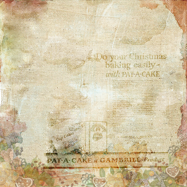
By lowering the opacity of the border (in the image below I’ve reduced it to 40%), we retain the nice graphic image, but reduce the weight of the border. This could be helpful, depending on what other elements you wish to add to your page.
5. Duplicate and flip Borders.
This technique might not work well with all Borders, but try it and see! Here is a Deck the Halls Border, duplicated and flipped, then placed on a Deck the Halls Kit paper. If you look closely, you can see that the edges don’t offer a perfect match (note especially the flower cluster at the bottom); however, with a little masking and creativity, we could get this to work just fine. One suggestion would be to add additional kit elements to hide the adjoining seams.
6. Duplicate and rotate Borders. As many times as you like!
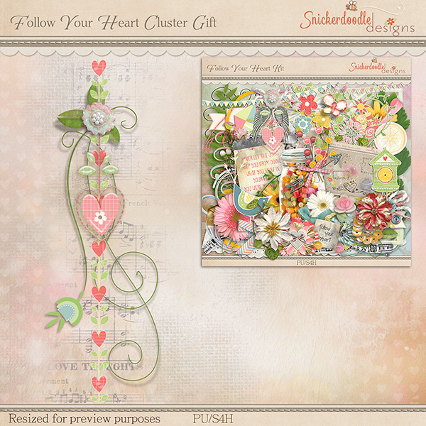
Pictured below is a border from Follow Your Heart Cluster Set 1.
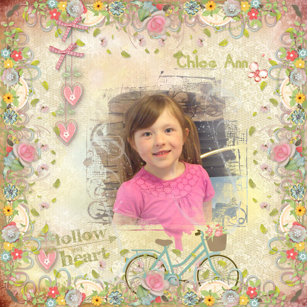
Here is a layout created by Renee, a member of my Creative Team, using this Border. She duplicated it 3 times, then rotated each border to create this beautiful 4-sided page border. That would have been enough by itself to create a lovely page, but Renee was having so much fun she decided to embellish her page further. She added the pink hearts and bows, the bicycle, the falling green leaves, and the pink butterfly (all kit elements). She used a mask that is in the Follow Your Heart kit for her photo, and topped her page off with her sweet model’s name and the Follow Your Heart Word Art. Gorgeous!
Can you think of other creative ways to use Borders? If so, please leave your suggestions and ideas in our Comment section! We would love to learn from you!
I love Borders and host the Surprise Me Border Challenge every month. Please join in the fun as we experiment every month with Borders! Here is the link for the January Challenge. Just check the Challenge Thread in the Forum for each designer’s challenge every month!
If you have been inspired to experiment with Borders, browse through our Personal Use store today! I’m sure you will find some on sale!
Here is a Border for you to play with! It was created using elements from my new kit Follow Your Heart! Introductory Savings are currently available!
Click on the image below to download.
If you would like to keep this tutorial on your computer for easy reference, you may download a PDF here.
See you next week!





Now why didn’t I think of that? I suppose because I haven’t got the creative mind you have. Thank you so very much for the “push” to use my borders in a different way.
Nice examples, good tutorial. i’ve used some of the ideas you mentioned, but some were new ideas. Thanks for taking time to write them up. And thanks for the sweet freebie!
Wow…..this is great. I saved it and pinned it !!!!! I just love to learn something new. Gave page borders a whole new meaning. I don’t usually get them unless they come with the kit. I will be looking at them much closer in the future.
Thank so much for taking the time to share this. It is appreciated.
I love borders! This one is exquisite, love the music background. Thank you!
Very cool Karen – great tips! Thanks, Rose
Very cool Karen – thanks for the tips. Rose
I love love love borders! Thanks for all the great ideas, the adorable freebie, and for making the tut available as a PDF.
Your comments warm my heart! Thanks for taking the time to leave your thoughts!
I would have never thought to use a border other than a border so thank you for the ideas…and the freebie! Love the PDF! I can save them in your folder and not have to search.
Thanks, Carolyn. I’m glad you are finding the PDF helpful too!
Thanks so very much for the beautiful border and a great big thanks for the pdf. This was great.
Waaay behind here! But, I had to pop in and tell you, “I love this!” You have such clever ideas! And, you do a ‘mean’ border! These are all awesome! Thank you!
Su
Thanks, Su, for going back and catching up! Thanks also for your kind words. 🙂
[…] Borders: Stretching your Digi-Stash with Premade Borders […]
[…] your Digi-Stash with Pre-made Clusters Stretching your Digi-Stash with Masks, Part 1 and Part 2 Stretching your Digi-Stash with Pre-made Borders Use Styles to Stretch your […]
[…] clusters or borders you should check out these tutorials, Stretching Your Digi Stash: clusters and borders. The tutorials are loaded with ideas on how to use these extras to create gorgeous pages […]
[…] This is a preview of the kit only, but for additional previews, as well as a gorgeous free cluster created by Norma, check out Saturday’s Blog Post. I personally love the collection since it’s the best value. In addition, using the premade clusters and borders can make for some quick and easy, yet polished, scrapbook pages. I’ll link two tutorials here in case you missed them previously: Stretching Your Digi Stash – clusters and borders. […]