Color is one of the most important tools we have in our scrapbooking. From the colors of a kit, to the colors in our photos – we have to mix and match them just perfectly to create exactly the perfect pages. We adjust the colors, mix and match and play around with the elements in a kit to find just the right one to complete the page.
Colors work together (or, against each other) – it’s their nature. Not all colors get along with each other – so if you think that red flower looks funny on that brown layout you might be right!
As I was thinking about colors, I found a great article explaining a color wheel. It defines the difference between the shade, tone and tint of a color and color families. It’s a little detailed, but very interesting.
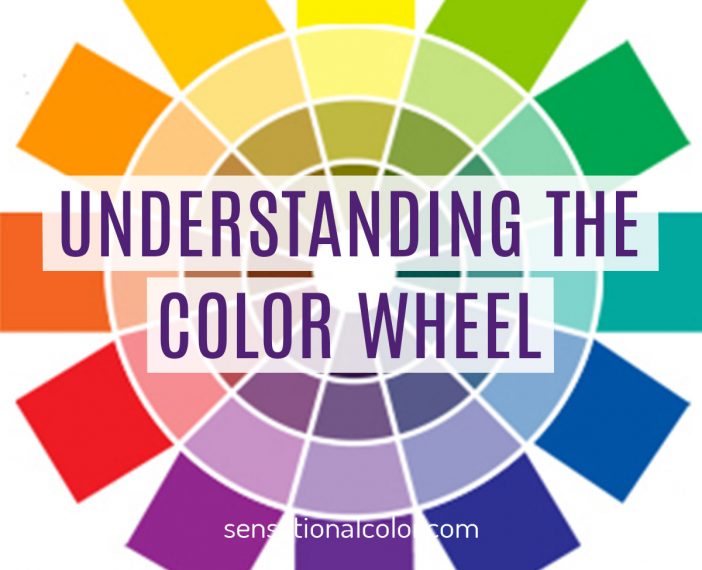
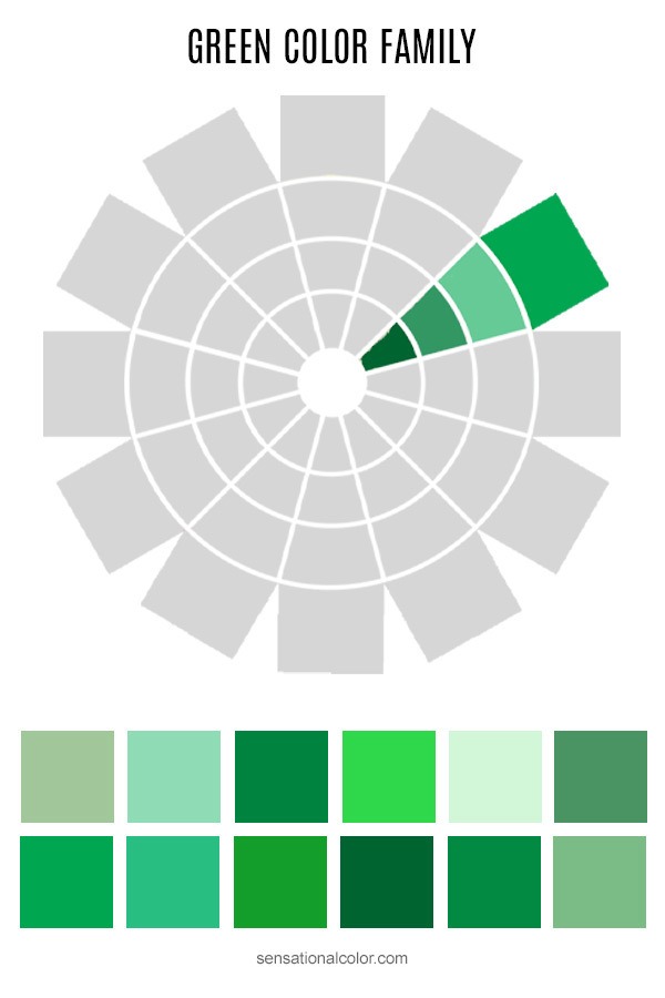
As the author continues, she starts talking about color families – like the green color family. There are so many shades, tints and tones of each color! It really is kind of amazing to see all of the varieties of the color. Here are the examples the author uses of the green color family, but she also explores the yellow-green and blue-green families (also shown on her color wheel example).
This week at The Studio, we have been exploring the color green. Just like the varieties of the color, the themes and styles of green products we have in the store are countless! And the layouts created with all the green things are stunning as well.
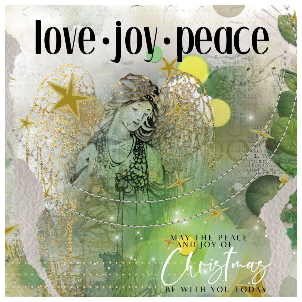
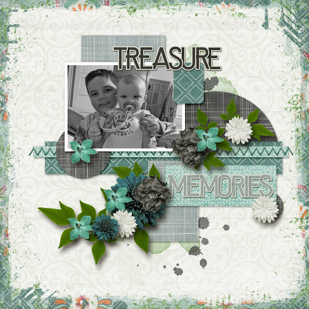
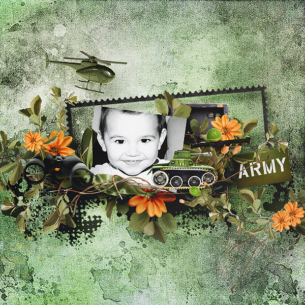
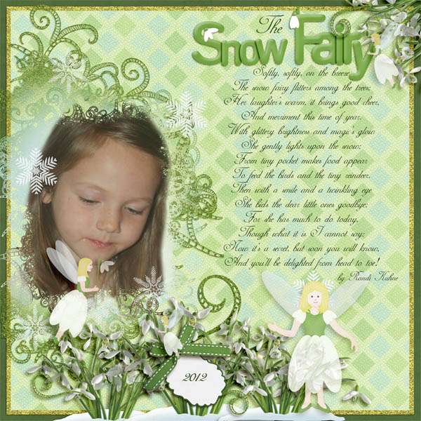
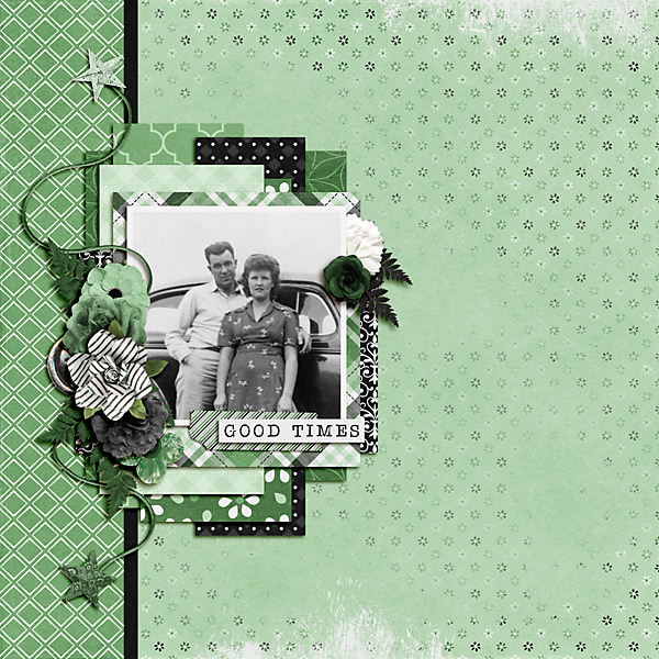
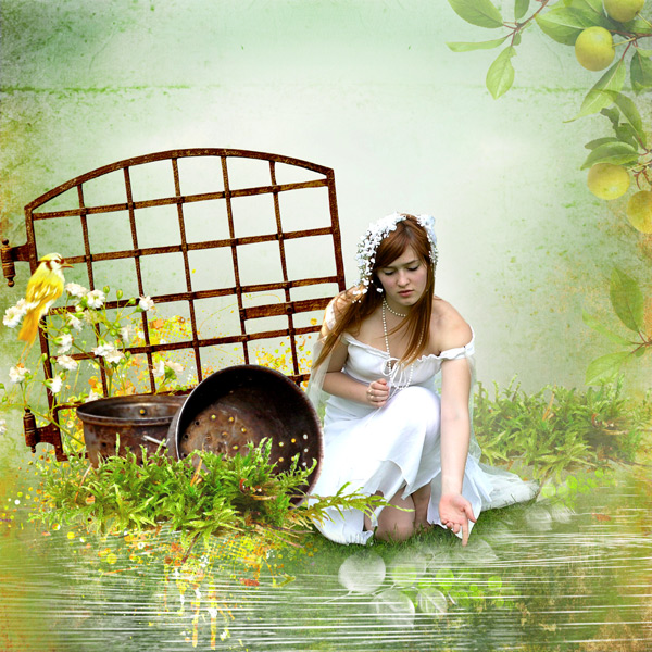
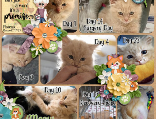
Color can have a strong impact on your layouts, it’s another tool we can use as we tell our stories, share our memories and share ourselves through our layouts. I found some beautiful green layouts to share, just admire the use of the color families, complementary colors and accents in these pages!
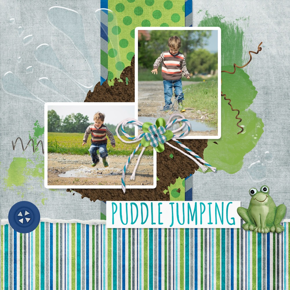
Mud & Puddles by Nibbles Skribbles

Leave A Comment