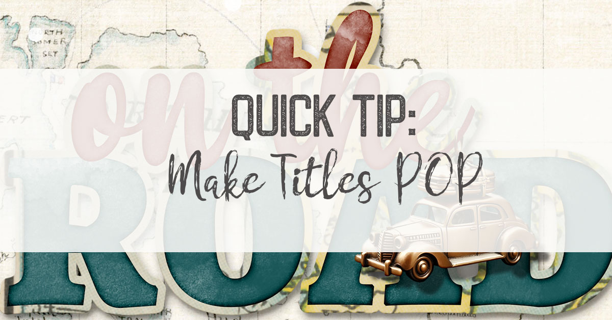
If there is one thing digiscrappers know how to do, it’s layer! So, when I started seeing this design trend pop up – text with elements woven in and out – particularly on book covers, I knew this was perfect for digital scrapbooking, too! The main techniques are selecting and masking layers and shadowing. Of course, your layer order comes into play, too.
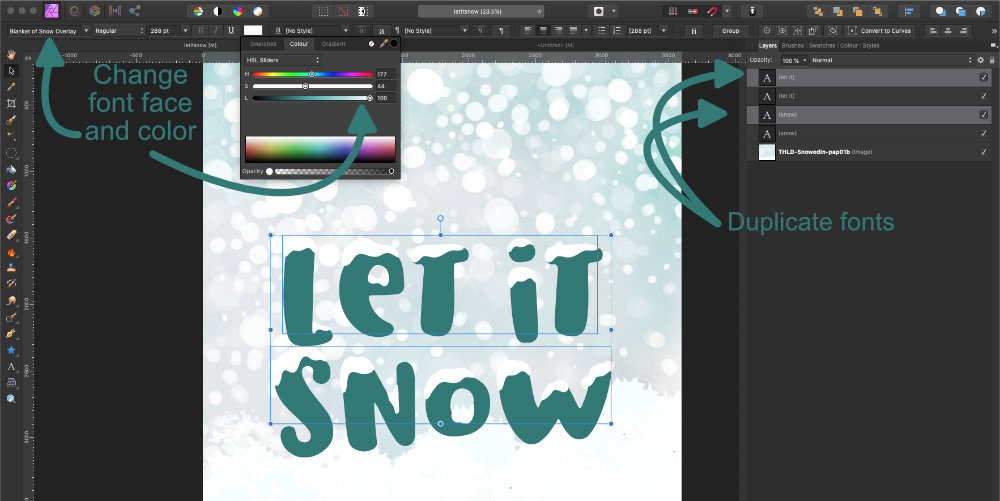
I started with the background and added the text. I used the adorable font Blanket of Snow, which comes with a separate font, Blanket of Snow Overlay! Irresistible! To get this particular font working, you type your text, then duplicate the text layer. Switch the font face on the top layer from Blanket to Blanket Overlay.
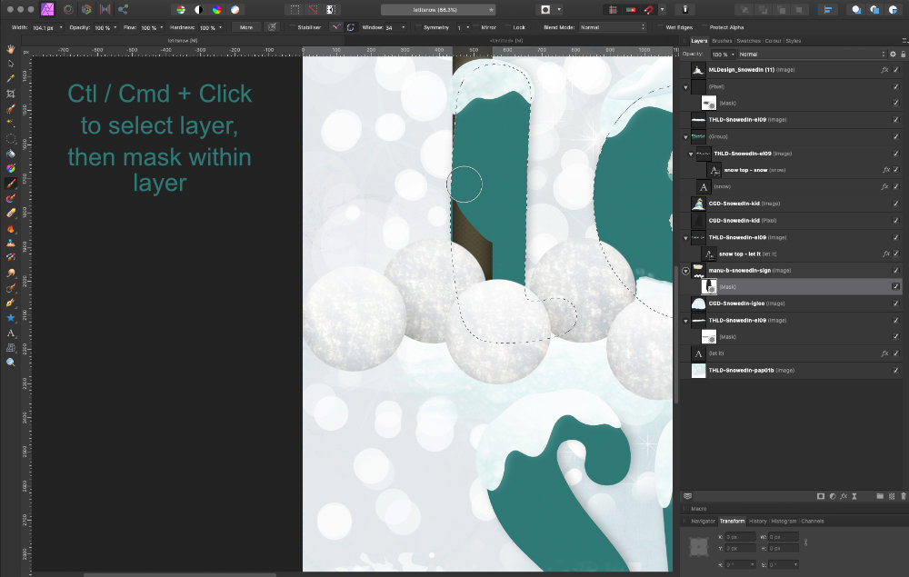
For the most part, this technique works with layer masks. For the sign, I wanted the snowballs on top, but the sign behind the letter L. So, I added an empty layer mask on the sign layer. Next, I selected (Ctl or Cmd + click on the layer in layers panel) the text layer, “let it.” Once you have the marching ants, grab a brush and starting painting in black in the layer mask. You’ll have to zoom in and decrease the brush size (TIP: use [ to decrease) as you get close to the edges. I used this same masking technique on the mittens and on the windy swoosh. If your software does not have masking, erasing is another option.
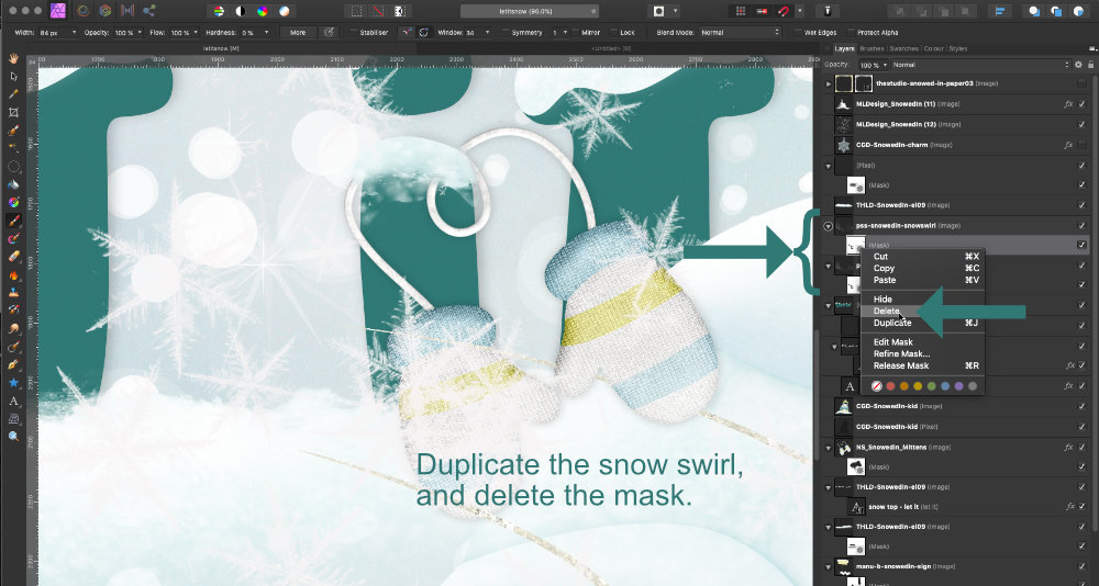
The next technique I used was shadowing. If you’ve masked an area, shadows can start looking really wonky. Affinity Photo, which I’m working in, doesn’t let you create a new layer from a layer effect (like Photoshop does), so I sometimes make my own shadows. This gives you a lot of control over shadowing.
I duplicate the layer I want a shadow on, like the snow swirl, and delete the layer mask.
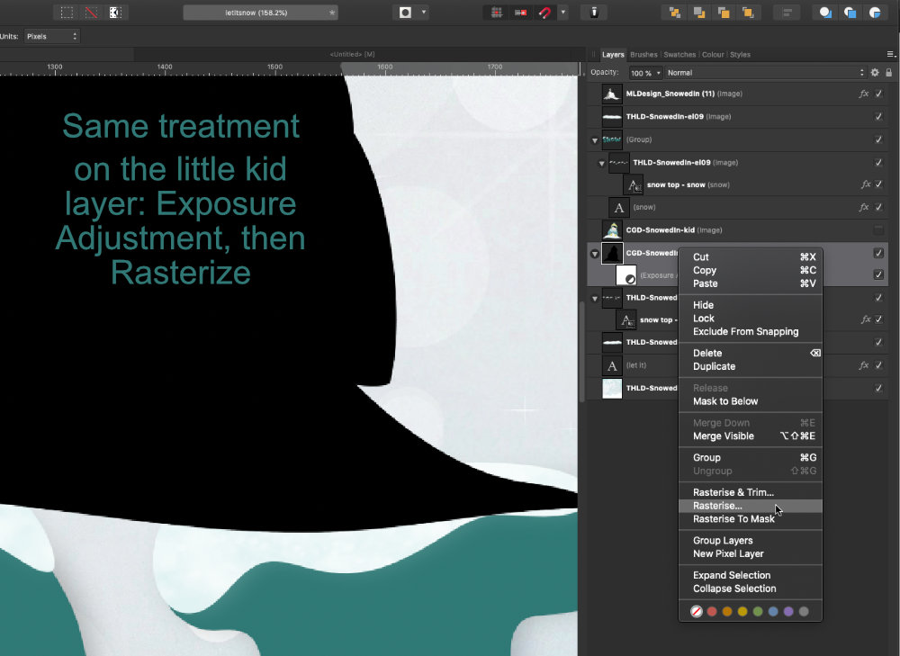
Working on the lower duplicate, I add an Exposure Adjustment layer pulled all the way down to its darkest. A couple other options here – you could also clip a black fill to the layer to get the same effect. Or – select the layer (Ctl / Cmd + Click), and paint black over the layer.
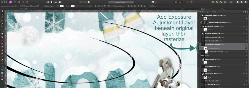
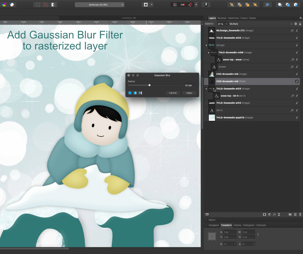
If you’ve used an adjustment layer or fill layer, rasterize the layer. Next, add a Gaussian blur.
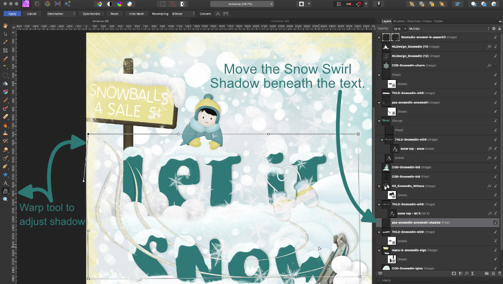
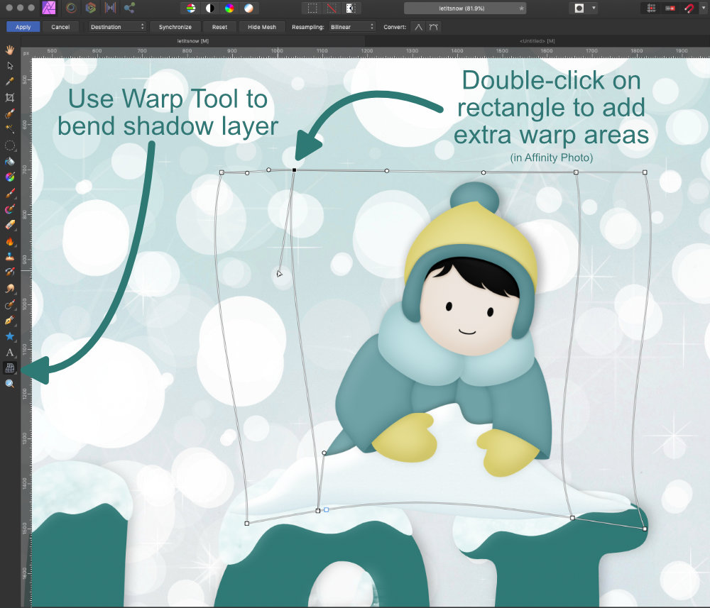
I still thought the shadows could look better, so I used the Warp tool on my shadow layer to hide parts and exaggerate other areas. I used this same shadowing technique on the little kid. You can also mask parts of your shadow since it’s on its own layer.
Hope this quick overview helps when you want to weave elements in and out of title text.
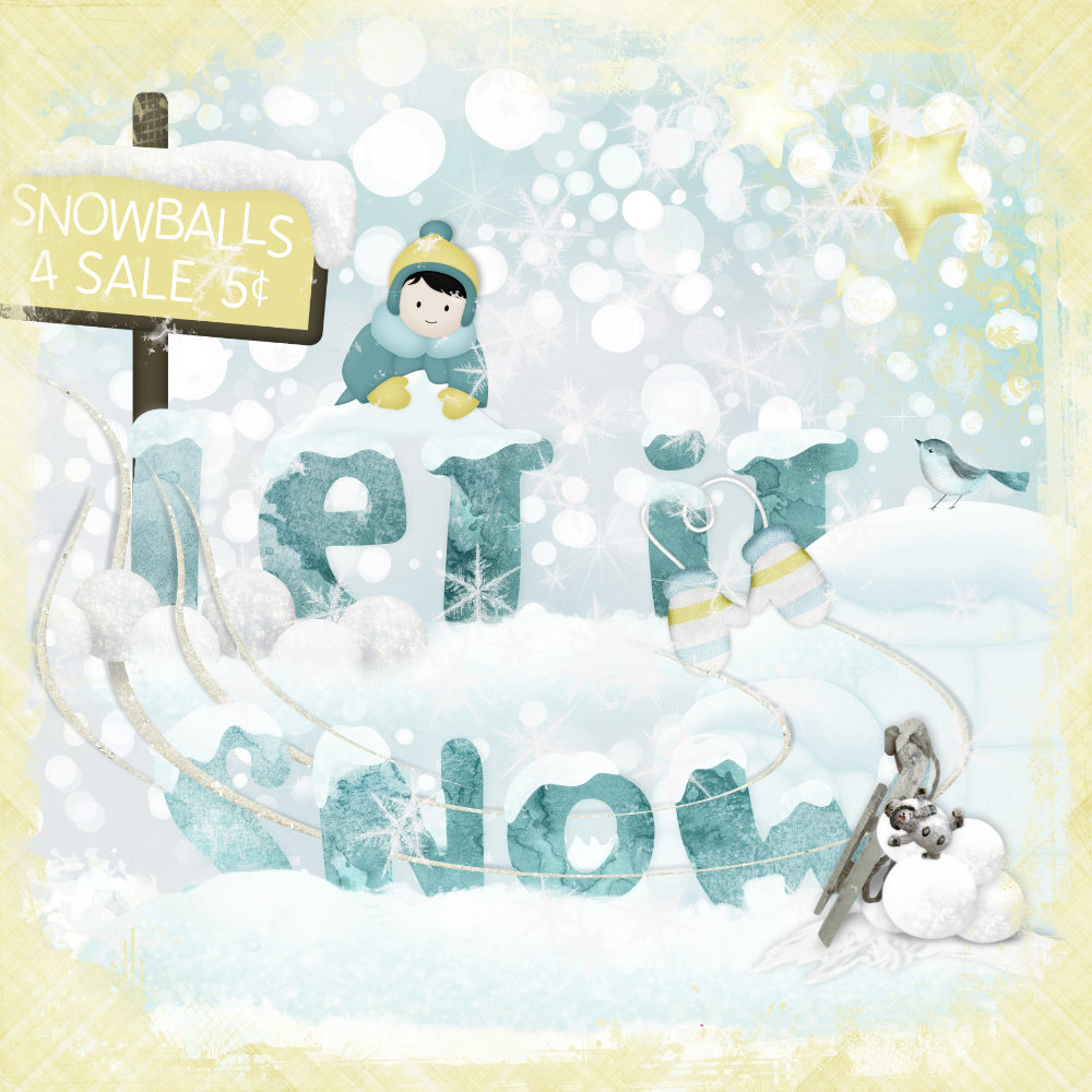
This page was created with mini kits from Snowed In, this past January’s Layout-a-Day event. Thaliris, Carin Grobe, ADB Designs, Urban Fairy, Manu Scraps, Nibbles Scribbles, Prairie Song Scraps, and ML Design.

I love this! Thank you!
[…] have a tutorial up on the blog at The Studio about how to weave together a title and elements in a […]