The vibrant palette and the bold mix of patterns of the new Carmen Miranda bundles are really eye-catching. But I’ll be the first to admit, putting those patterns and bold colors to use on a layout can be intimidating! But it shouldn’t be. Below I’ll share 6 ways to use pattern and color on your pages.
1. Pair Patterns Wisely
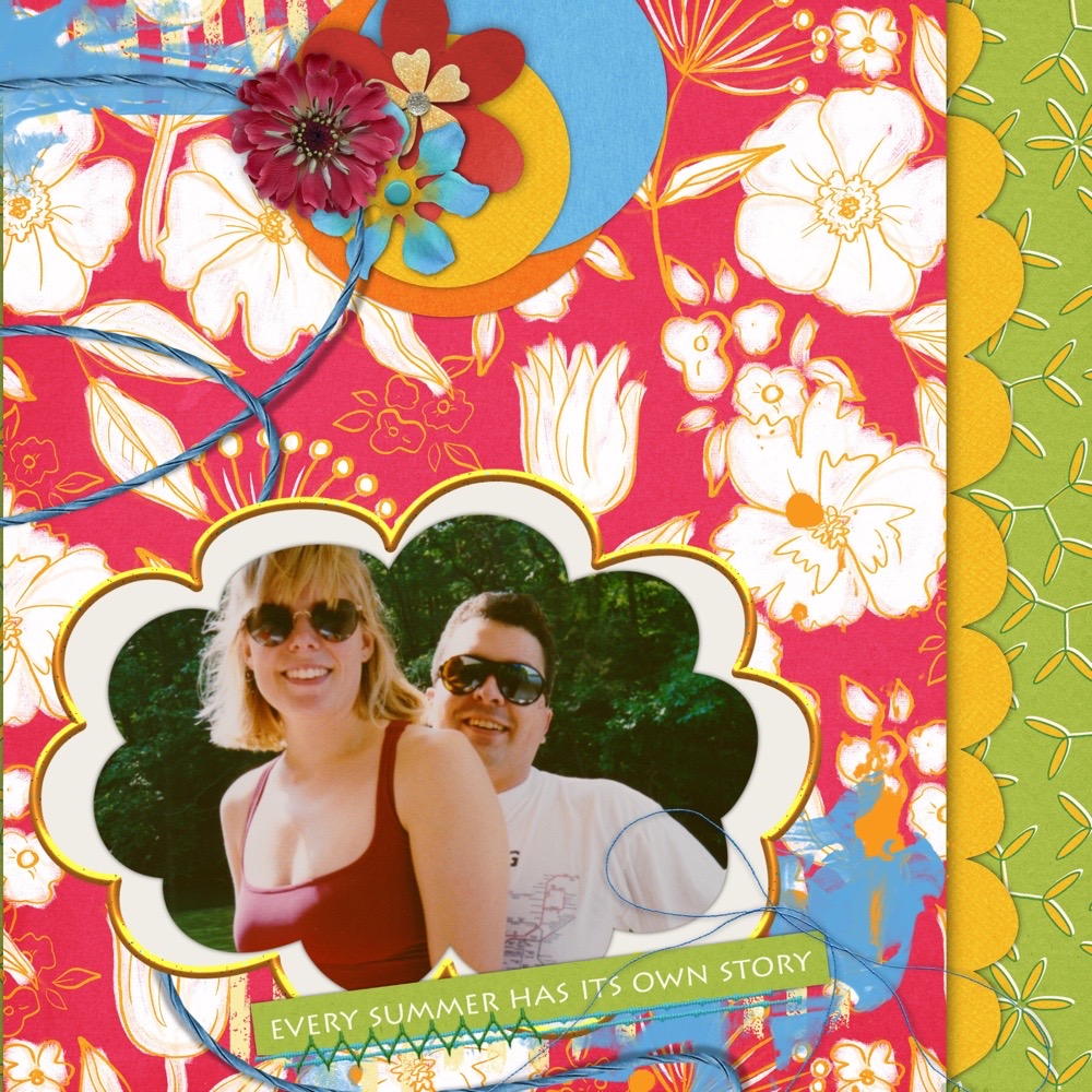
Think contrast when pairing patterns. Geometric and floral patterns together. Large prints with small prints. Heavy weighted patterns with a lighter, delicate pattern. Above, I used Lori Fortini’s bundle to mix up both color and pattern.
2. Keep a focal point
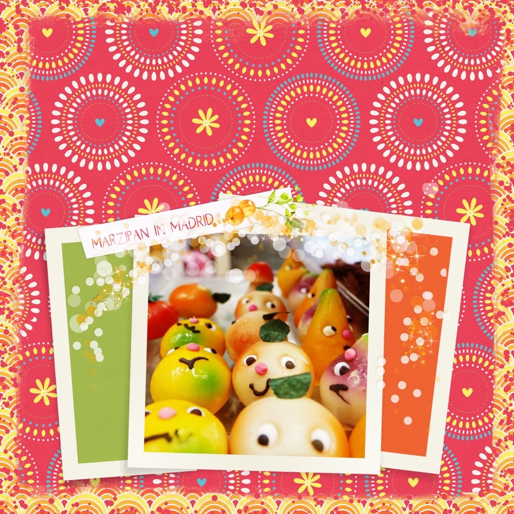
Keep a contrasting focal point inside the pattern – a single photo or large, contrasting element. Here, I used Thaliris’ bundle to place solid papers inside the frame to offset the photo. I left plenty of room at the top of the page to let the eye wander down to the photo. Again, I used the edge with a small print that contrasts with the larger pattern in the center of the page.
3. Repeat Color
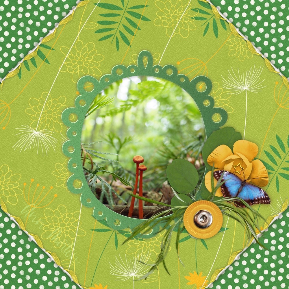
One easy way to mix patterns is to repeat colors throughout. I used Lori Fortini’s bundle to bring in two green papers and mostly green elements with little hints of yellow. The orange mushrooms in the photo bring me to another tip…
4. Use contrast in your photo
The photo in the layout above works for me because the greenery in the background blends in with the greens in the papers and elements, but the bright mushrooms definitely stand in contrast. Another way to achieve this would be to use a black and white photo on your layout, or edit your photo to be black and white with one pop of color that matches a color in your page.
5. Repeat shapes
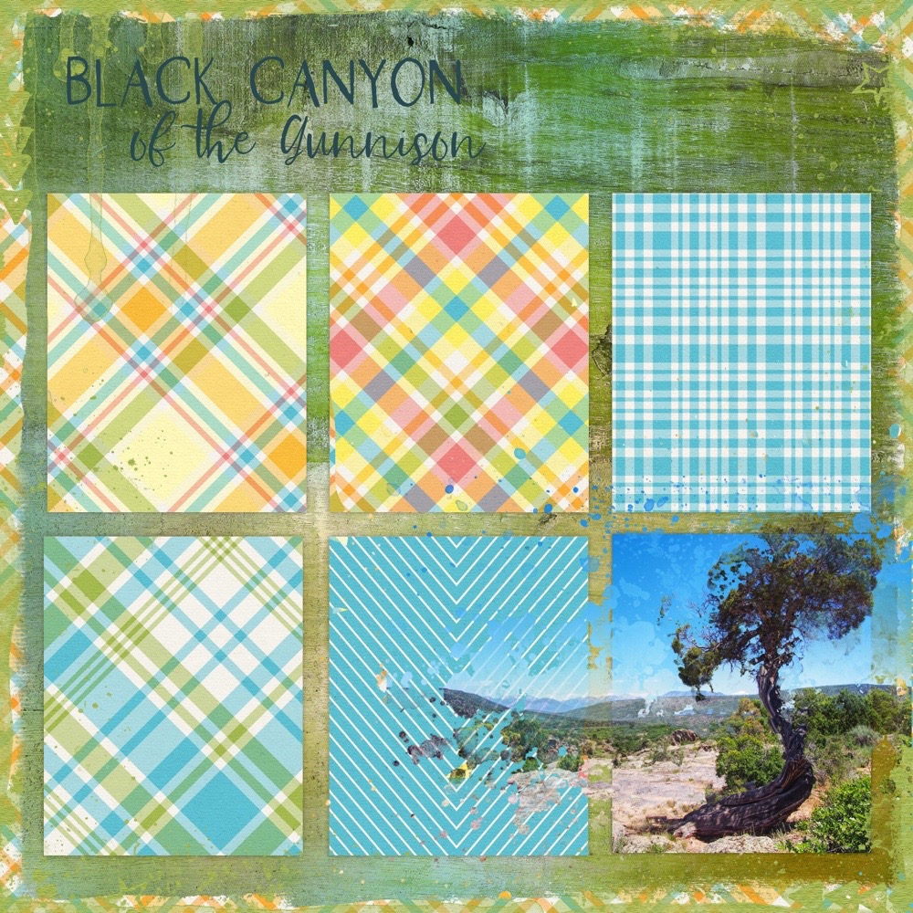
Using repeating shapes on a page can be a great way to draw the eye across the page without feeling too overwhelmed from a mix of patterns or colors. Above, I created little pocket cards with multiple patterns, then clipped the photo to one card. I also clipped duplicate copies of the photo to some splatter elements to break up the pattern of the repeating card shapes. The edging echoes the plaid and draws your eye into the page. You can do the same with color, repeating a color throughout the page, or repeating color among shapes.
6. Repeat the same pattern
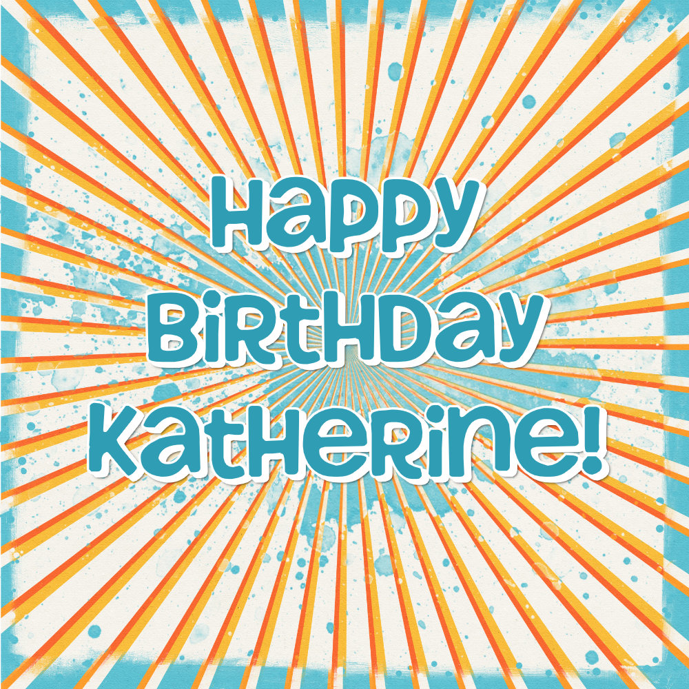
Designers often have elements that echo a paper pattern. In the birthday card I made above, I used the splatter element on top of the orange and white starburst background. Then, I clipped a blue version of the paper to an edge element.
I hope this helps when you are ready to start combining patterns and colors. And I hope you’re as inspired by the Carmen Miranda collection as I am!



Leave A Comment