Layouts can have such a dramatic flair when you use dark backgrounds. I’ve created a few quick tips on turning the lights down low in your layouts… fun for Halloween or any time. And, with the holidays around the corner, you may have other opportunities to use similar techniques – I’m picturing dark base layers behind photos of bright, festive lights.
I’m working in Affinity Photo Desktop, but these steps should roughly apply in other layer-based photo editors.

Tip 1: Use subtle color changes or gradients in the background. These can be a great tool to add visual interest. I blended two images from unsplash.com on top of Sylvia Romeo’s deep, purple background. This creates subtle color shifts in the back drop.
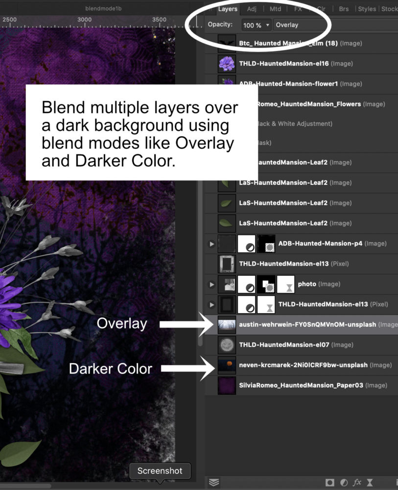
The dark tones appear closer (the tree branches), and the lighter tones of the sky and moon appear further away, adding a dose of realism. Sticking with similar, dark hues makes it more subtle.
Tip 2: Use highlights for contrast in your layout.
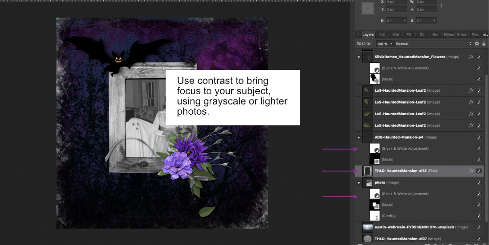
Here, I used a black and white adjustment on my photo with Thaliris Designs’ gray-toned frame. The contrast with the background makes the photo stand out.
Tip 3: Use shadows, but not too much!
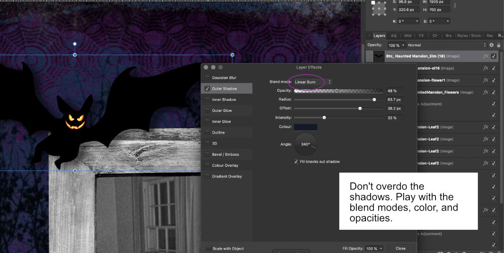
I like deep, inky shadows, but a little still goes a long way, even with dark backgrounds. With the bat element, I used a Linear Burn mode on the shadow, along with a blue hue I selected from the background. I increased the intensity, but backed the opacity down to about 40%. Using drop shadow layer effects, start subtle. Work lighter to darker and more transparent to more opaque.
Tip 4: Ditch the built-in effects. Instead, work with a shadow on its own layer.
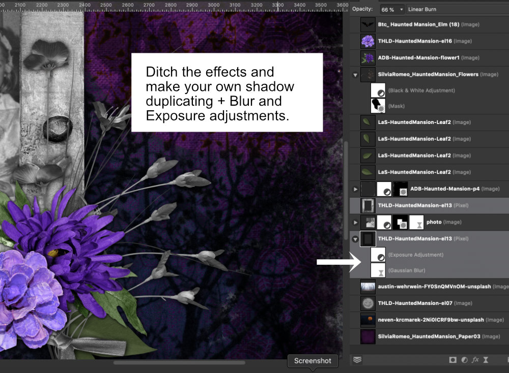
This is more flexible, and it also lets you adjust for perspective in your shadows, (flying witches?), since you’re working on a separate layer. Some programs like Photoshop allow you to move an effect (like drop shadow) onto its own layer. If that’s not an option, you can do the same thing in four steps. I duplicated the frame, then moved it below the photo. I added a Gaussian blur, then brought the Exposure down to darken it. I adjusted the layer’s blend mode to Linear Burn, and brought the opacity down to the mid-60s.
Be sure to share your dark background layouts in the gallery and Layout-a-day fourm!


Leave A Comment