Using a couple fonts together in a layout seems easy enough, right? But it can take some thinking (and searching!) to come up with 2 fonts that really work well together. Do they look good together? Do they compete with each on the page? Do the styles of the font complement the general style of your page? Below, read 4 tips for pairing fonts in your layouts.
First, use two different font weights. This example uses the fun, fat CHICKEN pie font with the stylized, thin cafe & brewery font on top.

Next, mix up Serif and Sans Serif. This example uses the Serif font Always Here (winter) along with the cute Sans Serif Moon Flower font (memories).

Third, use complementary fonts. This is an example of pairing similarly-weighted fonts. Both are heavy and dark. Their forms contrast, but not too much. Also, it’s a little bit more subtle way of using a Serif and San Serif together, like above. I used Snowkybrush (perfect for Layout-a-Day, right?) and The Artisan Marker.

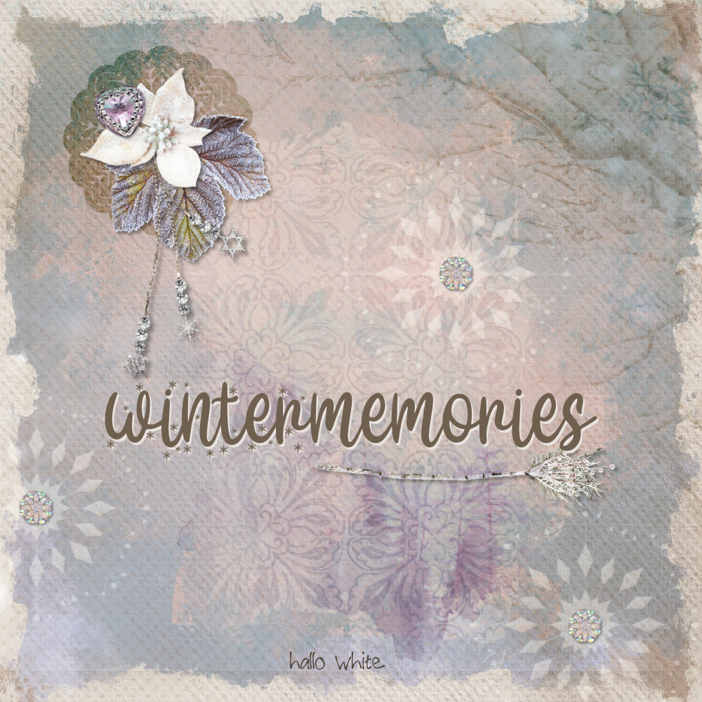
Finally, try using variants within the same font family. This one uses two different styles in Hallo White. I love the subtle, sparkly Display font here along with the simpler second style. Maybe another good Layout-a-Day font?
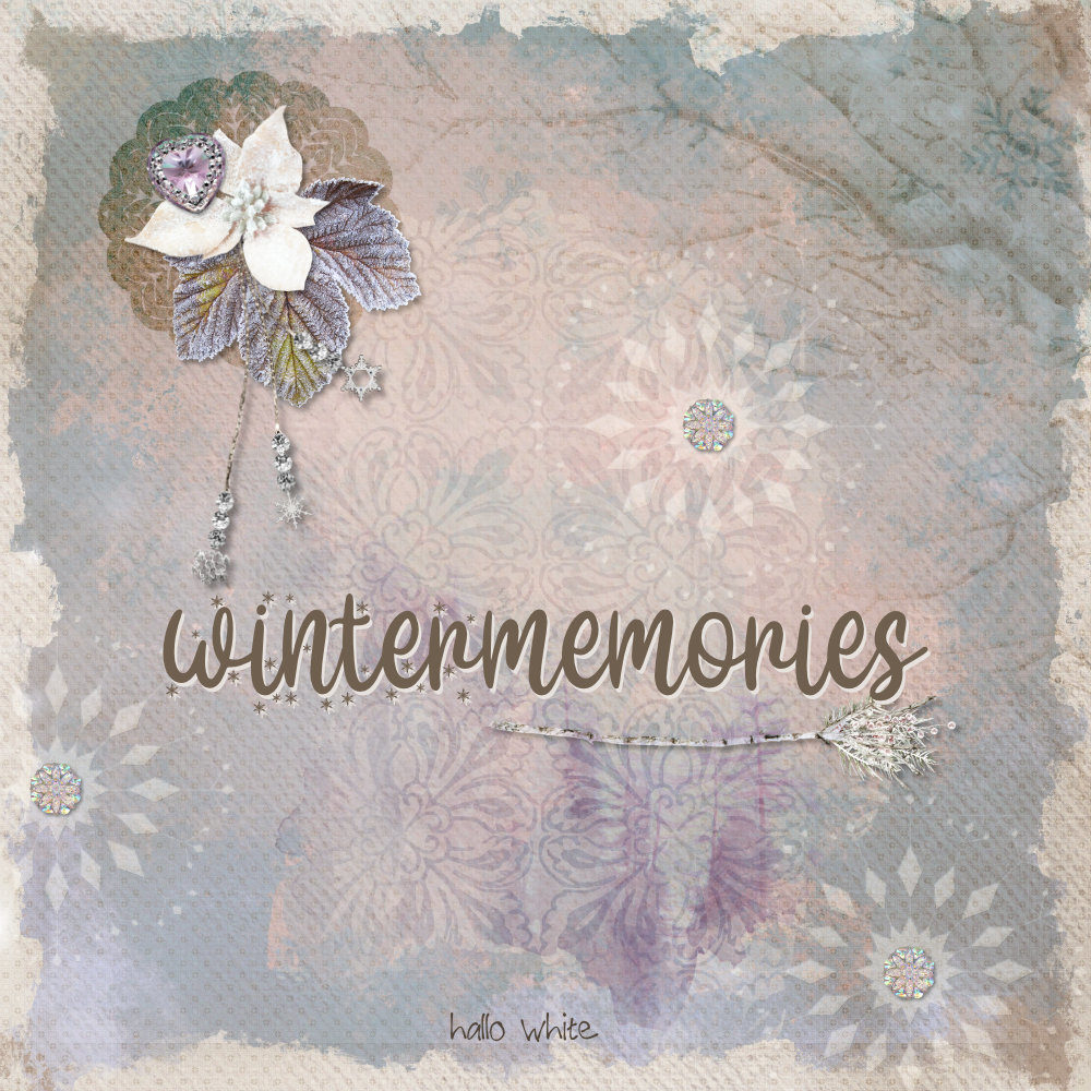
I made these samples with the new Studio Winter Memories Bundle.

I hope this gives you a few things to think about the next time you’re using two fonts together in your layouts.



Thank you Ann for this quick tip and the beautiful fonts with the links!
Great tips, Ann! & thanks for sharing these beautiful fonts — will be adding some to my stash! 😉
Thank you for the great info and the links to some very fun fonts!
Thank You Ann, I am loving all the new Fonts and adding them to my collection, I always though it was so hard to add fonts – I have found out this is not so – loving it.