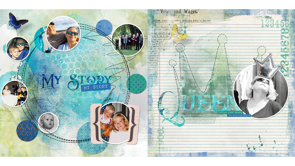
Most of us use Overlays all the time when we scrapbook. But what about Transparencies? Have you ever used those?
Both overlays and transparencies have a place in my digi-scrap stash, and I love using both of them. I don’t think one product is better than the other. They just both give different results, depending on what colors you are working with, what textures are involved, and what blending modes are applied. I might try an overlay, and if I don’t get the result I am looking for, I will try a transparency. Or vice-versa. Sometimes I use a combination of both!
Our Commercial Use store here at theStudio is chock full of amazing products. Because I love working with textures, I find myself gravitating toward the Overlay and Pattern products many days, but we also have Transparencies available to choose from.
Today I want to demonstrate the difference between an Overlay and a Transparency.
Here is one of the transparencies in my Grungy Transparencies – Set 1. I have placed it on a gray background so you can see it; however, the transparency itself is just the white that you see, with transparent pixels in all other area (where the gray is showing).

For demonstration purposes, I merged a copy of the white transparency onto a gray background, to create an overlay.
Now let’s see how differently a transparency and an overlay interact with a lilac colored, cardstock-textured paper.
For the first experiment, I just changed the blending mode of the Transparency (on left) and the gray Overlay (on the right) to Overlay. The Transparency didn’t alter the color of the original lilac cardstock, while the Overlay lighted the background.

In the second experiment, I changed the blending mode to Exclusion. I don’t use this blending mode very often, but I love the look this mode gave to the Transparency, but I’m not super crazy about what it did to the Overlay.

In the third experiment, I changed the blending modes to Dissolve. I like the look that the Transparency gave the lilac background paper, and depending on what I am working on, could find that very interesting. The Dissolve blending mode on the Overlay turned the whole document gray.
 Now there are definitely some instances where I prefer an Overlay to a Transparency… but Transparencies are a really nice option sometimes!
Below is a paper I made as a sample for you. This is a paper from Laddie-Lassie Solids. I simply placed an overlay on top of it (from Grungy Transparency Set 1), and changed the blending mode to Overlay. That’s it!
Now, through June 19, 2013, my Commercial Use Store will be on sale at a savings of 40%! All of my transparencies, and overlays, will be included in this sale. So if you are ready to give transparencies a try, this is a good time to pick them up at a great savings! Just go to my CU store and type in “transparencies” in the Search Box on the left to see what I have for you!
Click on the image below to receive this free Sample Paper, as well as one free sample transparency for you to play with!
And don’t forget to check out all of the Overlays and Patterns we have in the store for you! There are 718 products in the Overlays & Textures Category alone! And 121 products in the Patterns category! A virtual playground for those who loves textures and patterns!

[…] Transparencies vs. Overlays – 2 freebie(s) […]
[…] Transparencies vs. Overlays – 2 freebie(s) […]
Thank you very much.
Thank you! I’ve always used transparencies. I love scrolling through all the selections to watch the picture change with the different blending modes. 🙂
This has convinced me that transparencies are better. Especially since I was thinking of turning mine into overlays to save space on my hard drive. I’ll leave them as is. Thank you for the demo.
[…] If you would like to read a previous tutorial on the differences between overlays and transparencies (the PNG format), you will find one here: Transparencies vs Overlays […]