Why do we create scrapbook pages? I think most of us would say we do so in order to preserve memories.
Scrapbook pages can tell a story through photographs alone, but most often we include journaling, using our words to help tell our story.
Choosing the correct font for our journaling or title work can be just as important as the words we choose to use!
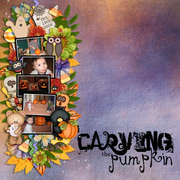
Carving the Pumpkin, by bcalberti, caught my eye today. She used a word art graphic as her title (Word Art by Bethany). The font in this graphic perfectly compliments Barbara’s page.
So what happens if you find the correct font, but the Tracking is not quite right?
I used to think I just had to choose another font! But that’s not true. Today we’ll look at how to fix a tracking problem.
First, let’s take a step back and define Tracking.
Tracking adds to or subtracts from the spacing between letters or words.
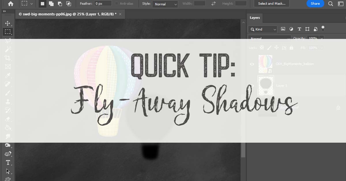
We access the Tracking option in the Character Panel.
My Character Panel is docked on the right. If you do not see your Character Panel, you may access it by going to Photoshop’s top menu bar > Window > Character.
![]()
The designer of a font, typically, will create the font characters with the right amount of space before and after each letter, so that when we type, the letters will look properly spaced.
However, sometimes we will come across a font where this is not the case.
Here is an example of proper tracking and improper tracking.
In the proper tracking example, all of the characters are evenly spaced and the word looks good.
In the improper tracking example, we see uneven spacing between the apostrophe and the “s.”
That doesn’t look good. Let’s bring those 2 characters closer together.
![]()
- Select the Type Tool
- Position the cursor directly in front of the “s”
- Hold down the Alt key, and without releasing it….
- use your left arrow key to nudge the “s” into the position that you would like it to be
I nudged the apostrophe over, then nudged the “s” over.
![]()
It’s as simple as that.
Next week we’ll take a look at Tracking entire words, as well as Leading!
*Credit. Thank you to Barbara for allowing me to use her Lil Tots (collaboration between SnickerdoodleDesigns and KimberKatt Scraps) layout as an example. Barbara is a member of theStudio’s amazing Creative Team.
The paper used in this tutorial is from Firm Foundation by SnickerdoodleDesigns.
The Character Panel is not available in Photoshop Elements. For today’s tutorial, I was using Adobe Photoshop CS6


[…] Character Tracking in Photoshop – 1 freebie(s)? […]
Excellent post. I was checkming constantly this blog and I’m inspired!
Veryy useful information specifically the remaining phase :
) I take care of such info much. I was looking forr this particular info for a very long time.
Thank you and best of luck.