I’m a big fan of Photoshop Styles. I love to create them, use them, and try to convince everyone I know that they’re one of the best Photoshop tools there is! Today I will show you how you can get some extra mileage out of any Styles you already own, and how to look at Styles in a different way, when you consider future purchases.
Up front, I acknowledge that Styles can be scary. Often times, a Style will have many design options used in its creation, and each option can have multiple components. But today, we’re not going to talk about “scary.” We’re going to talk about “easy,” and how to make Styles work for you in a way you may not have thought of before.
For the purposes of this tutorial, I am using Photoshop CS6. However, this tip should work in all versions of Photoshop. I also checked this tip in Photoshop Elements (PSE) 9, 11, and 12, and the option is available; so my assumption is that it will work in other versions of PSE also.
Pictured below is one of the line art graphics from Hidden in my Book, a collaboration between Dani (The Urban Fairy) and Jill (Jilbert’s Bits of Bytes). (I totally LOVE this!)
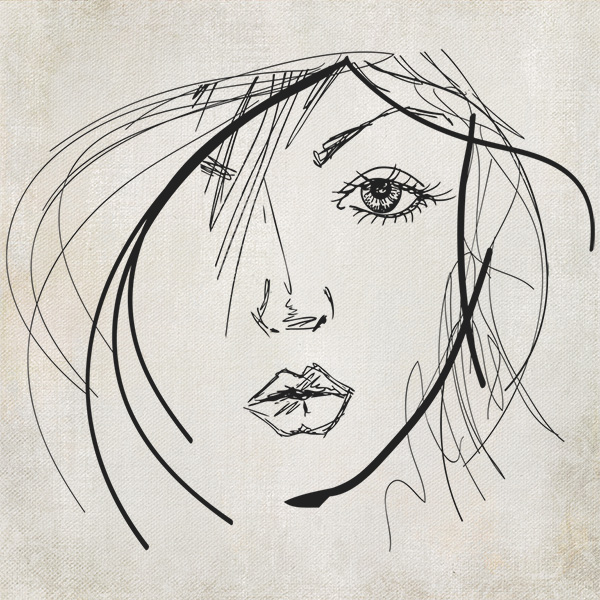
There are multiple ways to use this, or any, line art graphic: leave it as it is, clip a paper to it, colorize it, use blending modes to achieve different results, you name it.
Since this line art graphic was included in a kit, it would certainly make sense to use kit papers as you work with it, so that everything coordinates perfectly. But let’s say you have a style that you particularly like and want to use because of its pattern. Let’s also say that Style has a bevel on it, and that bevel just doesn’t work with the type of page you are creating. Let’s fix that!
Here is the same line art graphic with a Stratified Rock Style (Set 1) applied to it. The Bevel of the Style doesn’t look good with this piece of line art, but I really love the color variation and think it goes great with the style and colors of Hidden in my Book.
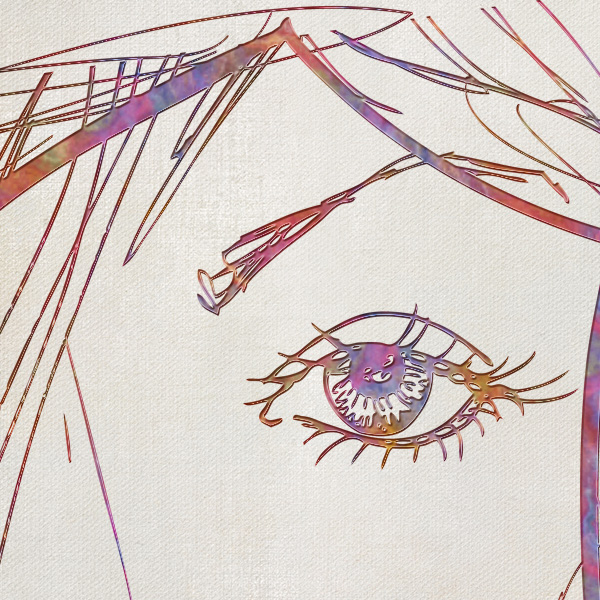
The color variation you see is the “Pattern” of the Style itself. And that is what I want to use. Not the Bevel – just the Pattern.
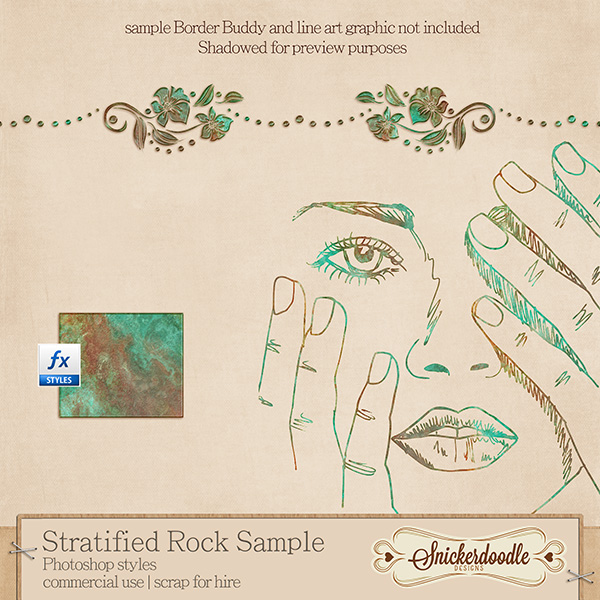
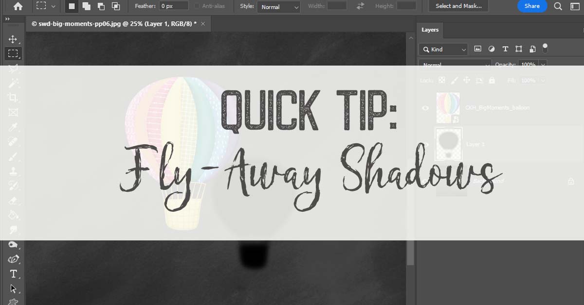
Here are the main options of the Stratified Style: Bevel & Emboss; Inner Shadow; Pattern Overlay.
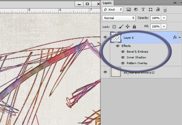
Inside each option, there are additional design choices made, to create this particular style; but that is not important for us to know today. We just know we don’t want the line art to have a bevel to it, so let’s turn it off. To do that, click on the Eyeball icon next to Bevel & Emboss.
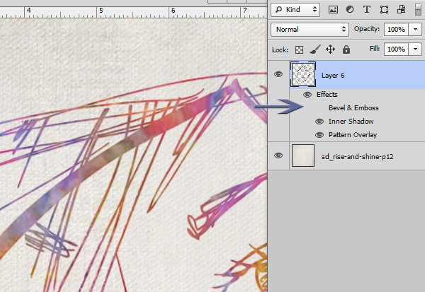
Without the Bevel & Emboss, we just see the Pattern and the Inner Shadow. If we wanted, we could turn off the Inner Shadow also, but I liked it, so I left it turned on.
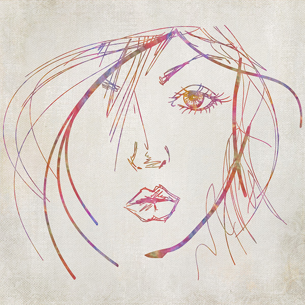
Now we have a beautiful line-art graphic with some color variations, which goes really well with the artsy style of Hidden in my Book.
Look at the Styles you own, or some you are considering. Look past the options on the style (Bevel & Emboss, Inner Shadow, Outer Shadow, Outer Glow, Satin, etc.) Look just at the pattern itself. Do you like it? Use it! Just turn off the Styles options you don’t want, and you have, in essence, created your own style, one that suits your particular needs!
Here is a sample Style to practice with. Just click HERE or on the image below to download.
Credits: Hidden in my Book, a collaboration of The Urban Fairy and Jilbert’s Bits of Bytes; Stratified Rock Styles by SnickerdoodleDesigns. Enjoy Promotional Sales right now!


Very nice tutorial. I also love styles and have bought several of yours. I would, however, like to know what I can do to keep the styles ‘intact’ when I have to merge layers for posting on the web, or printing. They always seem to ‘flatten’, and just don’t have the pzazz I like. I’m sure it is in the way I am saving the file. Please, what am I doing wrong? thanks
Thanks for your comment and question, Pam. I’ll answer that next Saturday in a tutorial.
Great tutorial Karen! Thanks so much. It is so helpful to read how to use the styles.
In PSE there is a little fx icon next to the name of the style in the layer panel. Click on it and the style options drop down box will appear.
And I LOVE the Art Graphic you used from Hidden in my Book, a collaboration of The Urban Fairy and Jilbert’s Bits of Bytes.
Thanks, Renee, for mentioning that FX icon for PSE users! I forgot to refer to that. PSE users would then just turn off the visibility of the Bevel layer.
Thanks for the tutorial and awesome style! I’m a huge Style freak and use it all the time.
[…] Using Styles to Stretch your Digi-Stash – 2 freebie(s) […]
WOW, never would have thought of using a style for a sketch like this! Yes, I am one of those “fraidy cats” when it comes to styles, but now after reading this, I can’t wait to play!!! Thanks, Karen!
Yeah!!!! Thanks for letting me know, Nancy!
Thanks for taking the time to share another great tutorial in the midst of moving! And thanks for the sample – I love the way this style looks with the line graphic & can’t wait to give it a try!
I wish you luck with packing! The last time I moved, it took me forever to pack because I kept finding things I had not seen in a long time & then stopping to view & reminisce.
Love all your styles and this one seems like another winner. I’ll go check them out at the store.
[…] Style Sampler […]
Nice, clear tutorial – as usual! Thank you!
I have found styles where I really liked the pattern. I have created a doc. at 1200x1200pxs or even 600x600pxs, depending on the scale of the pattern. As we work mostly in 3600x3600pxs pages, I try to work in divisions of 300, 600, 1200, etc. I fill an empty layer with any color, then, add the style. Go in, like shown above, and turn off everything except the pattern. Then, go to Edit>Define Pattern. Now I have that pattern to re-use over and over.
Looking forward to next tut!
Su
When you “Define Pattern”, it will be added to your installed Patterns. Save it if you want to be able to use it later by going to the Preset Manager. Highlight that pattern, and any others you might want to save with it, then, click ‘Save Set’ over on the right. Save it wherever you like on your hard drive. You can save one or all that are showing in the Preset Manager as long as you highlight them.
Su
I think that Styles are my very favorite part of Photoshop! I have collected MANY of yours! I am absolutely loving the new rock ones. They may be your best yet.
Thank you very much for the generous sale that allowed me to purchase the entire set. With tweaking and playing I can tell that there will be little housework done this week! 😉
Thank you for all of the helpful tips and tutorials. I collect them too!
And keuntje, Su, NancyP, Lee, and Mary, thank you for letting us know you found this tutorial helpful, and for your kind comments. I will be addressing Patterns in next week’s tutorial.
[…] week we talked about Using Styles to Stretch your Digi-Stash. Thank you for communicating with us via the Comment Section, which follows each post. We […]
Pam – please PM me. Thanks.
[…] Exploring Patterns in Photoshop Styles […]
[…] Exploring Patterns in Photoshop Styles […]
[…] Read More HERE […]
[…] Stretching your Digi-Stash with Pre-made Clusters Stretching your Digi-Stash with Masks, Part 1 and Part 2 Stretching your Digi-Stash with Pre-made Borders Use Styles to Stretch your Digi-Stash […]
[…] Styles: Using Styles to Stretch your Digi-Stash […]