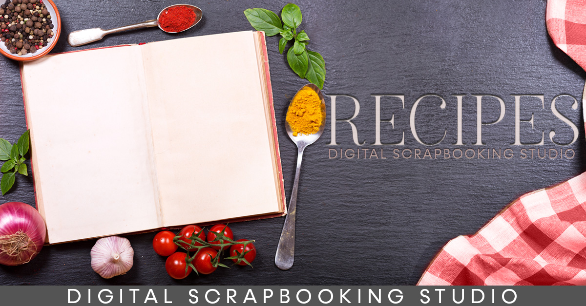
Today we kicked off our first-ever mega Recipe Exchange, with none other than an Appetizer round. Are you in? Are you sharing your top secret recipe? Or maybe a family favorite? All I know is, I’m super excited to have a new, big, huge, amazing Recipe Book! One that will be the perfect size for my kindle.
I absolutely love my kindle! I watch “my” shows in the bath on my kindle. I listen to audiobooks while I drive. And I use it for my recipes in the kitchen. This new crowd-sourced Recipe Book is bound to be a new favorite in my house.
Anyone can join, and everyone that uploads at least one recipe will get a copy of the Recipe Book at the end of the month. You can create your recipe card anyway you like, as long it’s 7″ X 5″, 300 dpi. or you can use my free recipe card template (see the Recipe Exchange forum).
The hard part about recipe card templates is fitting your text to match the lines. The easy way out is to just delete the lines. But if you want to keep them, if you like the look, here’s a Quick Tip on making the text fit.
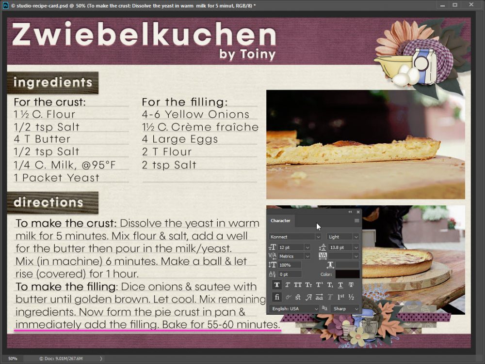
I’ve already taken the template and made it mine. I added some papers and clusters (on sale this week!) from Fall Baking by Laurie’s Scraps. I added my own photo’s and then typed in my directions. Of course my text didn’t fit right, but with a little tweaking in the Character palette that problem is fixed.
I’ve typed in the recipe directions, but while the first row of text lines up beautifully, the rest is all cattywampus.
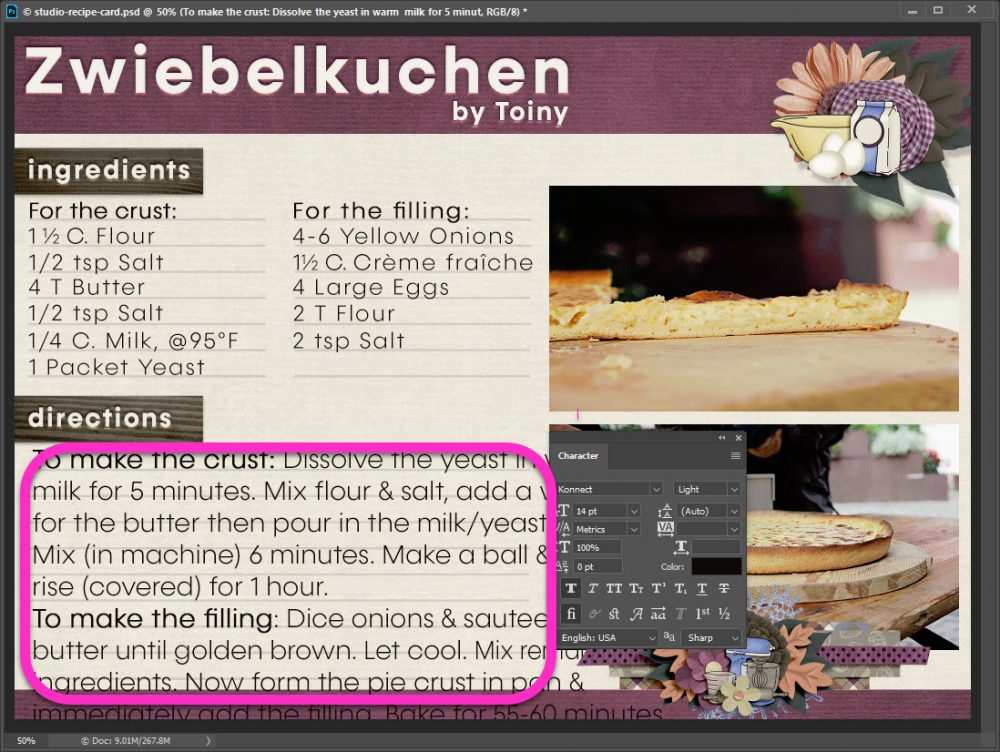
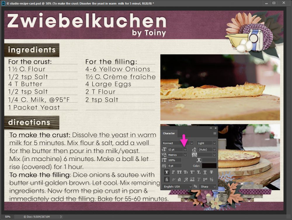
The easiest way to fix things is by simply changing the text size. Take note, be sure you are on your final font choice. Every font will line up differently. Here I’ve changed my font size from 14 pt to 12 pt. Now my first three lines look great, but I still have a problem with the bottom half.
Usually text is height spaced “Auto” this is called Leading, but you can change that with the click of the mouse. Just be sure to wear your magnifying glasses to find that teeny-tiny dropdown arrow.
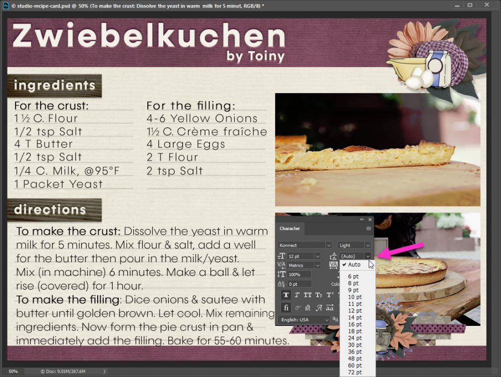
I always pick one point (pt) setting up from my font. Here I’ve switched from auto to 14 pt Leading. I’m really, really close!

You can also type in any point value you like in the Leading box. I lucked out & got the right value on my first try, it may take you more than one try or you may be lucky too! Since I needed only a small adjustment, I went from 14 px to 13.8 px:

My text now fits perfectly!
While I used photoshop for this Quick Tip, leading and character adjustments are available in most softwares. Take a look around in your program to make the adjustments you need. I cannot wait to try all your recipes!
I always make a text box for my text it automatically returns to the following line, will try your way also thank you
Great tip! & your recipe looks yummy!