Goodmorning!
I hope everything is fine in your little corner of the world! My name is Sonja, aka Synergy Ink and I’m the new Guest designer here at Digital Scrapbooking Studio. I live in the Netherlands with my husband and two teenage boys (17 and 15 years old). I know I should now show you a beautiful photo of me with my family all smiling and happy. Well, if that ever happens, I’m gonna let you know! The best I’ve got is frowned faces, back of heads and a lot of hands raised to the camera.. Making photos sure was a lot easier when they were younger!
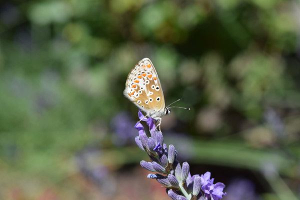
Instead a photo from my garden, because besides designing and making layouts, I love my little sanctuary! I usually enjoy it with a cup of coffee (or two), or chocolate, or both! And of course a good book!
But let’s talk about digital scrapbooking! One of my favorite tools in Photoshop to use are blending modes! And I use them A LOT! I love the easy artsy effect on my layouts; just 1 mouse click away.
I thought I would deconstruct a layout to show you how I work with blending modes on a layout. If you need more explanation or print screens, please let me know; I’ll be glad to help!
- I started with a background paper (No. 9 paper from the Adventure Collection). The paint strokes on the paper are perfect for blending a photo!
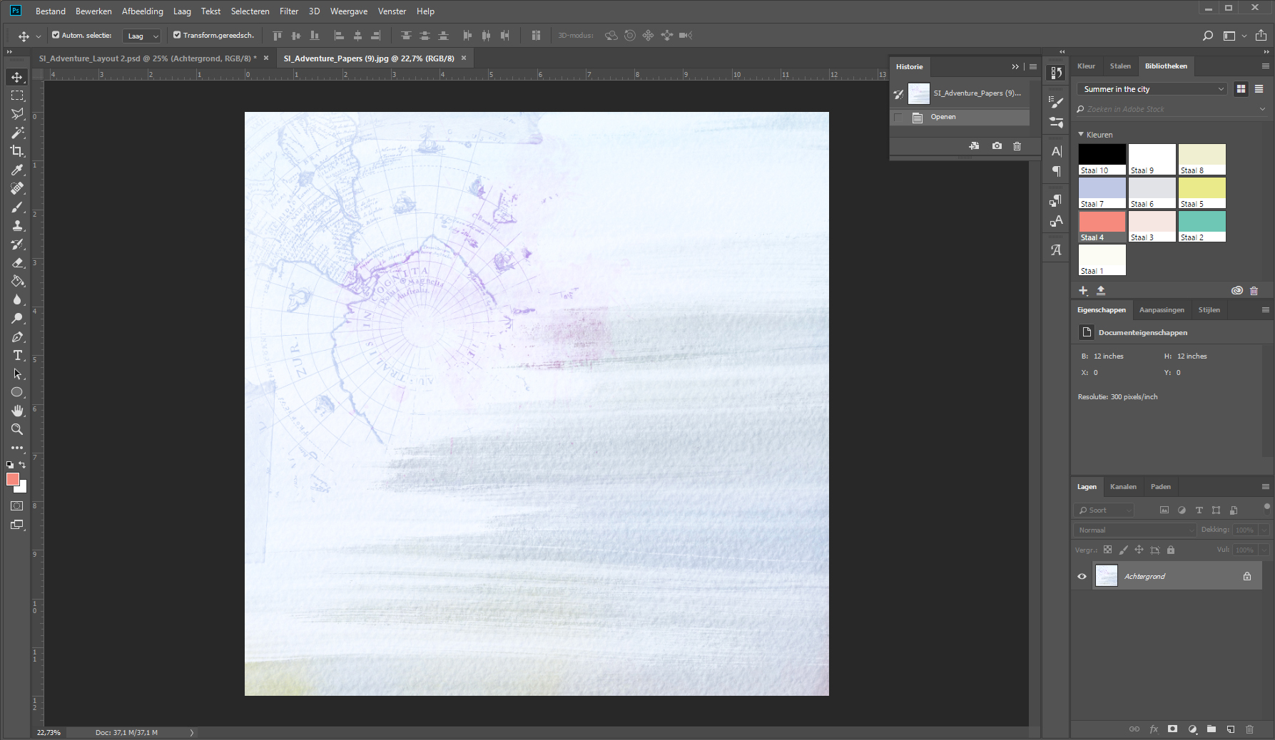
- Then I placed the photo from a beautiful Italian village and I made it large enough to cover more than half of the background paper.
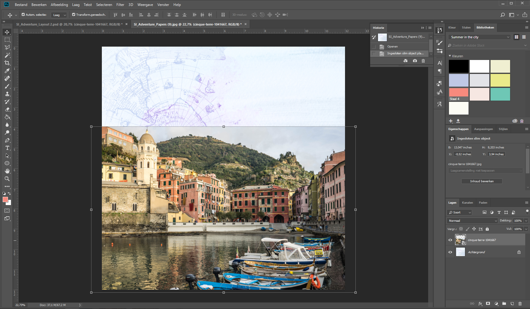
- First I duplicated the photo layer and made 1 layer invisible by using the little eye before the layer in the layer panel. Then I selected the visible layer and set it to Color Burn (Sorry! I’ve got the Dutch version of Photoshop). It’s the 5th option in the Blend Modes panel.
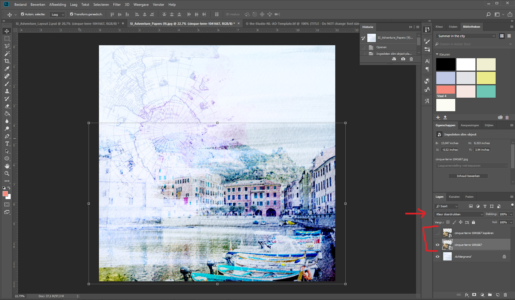
- Then I added a paint transfer from the Collection
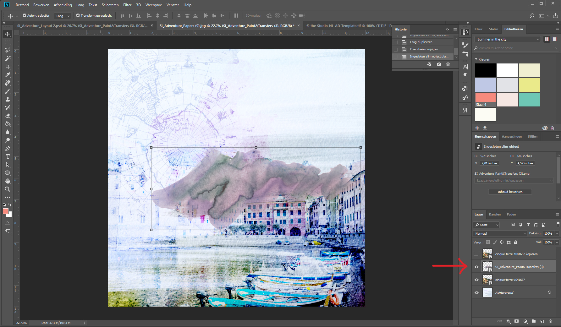
- And I moved it below the photo layer in the layer panel. This really intensifies the beautiful colors of the houses in the photo!
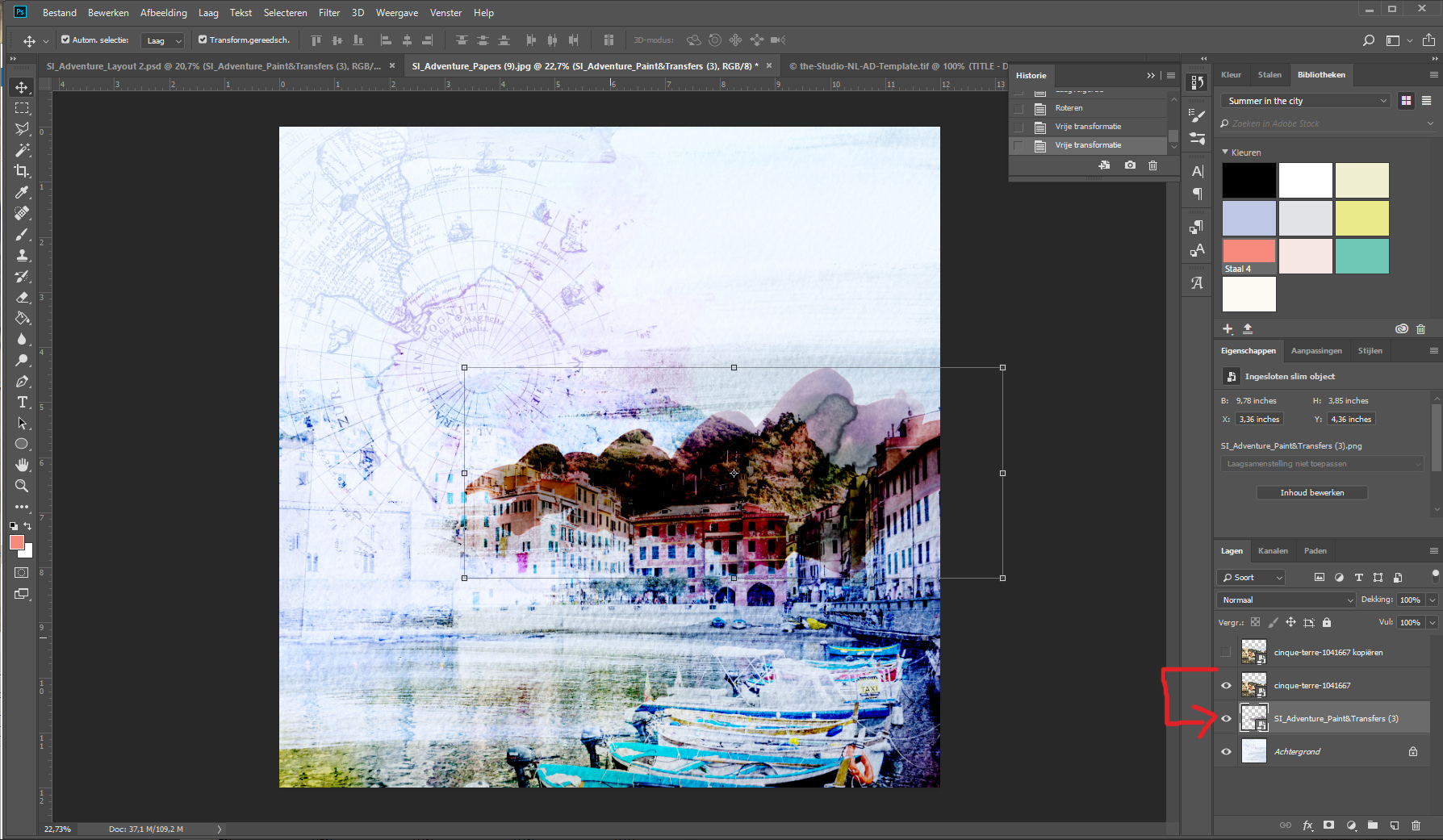
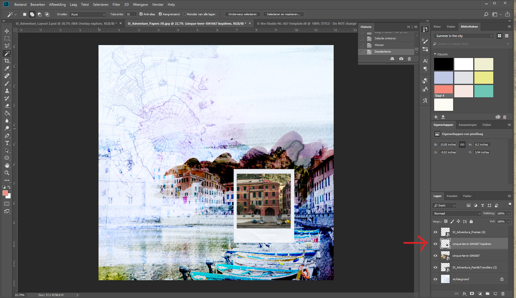
- Next I made the copy of the photo visible again and I added a frame from the Adventure collection on top. We are going to cut out a part of the photo to make an eye-catcher. I used the magic wand to select the inside of the frame (make sure you are on the right layer in the layer’s panel). Now you see all the marching ants inside the frame. Go to Select > Invert selection in the menu and select the photo layer in the layer’s panel. Than press “delete”.
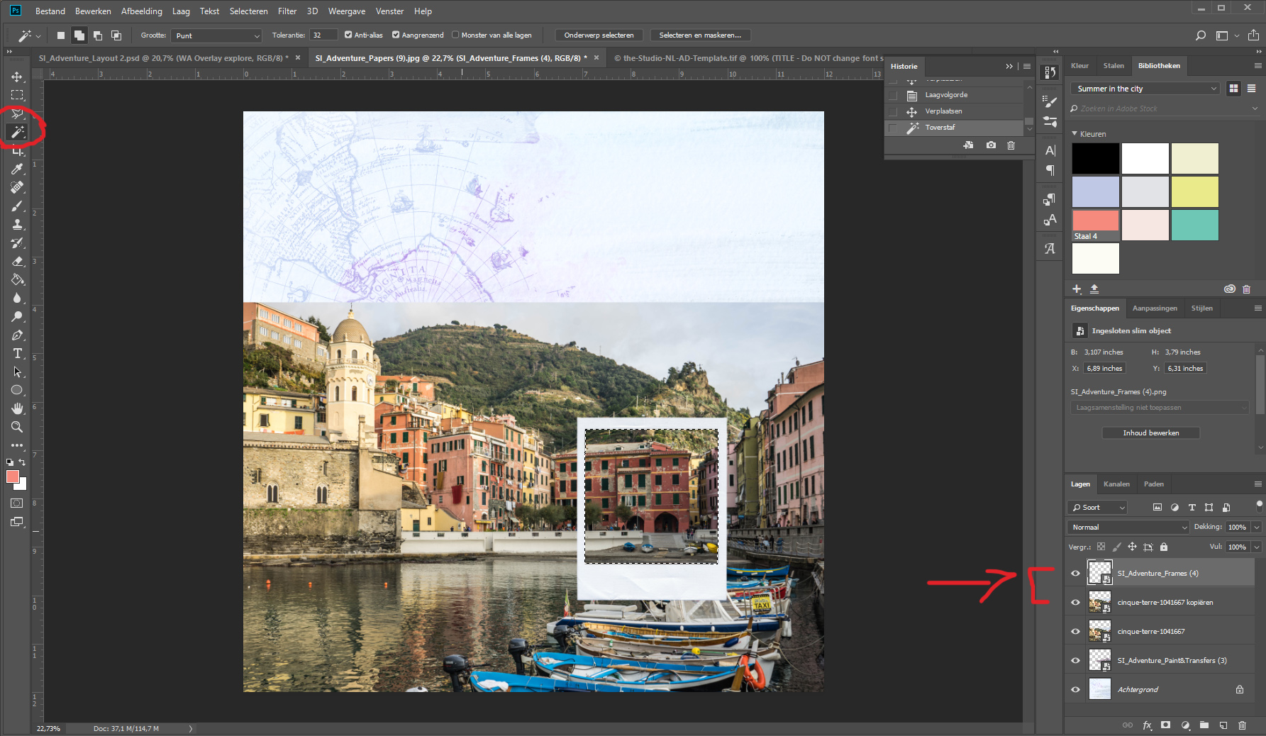
- All the parts of the photo outside the frame are now gone. I set the blending mode of the little photo to “darken” (3rd option in the list), to let the dark colors of the paint shine through, as you can see in the next photo.
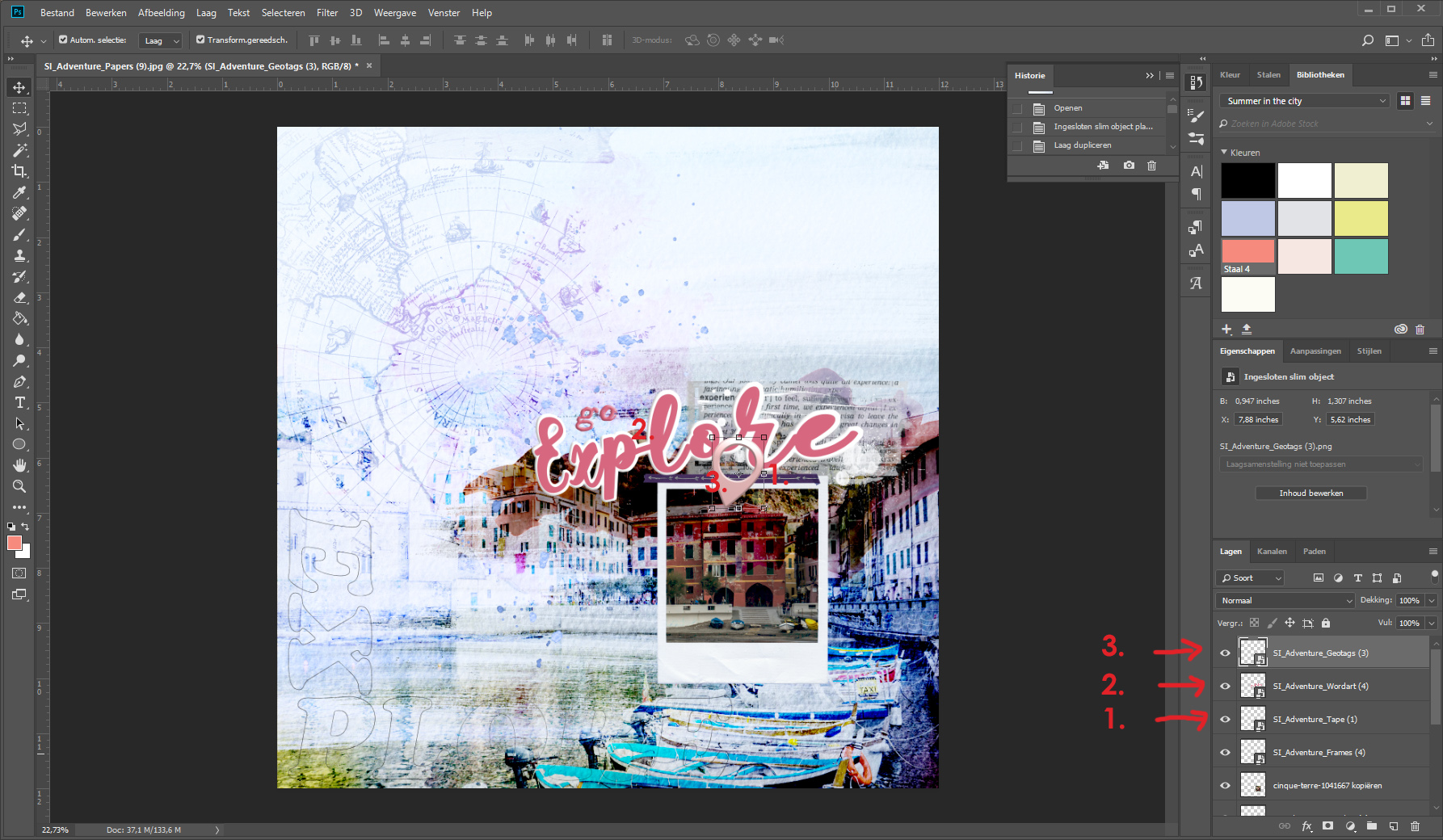
- Now I’m going to add some elements: the wordart element “explore” in the left corner, some splatter (what would I do without paint splatter!) and a text transfer, because I don’t like the way the paint transfer is sticking out above the top of the photo, so I’m going to hide it.

- Here I added the purple tape on the frame, a big title and the geotag to finish it off.
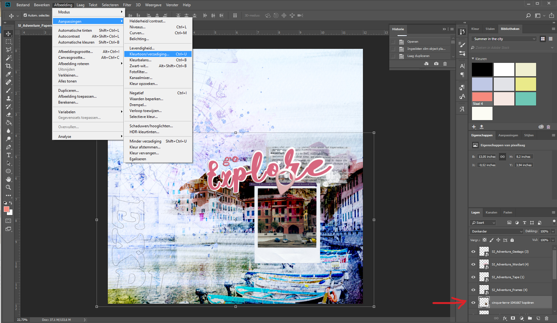
- Last but not least! Details!! Here I desaturated the photo (but not all the way!) to make the red color of the paint stand out even more. Go to “Image” in the menu, > Adjustments > Hue/Saturation and slide the Saturation bar to the left until you like what you see! (I think I desaturated about 50%, so you can still see the yellow and blue of the boats)
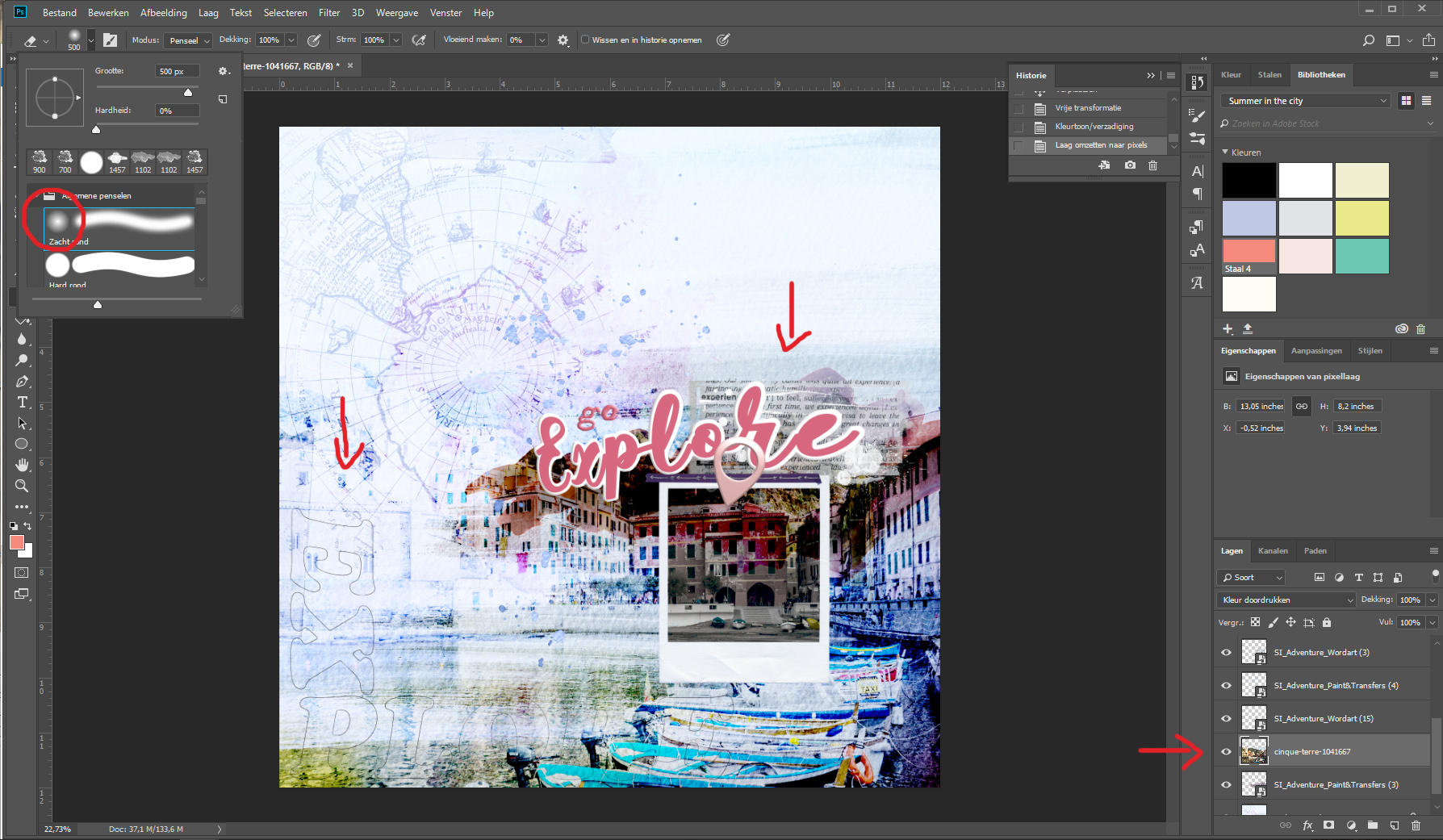
- To make the big photo look even more like a part of the paper, I used the eraser tool and a soft brush to erase the edges of the photo on the top and the left side of the paper.
- Et voilà!!

I hope you like it and if you have any questions, please let me know!!
I wish you all a beautiful day,
Sonja

Awesome! Thanks so much Sonja!
Thank you, Marianne!
Great tutorial Sonja, thank you. Just tried it and post a page on facebook.
Awesome page, Eileen! Thank you so much for trying!
I have to much to learn about digital scrapbooking, but this has certainly helped a lot with your great tutorial and wonderful page. Thank you.
Faith
Thank you Faith! And if you have any questions, please let me know!