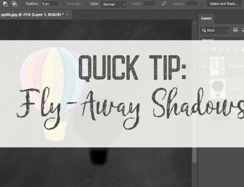
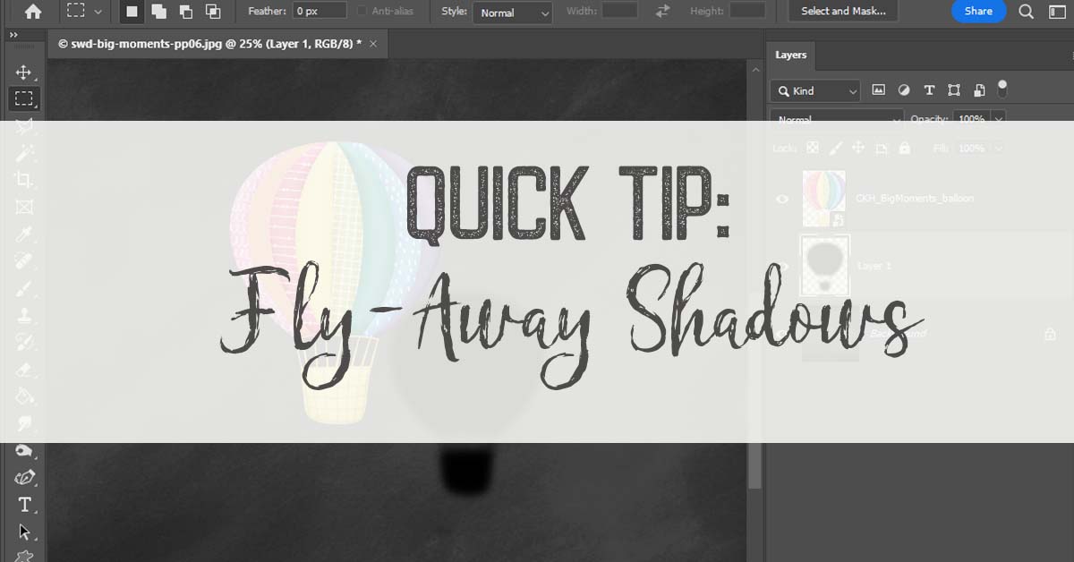
Shadows are a wonderful tool to make any layout POP! The right shadow can make it look like a butterfly just landed on your page, or has just left the scenery. Shadows are notoriously tricky to get just right. In the end, all that really matters is that it looks good to you.
I’ve got a couple of Quick Tips to get those butterfly shadows just right. I’ve pulled up one of my favorite October Anthology: The Naturalist layouts, already complete with a butterfly:
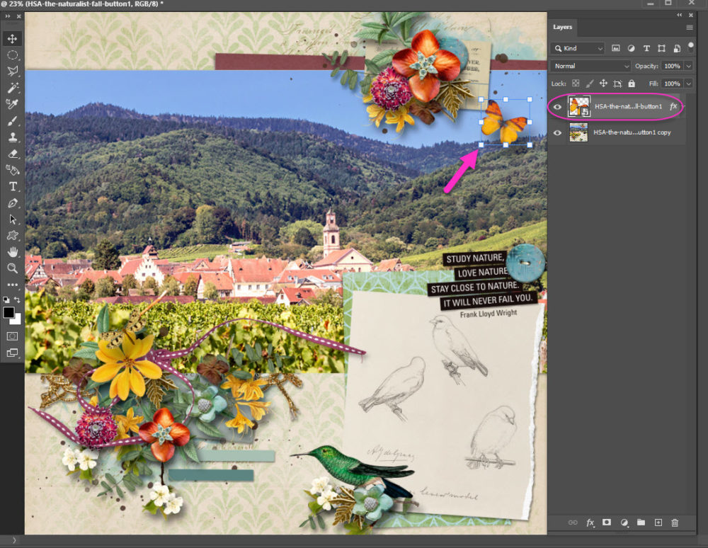
I’ve flattened everything but the butterfly for todays Quick Tip. It keeps my workspace a little neater. I already have a drop shadow set for my butterfly.
My settings:
- Multiply = 50
- Opacity = 50%
- Angle = 120°
- Distance = 100 px
- Size = 100 px
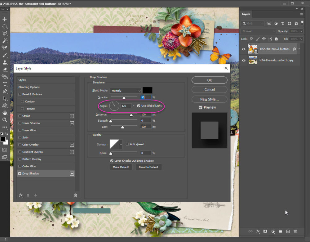
Notice that I keep my Global Light box checked. It helps keep all the light, and therefore shadows, coming from the same direction. Matching shadows, if you will, keep the eye from getting confused.
You can change any of the settings in the Layers Style Palette. One fo the fun things you can do is “grab” the shadow with your mouse and move it around to find the best placement.
Note: uncheck the Global Light box first!

I dragged my Layer Style box down so I could see my layout better, then clicked on the butterfly shadown, held-down the mouse button and dragged it far away. Obviously this is not where the shadow should go. The point is, it can go anywhere you want!
I like where my shadow wound up, a little farther than before. A little more POP off the page than before.
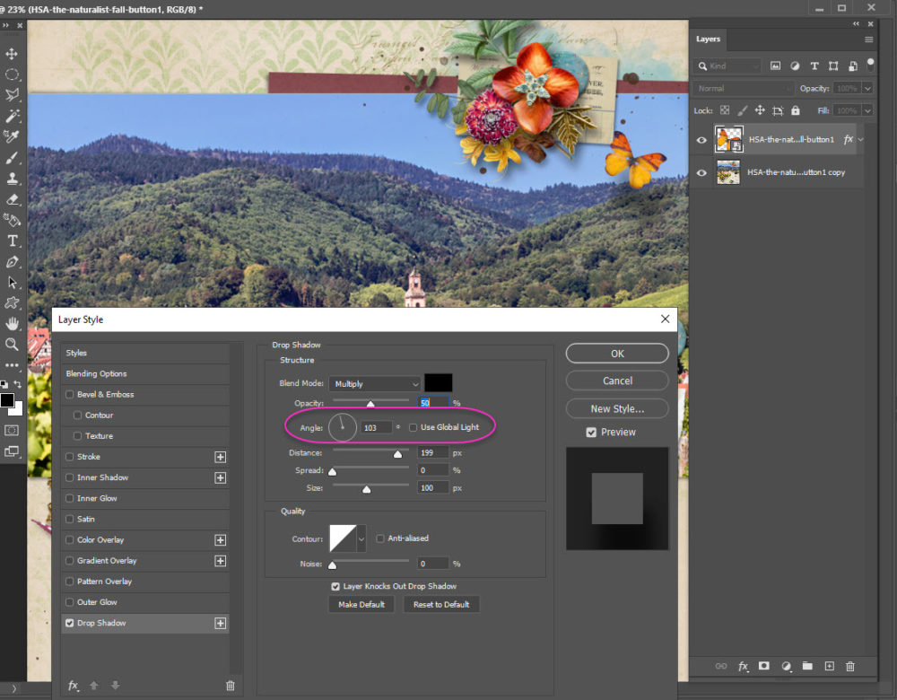
Notice that my Angle doesn’t quite match my other shadows anymore? You can go in & fix this by typing directly in the box or even trying to drag the Angle “clockhand” to the 120° mark. Or just leave it. One shadow not perfectly matching is not going to ruin your layout.
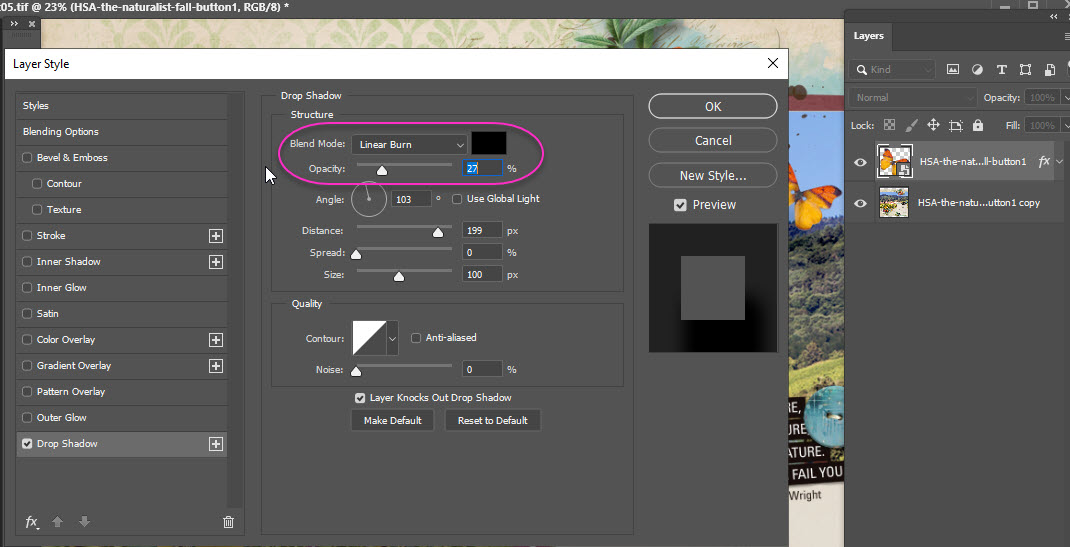
What I do want to fix is that the butterfly shadow seems darker on the blue sky than on the green trees. This is an easy fix by changing my settings:
- Blend Mode = Linear Burn
- Opacity = 27%
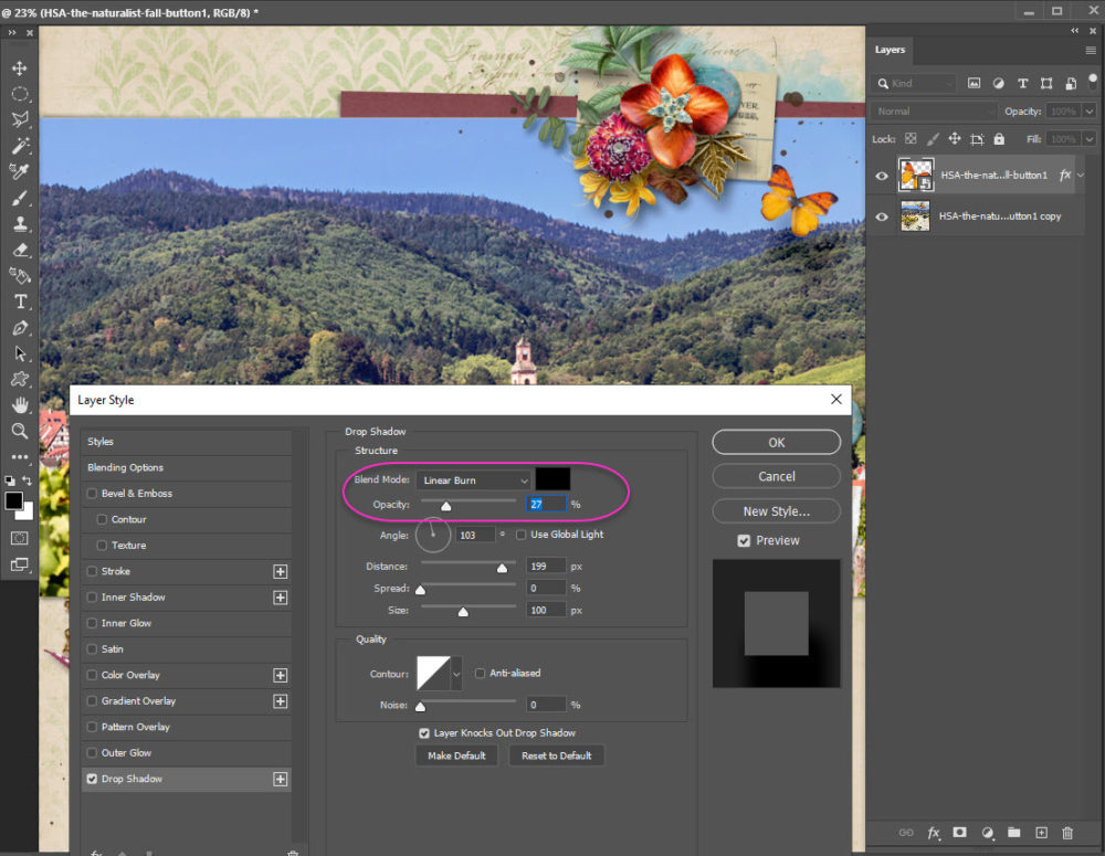
Note that I turned down my Opacity significantly when I changed blend modes. A too dark shadow will unbalance your entire layout.
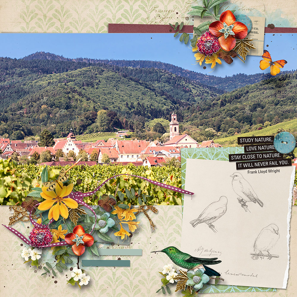
I’m happy with my page & my drop shadow! Go, give your shadows a POP!

Thank you very much.