To shadow? Or not to shadow? I just wish that was the question. It was the question I asked many moons ago when I wrote the Light & Bright Drop-Shadow Tutorial. Today I’m still asking that question, but this time I am interested in dark & heavy shadows.
I’m working with the free papers (and elements) from our LAD: Science 101. This is a darker, heavier, collection and as such needs darker & heavier shadows. As you all know, I’m a template girl. I went & dug in our store for the perfect template to use this darker stuff. I usually perfer the light & bright collections. This collection is out of my comfort zone, and yet I’m loving every layout I’m creating!
I found my perfect template: . The best part? This template already has the perfect shadow settings for working with dark & heavy papers and elements.
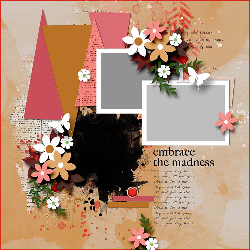
I’ve taken all the elements and hidden them from view. This way it’s easy for you to see the difference in shadows using Linear Burn vs Multiply.
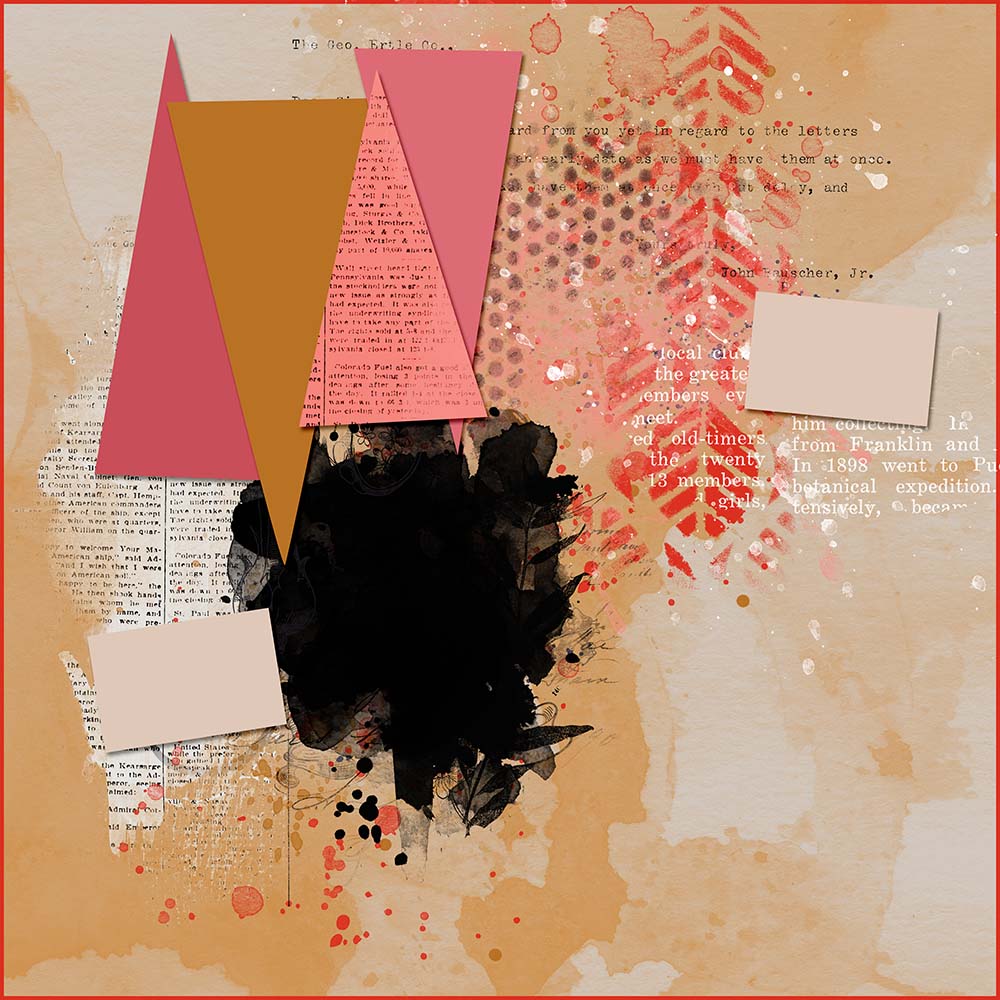
IMPORTANT: For this Quick Tip, I reset the template shadows to Multiply. This is the shadow setting I use the most, and the shadow setting most scrappers use the most. The actual template comes with the Linear Burn shadow settings.
I’ve replaced all the papers with journal cards or papers from the LAD: Science 101. I’m using papers & elements by:
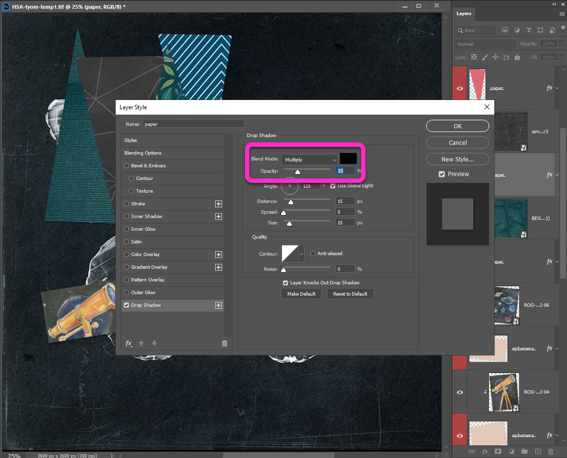
I’ve set the Drop Shadow settings to:
- Blend Mode – Multiply
- Opacity – 30%
- Distance – 15 px
- Size – 15 px
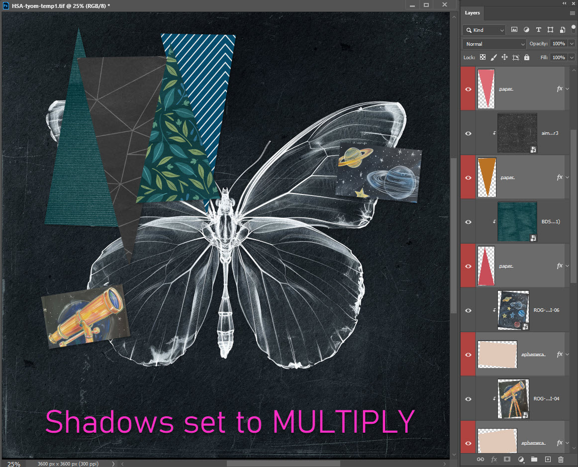
Now take a look as I change the Drop Shadow settings to Linear Burn. This time I’ve set the Drop Shadow settings to:
- Blend Mode – Linear Burn
- Opacity – 40%
- Distance – 15 px
- Size – 15 px
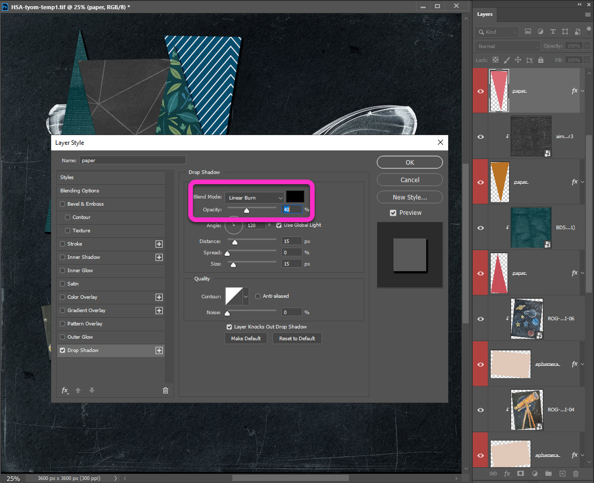
What a difference this small change makes! Now the papers POP and the shapes are easily visible.
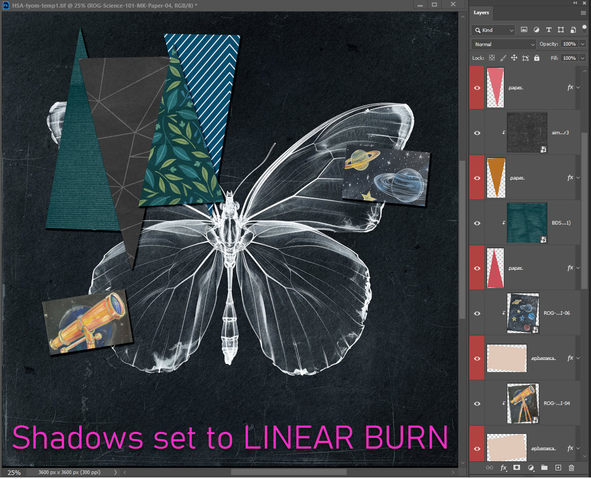
For the rest of the layout, I used the exact shadow settings Bryony (Heartstrings Scrap Art) included. I had so much fun working with darker, deeper colors and shadows. Most of the LAD: Science 101 elements are dark as well. They deserve to stand out on their own. They don’t deserve to blend in and be practically invisible. This is where the dark & heavy shadows really make a difference.
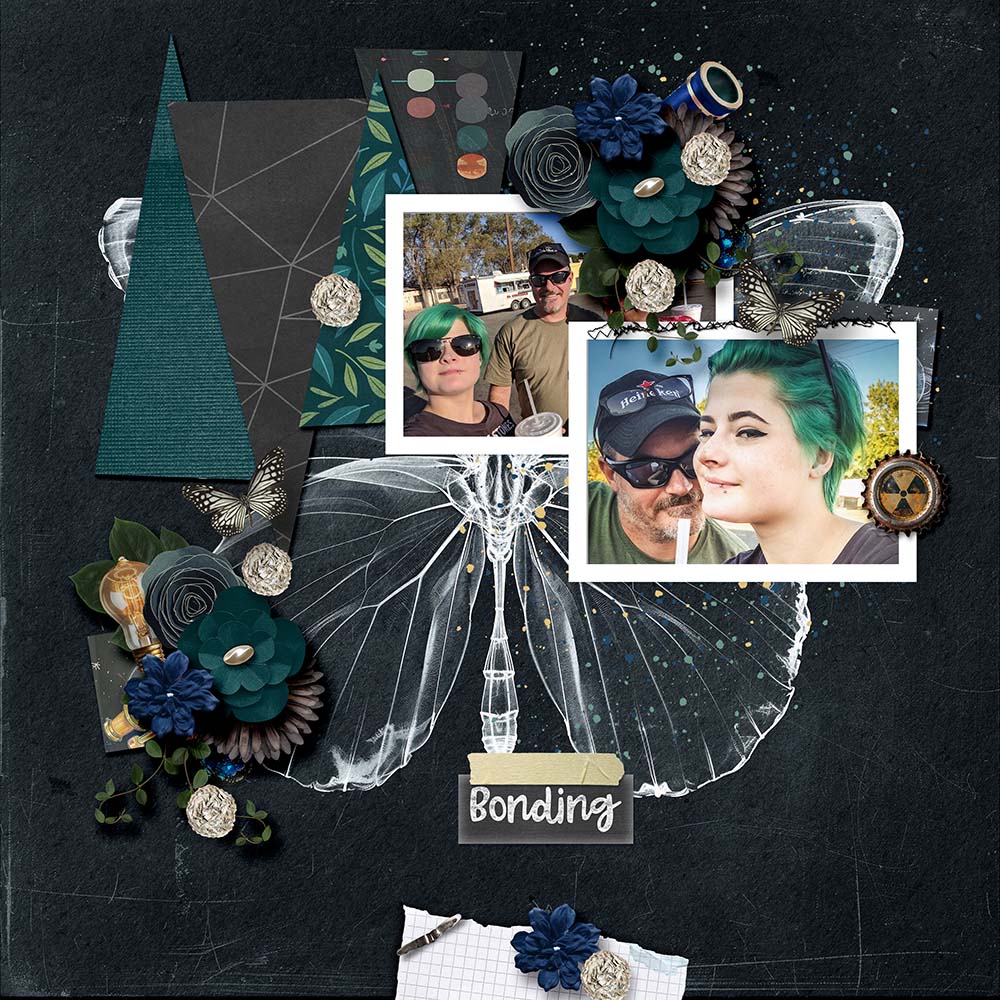
Today our challenge in the LAD: Science 101 forum is to create a dark page with dark & heavy shadows. Won’t you join us & give it a go? Every day you play = a free mini ❤




Thank you Toiny .