One of the things that I love about Photoshop is that there is always something new to learn.
For the purposes of this demonstration, I am using Photoshop CS6. Unfortunately, the Fill option, which we will explore today, is not available in Photoshop Elements (unless it has been integrated into the new Photoshop Elements 13, which I have yet to explore.)
Some things in Photoshop are obvious. Sometimes I stumble across a tool or technique unexpectedly. And sometimes I have to deliberately set out to learn something I don’t understand. The later was the case for me with the Opacity and Fill options in the Layers Panel. Let’s take a look at those today.
The Opacity and Fill options are at the very top of the Layers Panel.

Both the Opacity and the Fill options control the transparency of a layer. In the image below I have duplicated the word “Sweet.” In the “Sweet” on the top layer, I have reduced the Opacity to 50%. In the “Sweet” on the second layer, I have changed the Fill to 50%. The end result looks the same on both words, doesn’t it?

So when DO the Opacity and Fill options make a difference? The answer is: When using Styles.
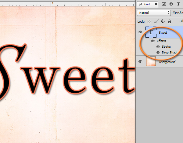
In the image below, I have placed a small stroke on the text, as well as a slight drop shadow.
Now let’s lower the Opacity of the text layer to 50%:

We can see that everything on this layer is semi-transparent – the text as well as the Layer Styles. Let’s take the Opacity back up to 100% and try lowering the Fill now.
In the image below, I have duplicated the text. I have lowered the Fill on the first layer to 50%, and the Fill on the 2nd layer to 0%.
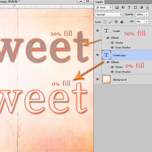
The Fill option affects the transparency of the layer, which in this case is the text; but it does NOT affect the layer styles, here the Stroke and Drop Shadow.
We are seeing a gray color at the 50% Fill level because my original text was black. If I had started with a different color text, the 50% Fill would result in 50% of the originating color.
You can see that at 0% fill, our text is totally transparent. We are left with only the Stroke and the Drop Shadow.
And that’s it. Simple, but elusive until you really take a look at it.
Experiment and have fun with this! It’s a great way to add interest to your Title work!
“Everything is easy, once you know how to do it.” ~ Jared Barneck
**Credit** I have Halloween candy on my mind, which is why I chose to use the word “sweet” in this tutorial. The paper used here is from Lil’ T.O.T.’s, a collaboration between SnickerdoodleDesigns and KimberKatt Scraps. Visit both of our blogs to pick up some adorable *FREEBIES* to coordinate with Lil’ Tots.
This is a great way to do ’embossed’ and ‘typeset’ styles … put your fill to 0 and then play with bevels!
great tutorial! thanks for sharing it.
I had been wondering about fill – thanks for showing the difference to opacity so clearly 🙂
Thank you for your comments, ladies! I’m glad to know you found this helpful.
Thank you so much for explaining the difference between the opacity and the fill. I have tried them, like in your first example, and couldn’t tell a difference. Now, I’m anxious to give it a try on my next project.
How simply you have explained this, thank you. I have played around with both and haven’t seen a difference either, looks like I didn’t use the right example LOL.
Thank you
I have wondered about this for so long. Thanks for sharing.