
Whenever we create a page, whether it’s a scrapbook page or an art journal page or anything in between, we set the tone by choosing color, elements and photos. We choose to set the tone of the page by everything we add to that page. We’ve talked a lot about color, light, elements, words, fonts, photos, etc. to help us convey the mood of our page. We haven’t talked much about tone.
Tone in art refers to the value or character of color, determined by its brightness or darkness. Each color has an almost infinite range of tones, from the lightest to the darkest.
This LAD, Layout-a-Day, Stormy Skies is all about exploring feelings, deeper thoughts and darker themes. One way to do this is by choosing the right tone for your layout. The Stormy Skies mega itself is darker in tone, but by using tonal gradients we can go even darker! Of course, we can also go lighter. It depends on the tone we want for the page.
For this tutorial I’m using an element and a paper that were part of the LAD: Stormy Skies prize on March 14, 2024.
- Paper by Mixed Media by Erin (ewright-StormySkies-mk-paper_01.jpg)
- Element by Cindy Ritter (rittc_stormyskies_mini_cloud1.png)
Obviously you can use either element just as it is, but let’s suppose we wanted a darker, moody page. A great way to do that, without losing some of the beauty of the original element is to add a tonal gradient. In other words, make part of the element darker without changing the entire thing. Here’s how.
Start by opening the paper in Photoshop Elements. For help with basic Photoshop Elements, take a look at my series of DUO Elements post. These are both written and video.
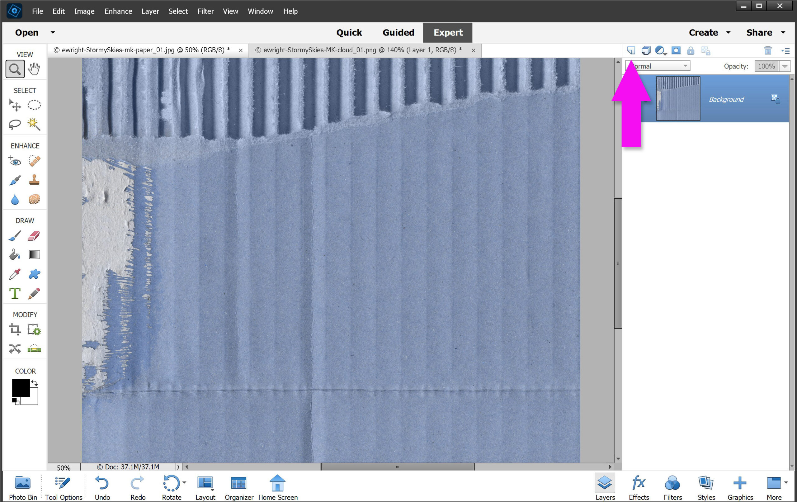
Add a New Layer above your background Layer.
- In the Layers Palette;
- Click on Create a new layer, in the top Layers Palette menu
Making sure you are in the New Layer (layer 1), add your gradient.
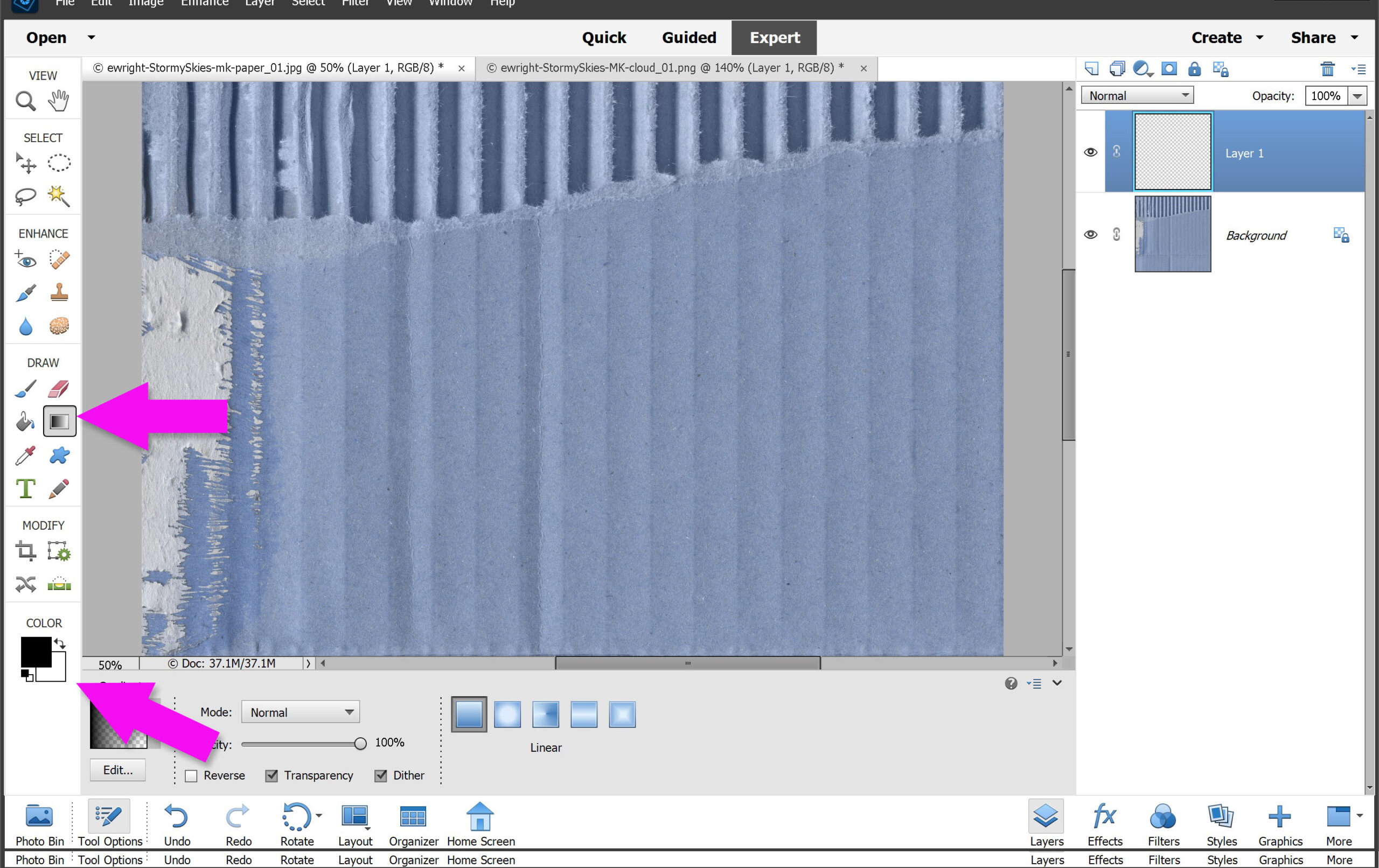
We are going to add our dark and light gradients in two separate layers. Let’s add the dark gradient first.
- Make sure your COLOR is set to default (black/white)
- Click on the Gradient Tool in the left menu
- this opens the Tool Options in the bottom menu
In the Gradient Tool Options menu,
- Click on the Edit Gradient button. This opens a pop-up.
- Choose the Foreground to Transparent option
- making sure again that black is your foreground color
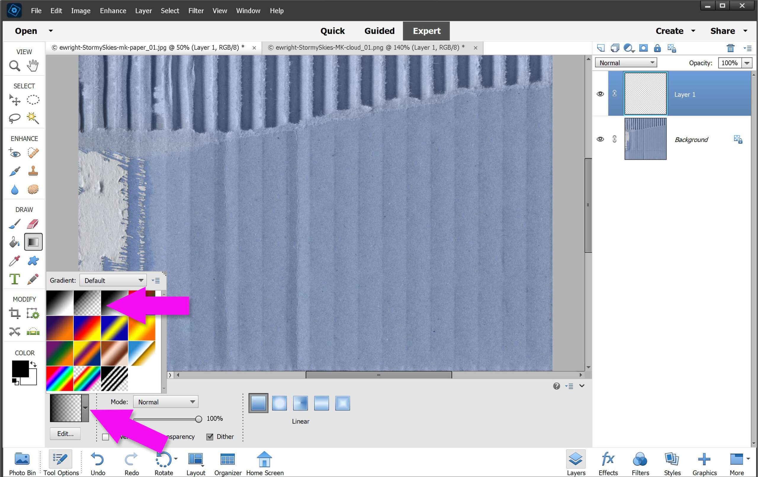
Your cursor will turn into a small cross shape. Drag this from the top down across your workspace.
- Make sure you are on Layer 1
- With the Gradient Tool selected
- Choose Option Linear Gradient
- Drag your mouse from the top to the bottom in your Workspace
Hint: hold down the Shift key to get a straight line/gradient
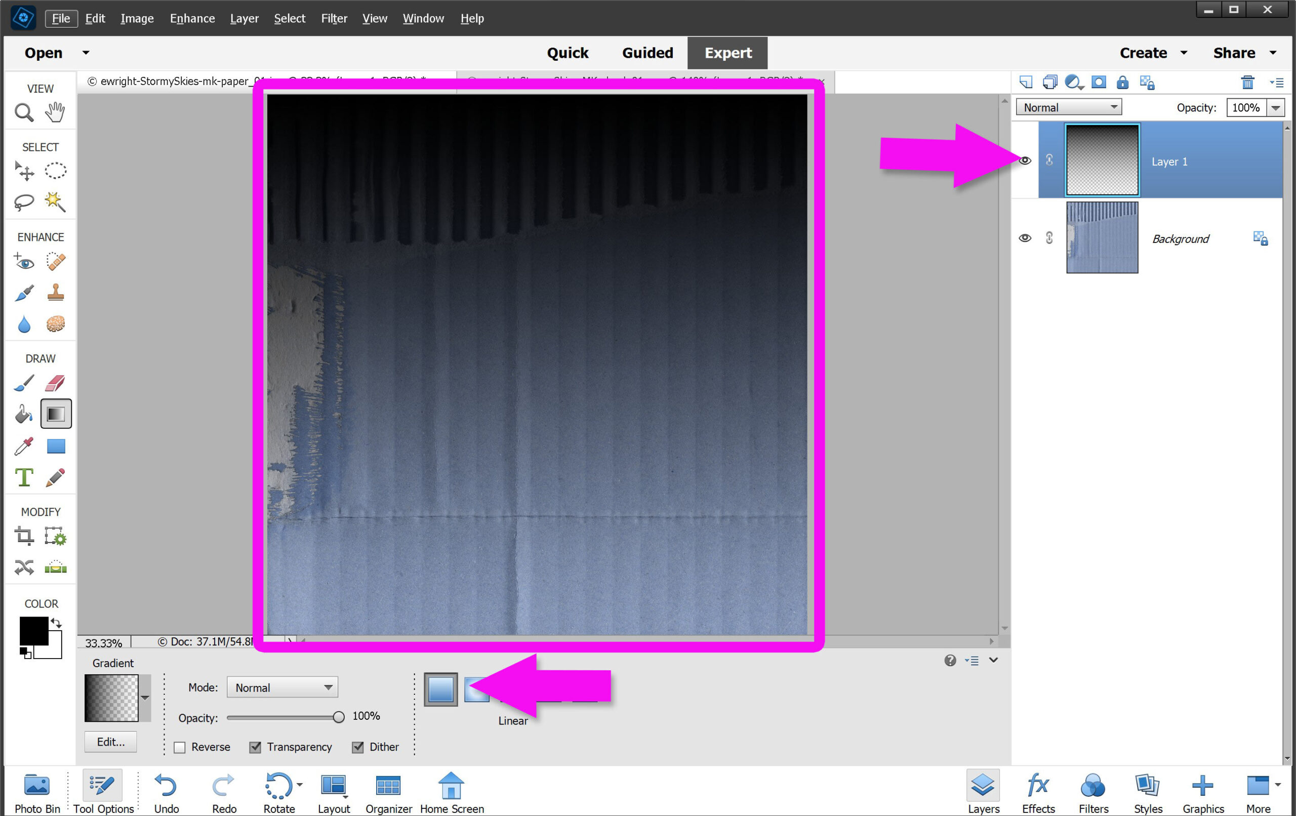
Making sure you are still on Layer 1:
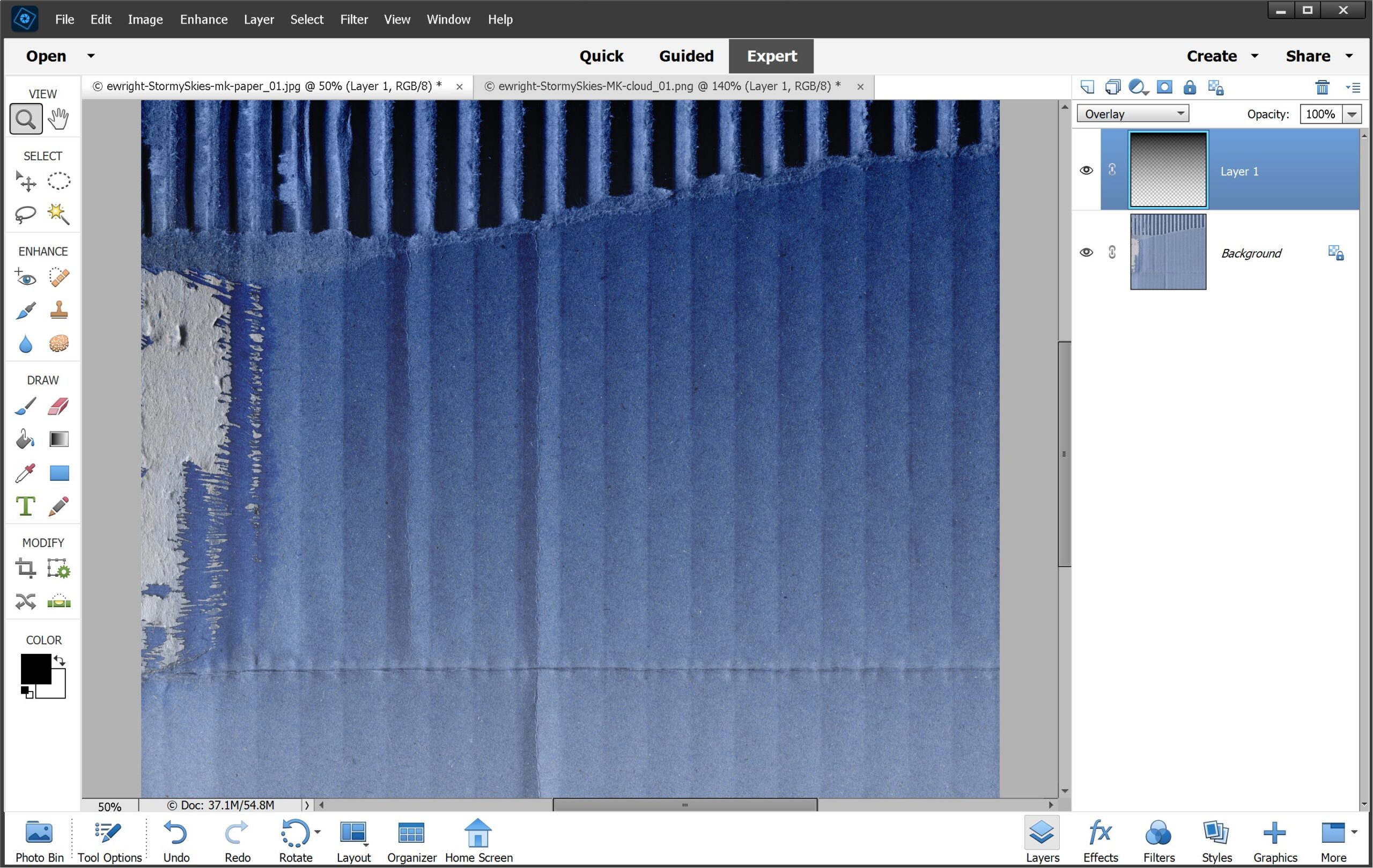
Change the tone of the Gradient to darker.
- Click on the teeny-tiny arrow on the Blend Mode
- Choose Overlay from the dropdown menu
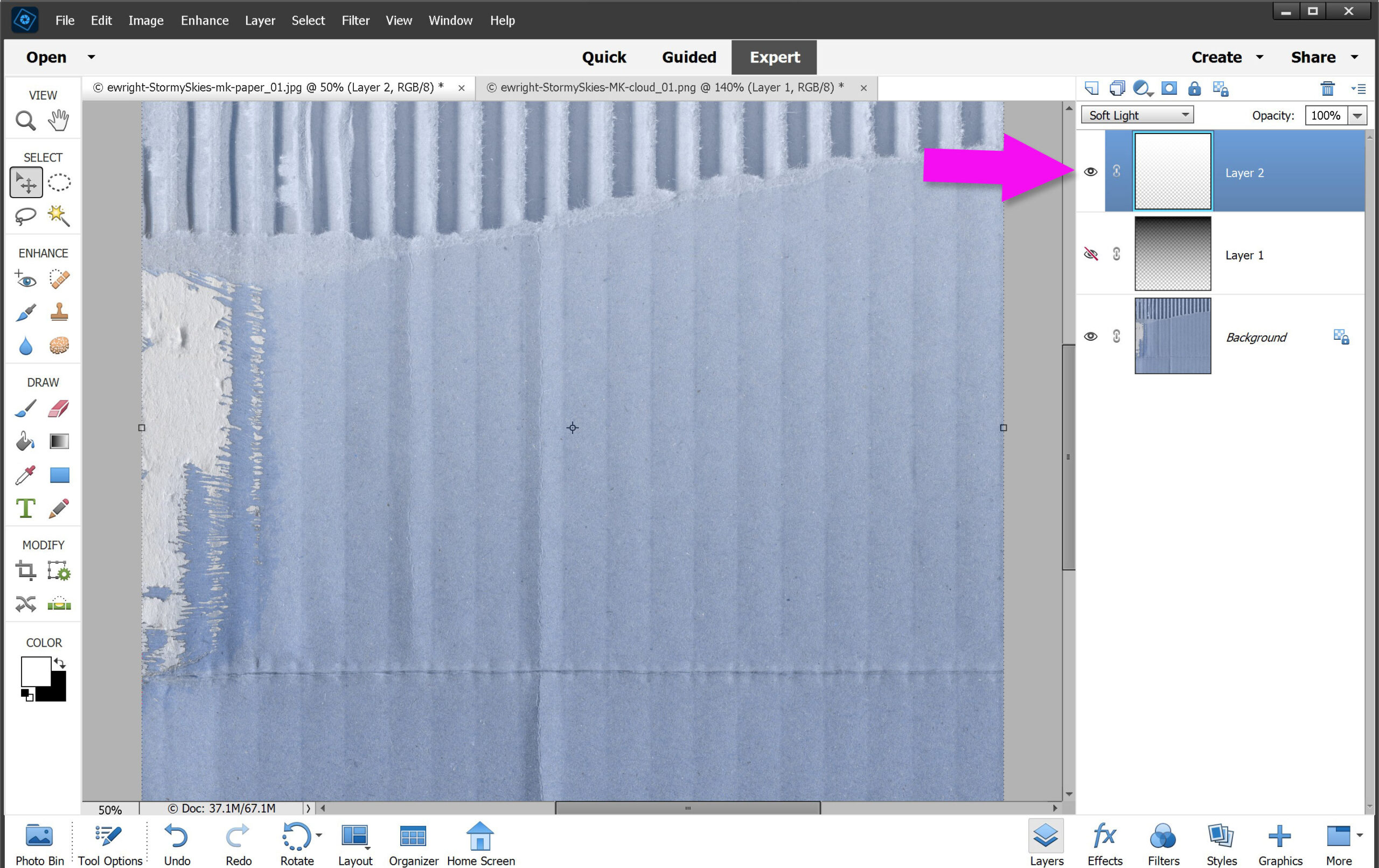
You can add additional Gradient Layers and even change up the Blend Modes to create a more dramatic effect. Or, change to a lighter mood by choosing a white/transparent gradient. Using the same steps as above, but choosing White as your foreground layer.
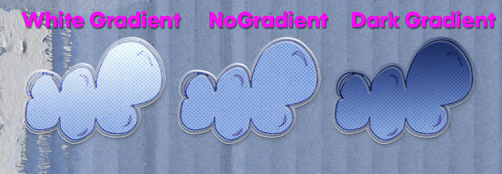
Don’t limit yourself just to plain papers, or even papers! This also works with elements, like this fun cloud element from Erin:
Whatever your mood, adding a tonal gradient can help set the tone of your page. Join us for our Quarterly Layouts-a-Day for daily prompts to help get your scrapping done. Every layout you create earns you free mini kit. Play every day to get an entire mega kit free, plus a fabulous bonus prize. Or even join our LAD SUPERsize and double the freebies. Double the fun!


Thank you Toiny.