In May of this year, I wrote a post entitled “How Personal Use Shoppers can Utilize Commercial Use Tools.” In that post I stated:
“You read it in many designers commercial-use (CU) product descriptions: “Perfect for the personal-use scrapper too!”
Sure, there are some CU products that might not be of interest to a personal scrapper; but there are also a lot of CU products that can be absolutely perfect for them!”
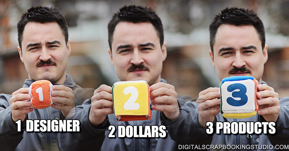
The Studio is having a 3-2-1 CU Sale this week: 3 products, $2 each, 1 designer. Because of that, I thought it might be a good idea to revisit the subject of how commercial-use tools have help not only the designer but also the personal use scrapper as well.
Before I get into today’s tutorial / information, here are some previous posts that you might find helpful if you, as a personal-use scrapper, are wondering how you would utilize commercial-use products in your work:
Stretching your Digi-Stash with Overlays: Using overlays can add interest to your kit paper, elements, or text.
How to Create a Clipping Mask: Clip papers to templates
How to Use Photo Masks: Learn how to utilize those beautiful photo masks in our CU store!
Coloring Digital Stamps: Learn how to create unique designs with digital stamps
Coloring Textured Grayscale Overlays: One fun, easy, creative way to color grayscale overlays.
4 Ways to use Overlays and Textures using Blend Modes: Blend Modes are easy to use and can give you a multitude of looks!
Blending a Photo into a Background: Our CU Papers will look even more beautiful with your photos blended into them.
PNG vs ABRfiles: Which should you use?: We have some lovely Brushes in our CU store. Have you wondered what to do with them?
Today let’s take a look at JPG overlays vs. Transparencies. Some designers’ textures/overlays include JPGs only, some offer Transparencies only, and some offer both formats. When you see these options, which should you choose?
For demonstration purposes, let’s take a look at my Grungy Stained 01-1. This is a light cream color in JPG format.
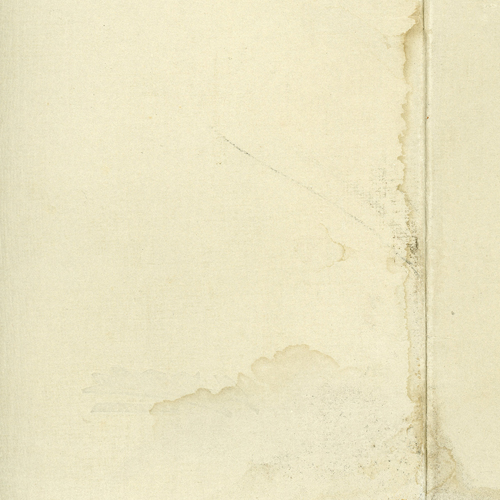
Original Grungy Stained 01-1 by SnickerdoodleDesigns
When using textures such as these, we frequently will combine them with other papers or solid backgrounds using Blend Modes.
In the image below I have placed this JPG over a solid green color layer. I have changed the Blend Mode of the JPG to “Overlay.”
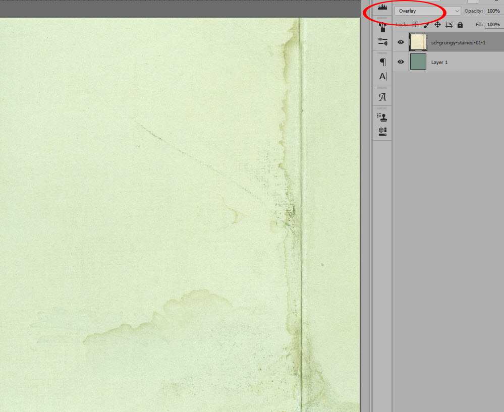
JPG set to Overlay Blend Mode
In the image below, I have placed the PNG of the same texture over the same solid green layer, and changed the Blend Mode of the PNG to the same”Overlay” Blend Mode.
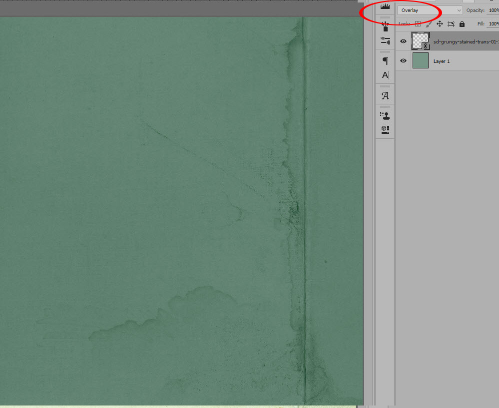
Transparency set to Overlay Blend Mode
In the first image, you can see how the JPG overlay changed the color of the green layer below.
In the second image, using the PNG texture the over-all color of the solid green layer did not change; the only areas that became darker were the areas where pixels were present.
So why is this? The Overlay Blend Mode multiplies dark areas and lightens light areas. Dark areas become darker and light areas become lighter. The JPG texture was a light cream, so it became lighter. The PNG texture was black (with transparent areas), so the black textured areas (along the crease and the stained areas), became darker. The areas of transparency, of course, did not affect the green layer, which is why the main color remained the same.
Two totally different looks. One isn’t necessarily better than the other; they’re just different. But if you want to retain the original color of your document, in this case, the dark green, using the PNG texture, rather than the JPG texture would allow you to do so.
So if you have a JPG overlay and want to retain the original color of your layers beneath it, is there hope? YES! Once your change your JPG to whichever Blend Mode you want to use, you can adjust the final color in other ways: Levels, Curves, Color Balance, Hue/Saturation, etc.
In the example below I have used the Transparency on the left. On the right, I have used the JPG, and instead of using the Overlay Blend Mode, I used the Soft Light Blend Mode. I then added a Levels Adjustment and a Color Balance Adjustment. The final results are pretty close.
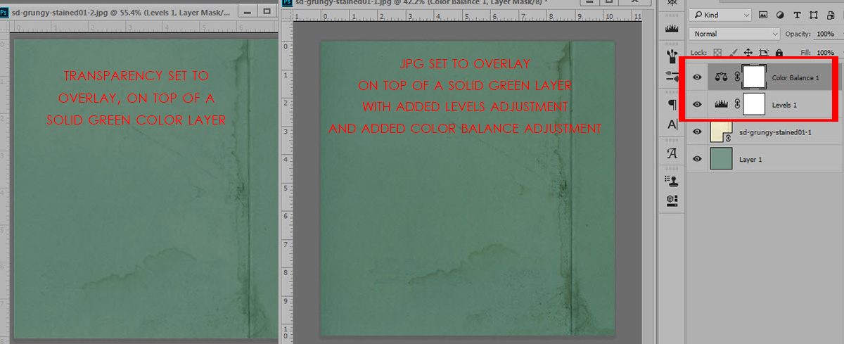
Transparency on Left – JPG on Right, with 2 added adjustments
For today’s tutorial and screen shots, I used Photoshop CC2015.5. Although Photoshop Elements does not have a “Color Balance Adjustment,” experimenting with the Hue/Saturation adjustment will yield similar results.
I hope you have found this helpful!
If you would like a PDF of this tutorial, you may download it here: How Personal Use Shoppers can Utilize Commercial Use Tools, Part 2
Are you a visual learner? Visit SnickerdoodleDesigns You Tube Channel or Digital Scrapbook Designs You Tube Channel for a video! Subscribe to both channels so you never miss a thing!


Leave A Comment