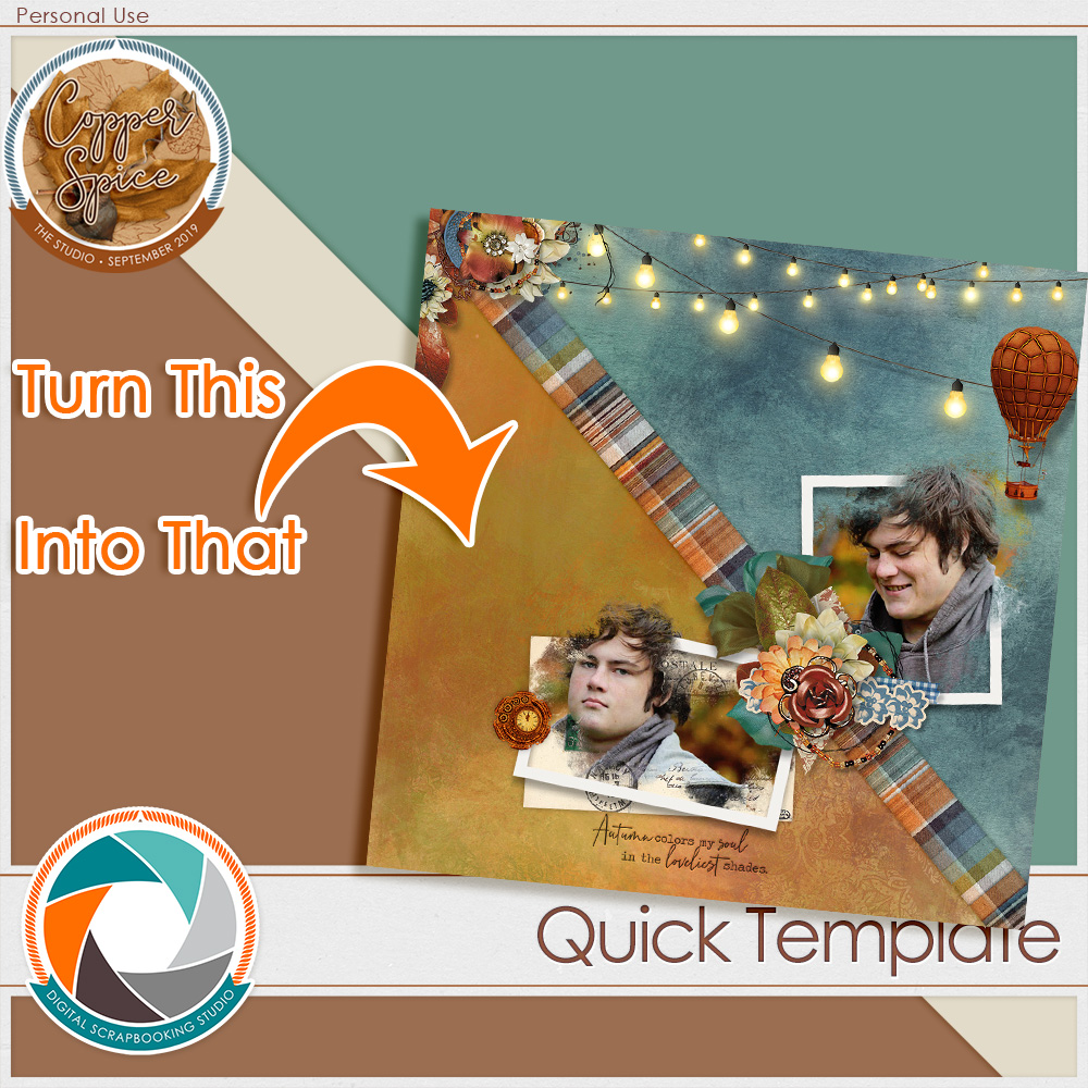
Sometimes all you need to make a big visual impact is a bold choice. Sometimes simple is best. I’ve not been quiet about my love for our newest collection: Copper Spice. The juxtaposition of the copper browns & the teal blues are just my thing. It is one of my all-time favorite color combinations.
It got me thinking… why do I love it so. The answer? They are opposites. Just look at the color wheel & you can see browns waving hello at the blues across the way. This is me. I’m waving too! I love this. And I love Fall. This was a love affair waiting to happen.
Autumn is returning with her tumbling leaves, and The Studio designers are singing her glory with one of our coziest collections ever, Copper Spice. This huge collaboration is filled with rustic warmth and accented with shimmering copper metallics & verdigris teals. Mix-n-match packs to create your perfect collection. Ready to fall in love with fall all over again?
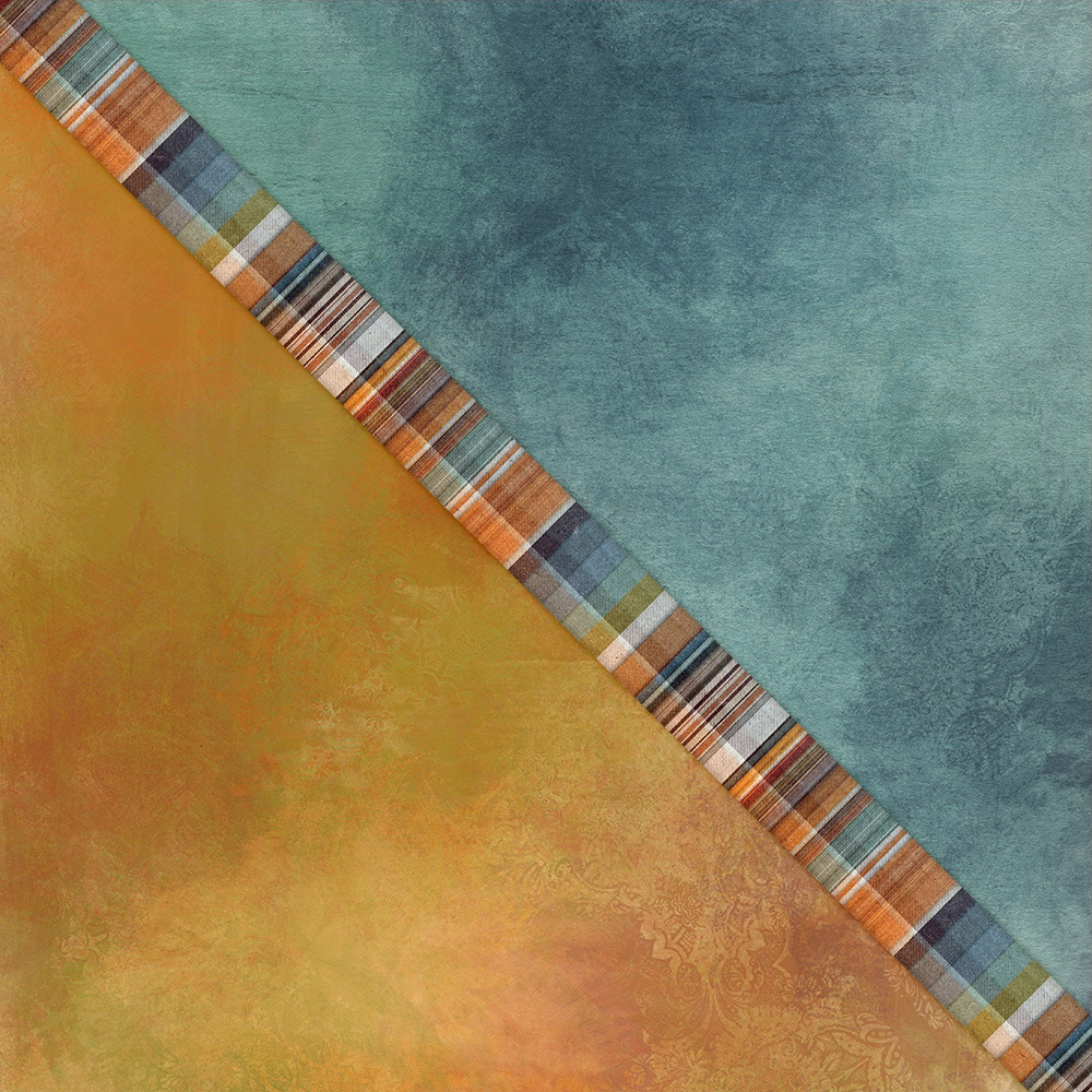
When it came time for me to really dig deep & play with Copper Spice, I again went to the color wheel. Once I’m there, I have a hard time staying away. This time I decided to playfully recreate that color wheel juxtaposition in my layout. I cut out all the colors inbetween, and I was left with just the copper. Just the teal. I adore the bold statement this makes.

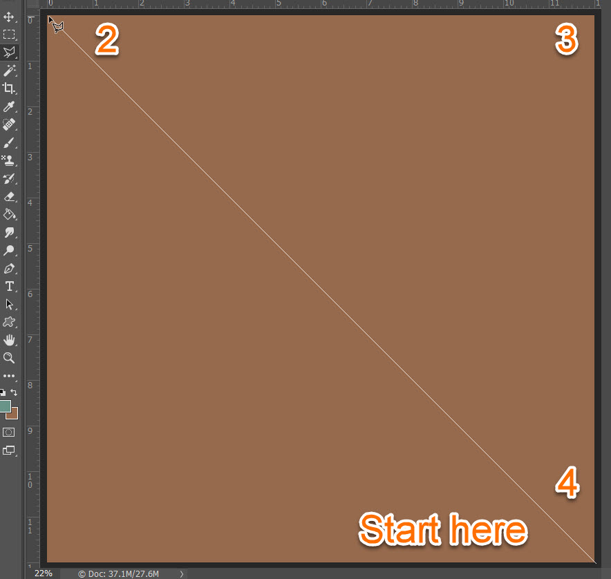
This is a very easy look to get quickly & easily. Simply divide your page in half, corner-to-corner, and color fill one side. I did this using the polygonal lasso tool by simply drawing from corner-to-corner-to-corner, then filling in the selected pixels.
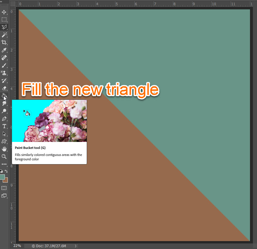
Be sure to create a new layer above your background layer, keep the newly selected triangle active, and click fill with the paint bucket tool:
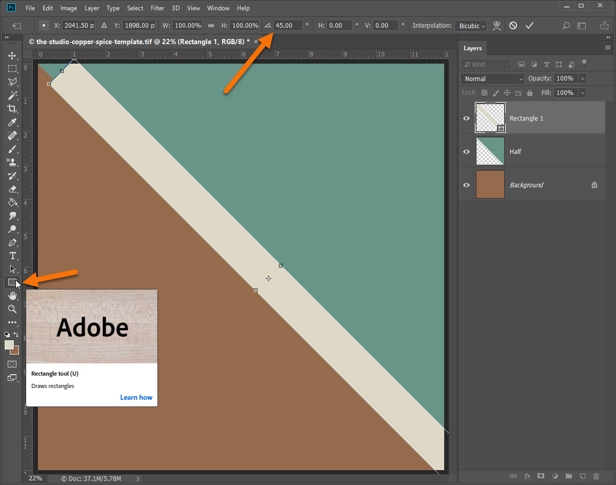
To make things interesting I added a rectangle and twisted it 45° to make a center divider:
Once the basic template was done, I clipped some of my favorite Copper Spice papers to my new template:
Papers by Jilbert’s Bits of Bytes & Antebellum Press
I always add my photo’s early on, it helps me build the page:

Photo’s by me. Frames by PrelestnayaP Designs.
I’m also a big fan of premade clusters. They make pages come together in a snap:

Clusters by Sekada Designs.
But. I like my pages to be “me” so I always add some elements that make the layout pop:

Extra elements by Julie C Designs. Word art by Heartstrings Scrap Art.
Tada! I’m happy. Now all I want is to play some more. Join me? Create your own bold statement with my free simple template. Sometimes simple is best.

So pretty! Thanks so much.
Loving all the helpful amazing tip and ideas, it sure get us out of our comfort zone
Thanks for another great tip!
Thanks so much for the fun
Thank you so much for the template and tutorial!!!
Thank you
I love your page! I am in awe of Copper Spice too. I don’t have every part, but I have a bunch!!! Thank you for the template!
Hugs,
Thanks for the template and tutorial!!!
Thank you for the clean & simple template!!
Great template and tut!
Thank you so much!!
Thank you so much