Our much loved Layout-a-Day (LAD) is back! This go around we’ve got a marvelous new mega, Winter Whites, for you to pick up in mini’s daily. Every time you post a layout, you get a mini. It’s that easy & that fun. Plus, we’ve got a ton of new tutorials & Quick Tips heading your way, right here on our blog. Learn all about white-on-white scrapping 🤍
If you are playing along today, you will be receiving a FREE mini tomorrow. Each daily mini builds one terrific kit. Don’t miss a day… or if you do, join us for Make-up Sundays. Every Sunday you can make up one prompt to help you get every fabulous mini.
Today we got you started with a clustering challenge and a quick link to Silke, Papierstudio Silke, previous clustering & shadowing posts:
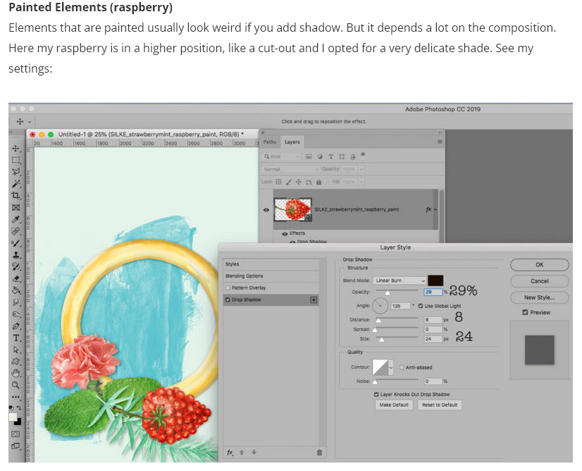
In the second Quick Tip, Silke shows us how to reduce the opacity on a shadow in order to give a more delicate shade. This is a great technique to use when working with light & white tone-on-tone layouts too.
There is another way. While most of use Multiply or Linear Burn for our shadow settings, all the Blend Modes (in photoshop & elements) are available to set your Drop Shadow style.
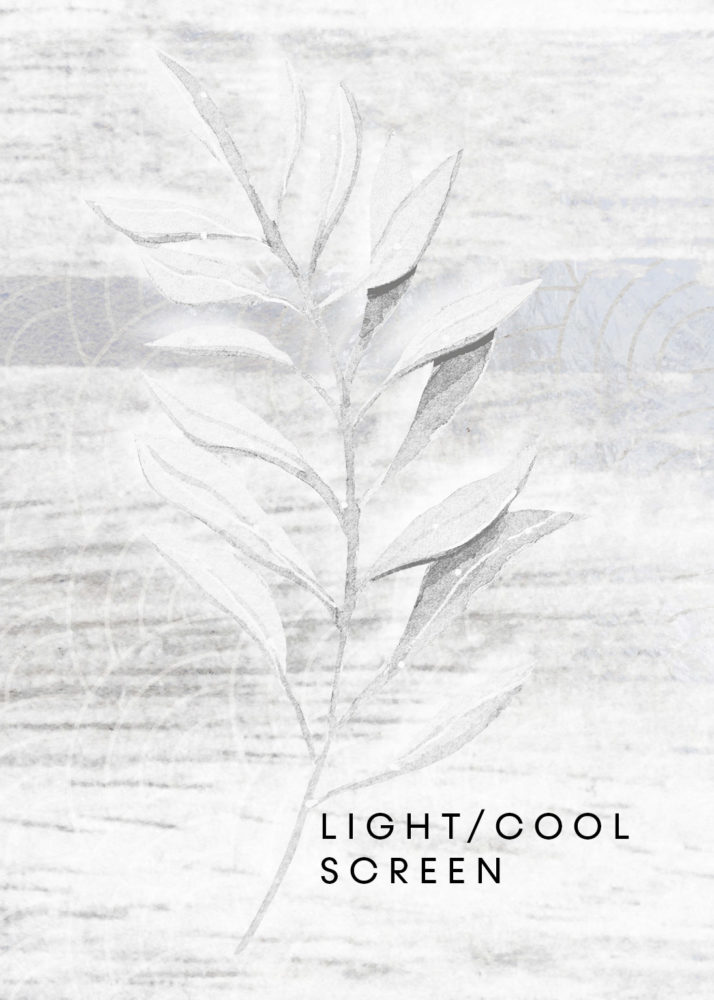
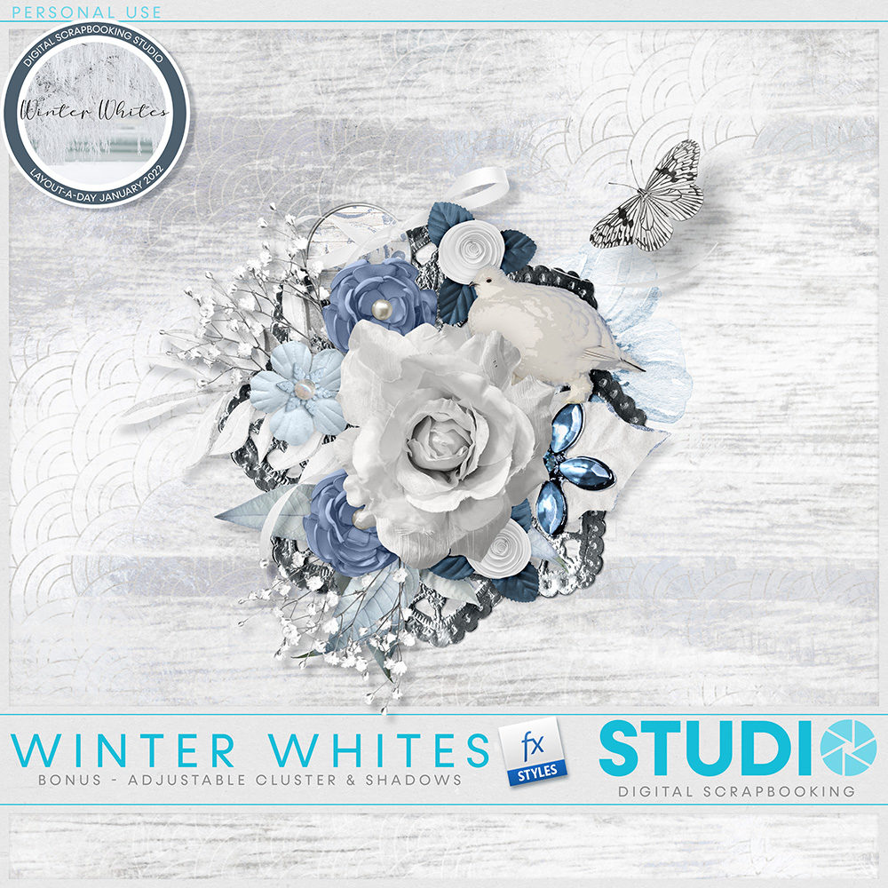
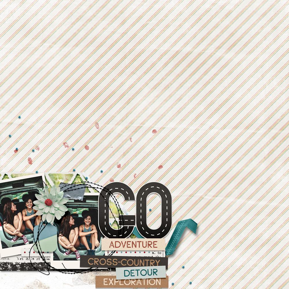
In my example today, I’m using the Screen setting. However Normal, Luminosity or Color Dodge will also work for light/white shadowing. I’m using a paper from Schwarzwald Design, and an element from TraceyB Creations. Both are part of the Winter White Mega and both are included in the free mini for completing the first Winter White Layout Challenge.
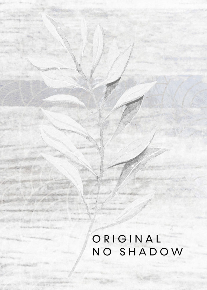
The paper & element are both white. That makes the element very difficult to see. It’s even harder if you decrease the size and layer it in a cluster. Silke’s drop shadow technique works very well, and can absolutely be applied here:
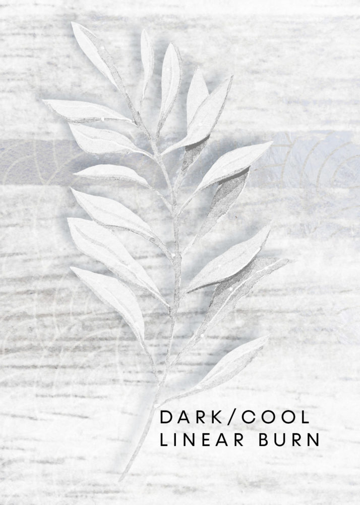
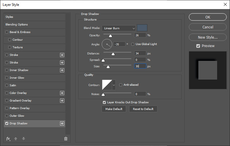
I’ve chosen a blue shade (HEX #4e606e) for my drop shadow. Blue shades give a cool look to a page. I want to keep my layout cool, white & bright. If you prefer a warmer look, you can use a red/orange shade for your drop shadow. My settings are:
This time I applied a very light shadow using Blend Mode: Screen. My element still pops and the textures are discernible from the background but my page is now much brighter & whiter. The shadow does not detract from the light look & feel I am trying to achieve:
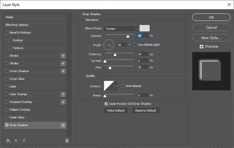
NOTE: if you want to switch the Blend Mode to Screen, you also need to change your shadow color. Dark colors will not blend in screen mode, but light colors will. Here I’ve again picked a blue shade, but a much lighter shade of blue (HEX #e0e0e2):
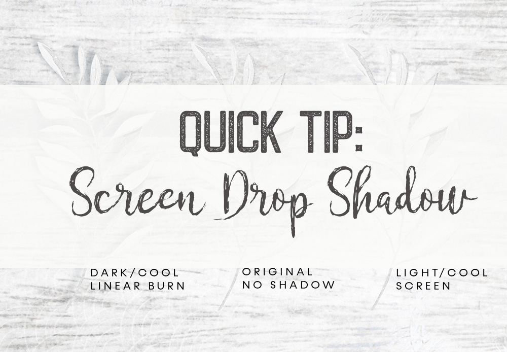
There is no right or wrong answer when shadowing your pages. It is entirely up to you! As they say, beauty is in the eye of the beholder. It also depends on what look you are trying to achieve. Me? I’m going for very cool & light & bright & white. For me, the Screen drop shadow is the way to go.
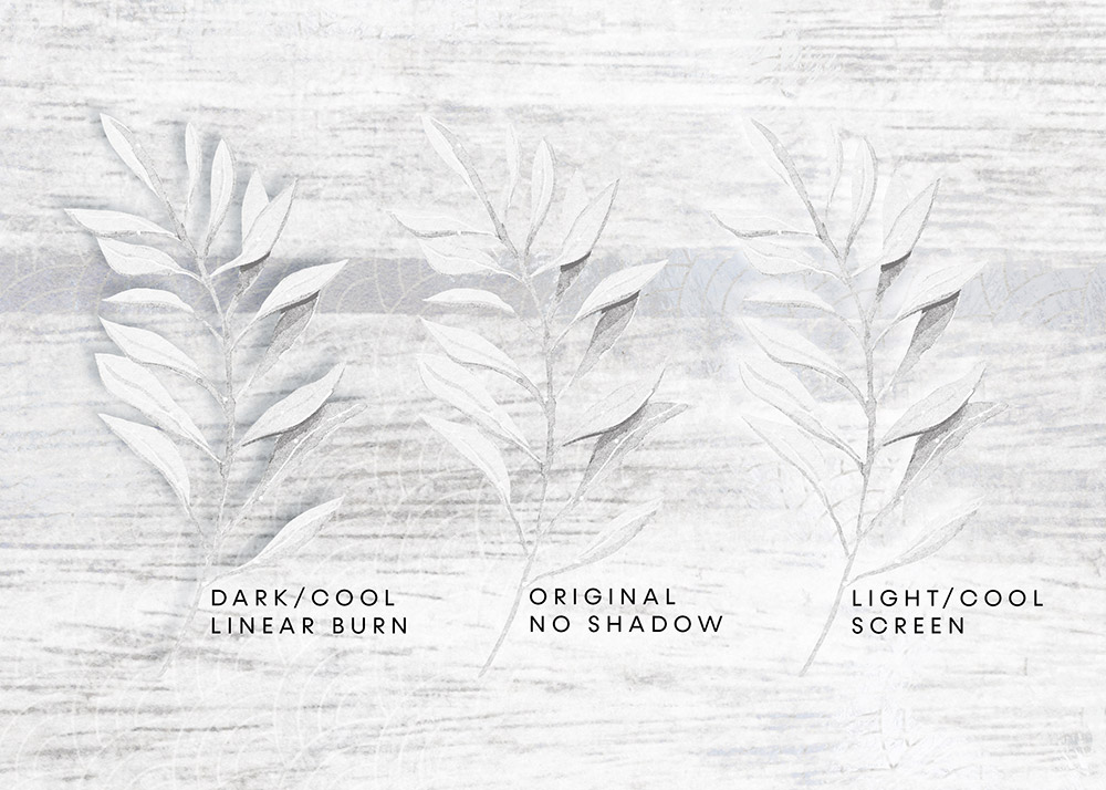
A quick visual comparison of all 3 looks:
Play along every day to get the entire Winter White Mega FREE!
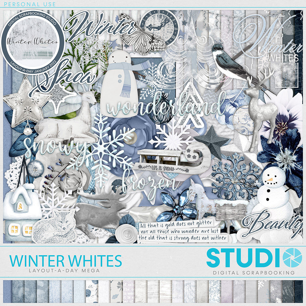 This LAD Mega was created by the talents of FranB Designs; Cindy Ritter; Schwarzwald Design; Tami Miller Designs and TraceyB Creations
Remember, Sundays are make-up days. There is an extra Bonus for everyone who posts a Layout-A-Day this January 🤍


Leave A Comment