We’ve talked a lot about making shadows with things that are uplifted from the page by large distances or fancy warps, but we haven’t talked much about things that are close to the page or are a little tricky because they are transparent. Today’s tutorial is simple, but it will give you a wider range with your shadowing that will allow you to work with things that you might have had a more difficult time with before now.
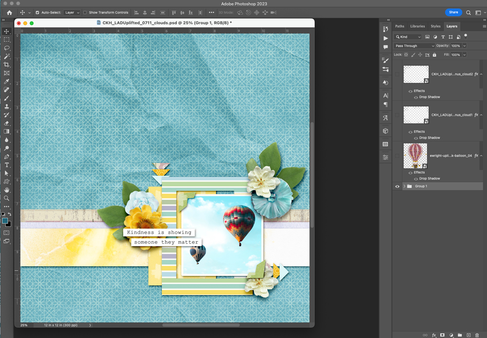
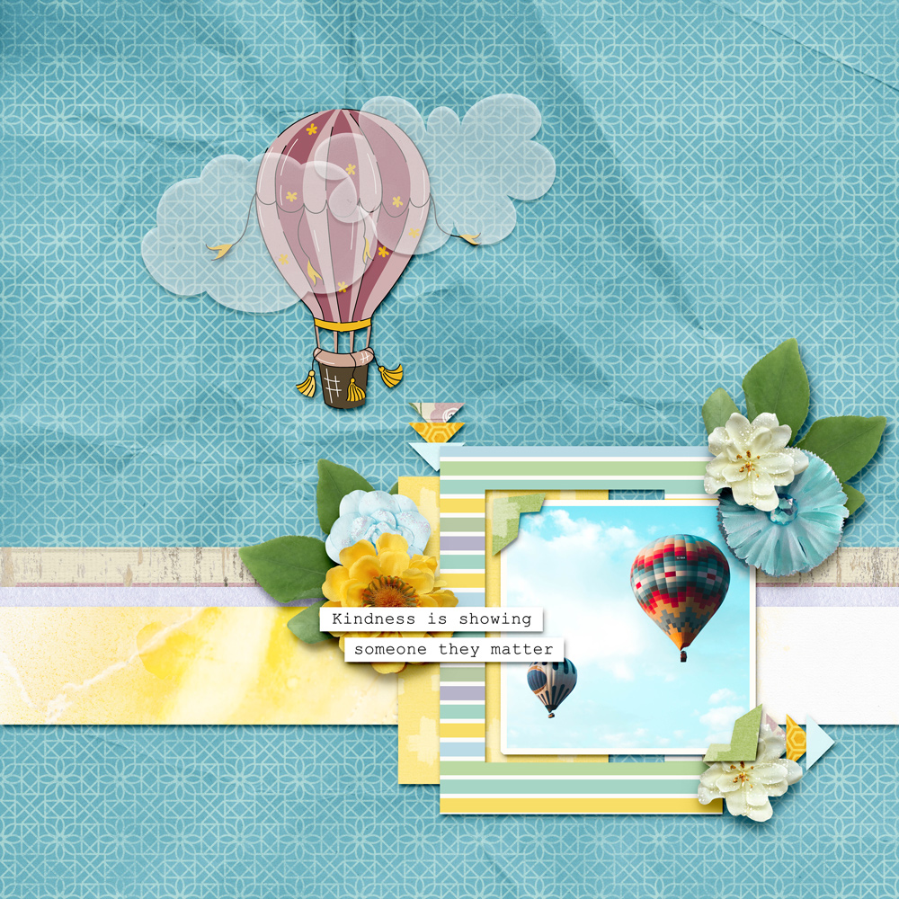
I’m staring with this layout that has some space on the top to add a hot air balloon from the LAD: Uplifted collection. For the purpose of this tutorial, I’m also going to add the clouds for a whimsical feel. This particular balloon is like a sticker, so I just gave it a paper type shadow. My clouds at this point are unshadowed.
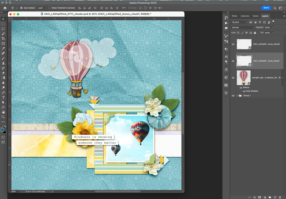
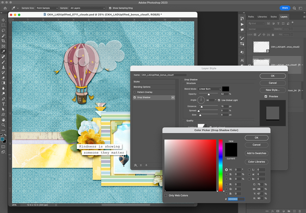
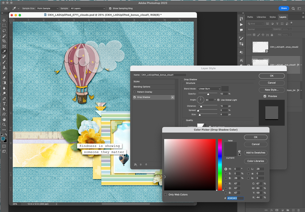
Pretty much any pre-made shadow that we add to the clouds is going to make things look really dark and not transparent any longer. This is where knowing a few tricks will come in handy. Playing with the COLOR of the shadow will really change the way that it looks on the page. Using the typical black or dark grey that we usually use will make an unattractive grey cast that will not work with this kind of shadow. Here it is with a black shadow, and then here it is choosing a medium grey.
I’m going to do a second cloud, but up the distance and size just a little bit since it is on top of the other cloud and the balloon slightly.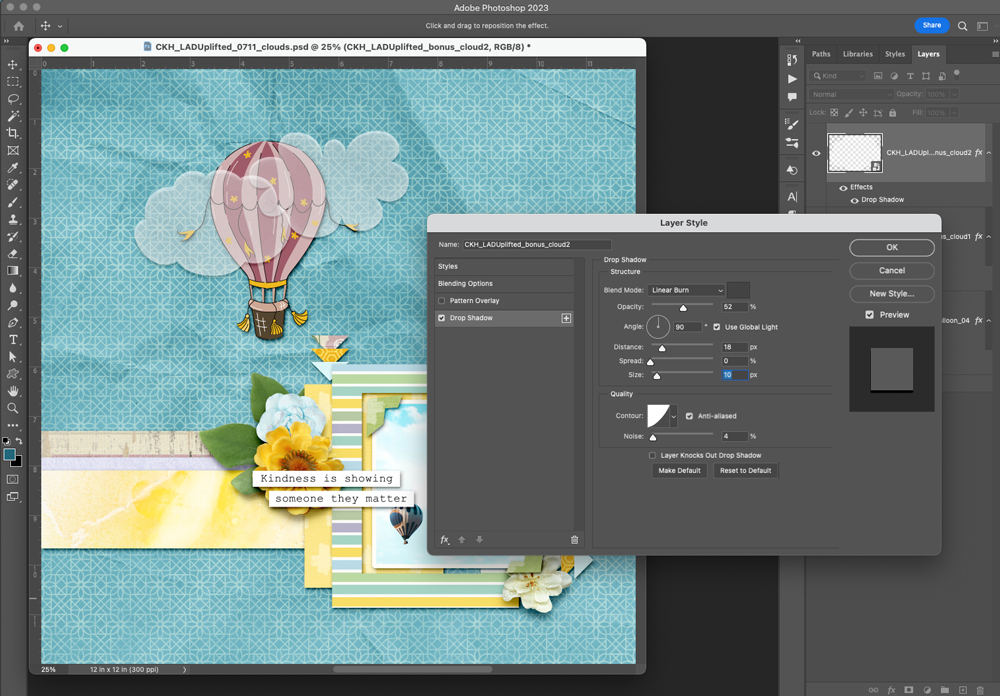
This method works great for vellum alphabets, clouds, or anything that is slightly transparent. Just adjust the shadow according to how far you want your object to appear from your background, and remember to play with your shadow color to get the perfect effect. Use this technique with the others you have learned this month to create layouts full of depth and pizzazz!
I can’t wait to see your beautiful layouts with all different kinds of shadowing!
Warmly,
Chere


Thank you
[…] to The Studio blog – and welcome back to Shadowing Transparent Objects, part 2! Back in July 2023, we discussed some fundamentals. Today we’re going to just go a step further – or farther […]