Sometimes, the pictures on our pages aren’t enough and we need to add journaling to really tell the story. The key to good journaling is not about what words you write, but about the font you choose to write them in. You want the font to match the feel of the page, but it needs to be legible and clear, especially if you have a busy background or a lot of shadowing that may overlap the words.
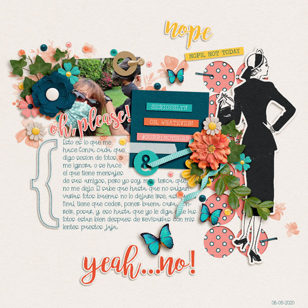
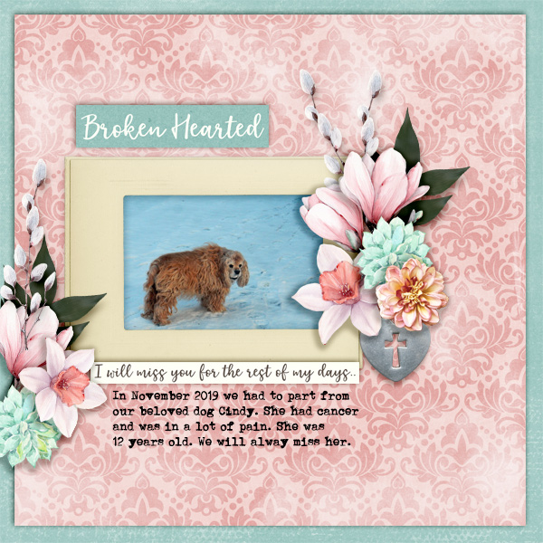
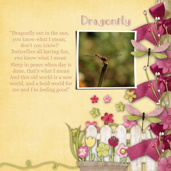
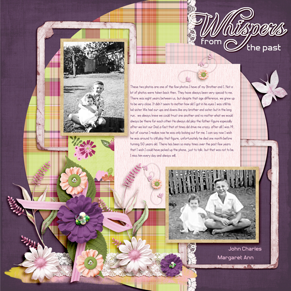
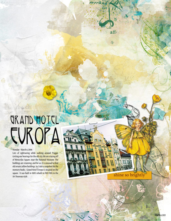
I opened the gallery today and found some gorgeous page featuring large blocks of journaling, you really can get creative with how you work the words into the design of the page!
Today I am sharing a great journaling font. It’s clean, it’s easy to read, and while it’s simple, it has enough fun to it that it works on just about any pages. Check out the free font Quicksand (we get nothing for sharing this with you, just the joy of knowing you have a new font! Please abide by the fonts TOU). (The paper used in featured image is designed by BenthaiCreations and is part of the May Mega, Mango and Lime).


Leave A Comment