
Hello! Dani here, Just Because Studio. I’ve got a great little Quick Tip to make a visually pleasing page in a couple quick, easy steps. Ready?
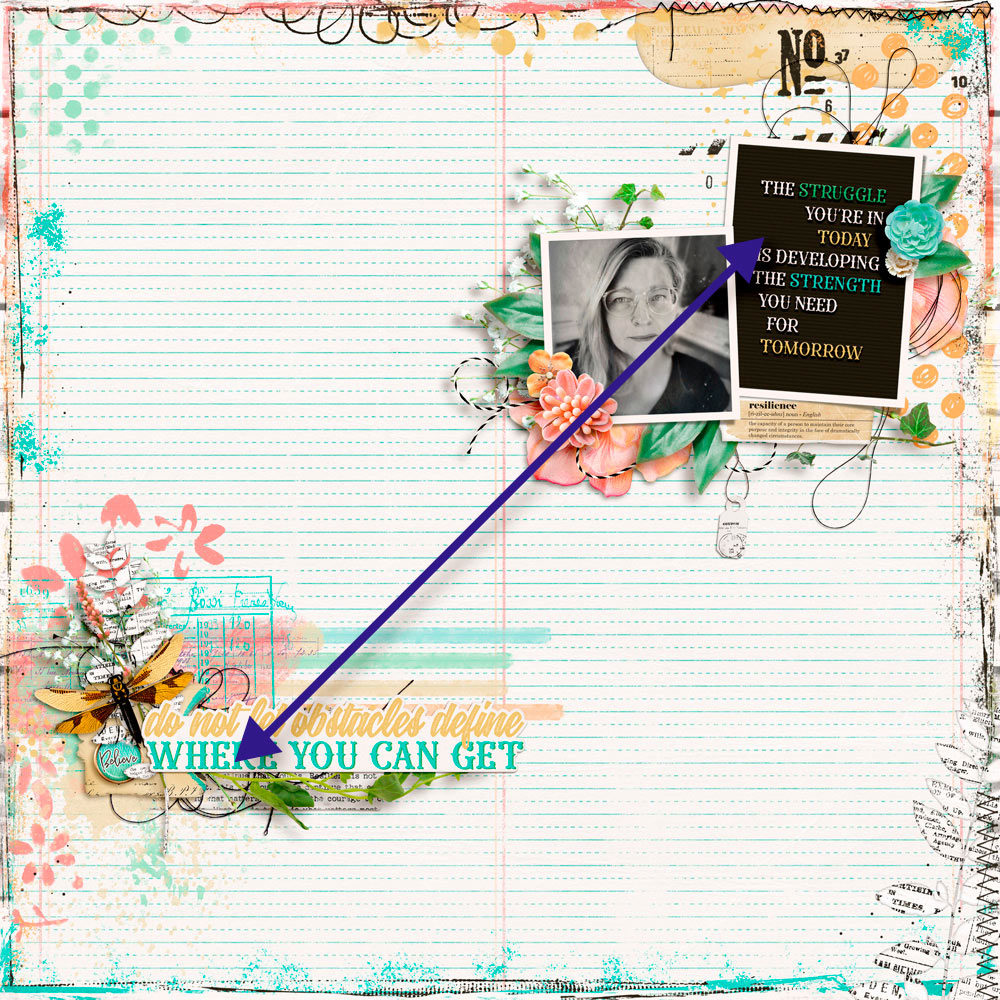
To make your page more visually pleasing, place the elements in opposite corners. This causes more balance in the composition. You can place it on any opposite side, but if you use it diagonally it will be even better as it balances the weight of the design.
To make it easier to understand the weight in your page design, imagine that it is a sheet of paper and you are holding it with one of your hands extended in front of you. If the elements were real, how would the weight be distributed on the page? Could you hold it with one hand without it falling off or weighing more on either side? Placing elements on opposite sides helps to distribute the weight.
See this page made by Carina with my newest Resilience Collection, the traditional selection of the April ANTHOLOGYFLEX. It is visually pleasing to look at. The weight is evenly distributed.
Now it’s your turn. Go give it a try.
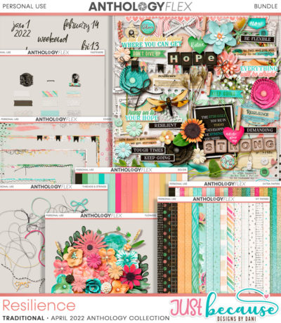
I can’t wait to see your pages.You can shop my Resilience Collection exclusively at the Studio this month. It’s part of ANTHOLOGYFLEX and available for only $9.99 including exclusive limited-edition bonuses!

Leave A Comment