As digital scrapbookers, we get the joy of working with all sorts of products and techniques to tell our stories. It makes for fun and creative art, and I know I love being able to work with my photos and the beautiful collections that the designers make for us to create pages. But another tool that we have that sometimes gets overlooked are fonts. Using a single font is perfect sometimes, but PAIRING fonts is even more fun and can really spice up your layout and create movement and tension. Let’s talk about 5 quick tips for pairing fonts!
1. Pair a serif & a sans serif
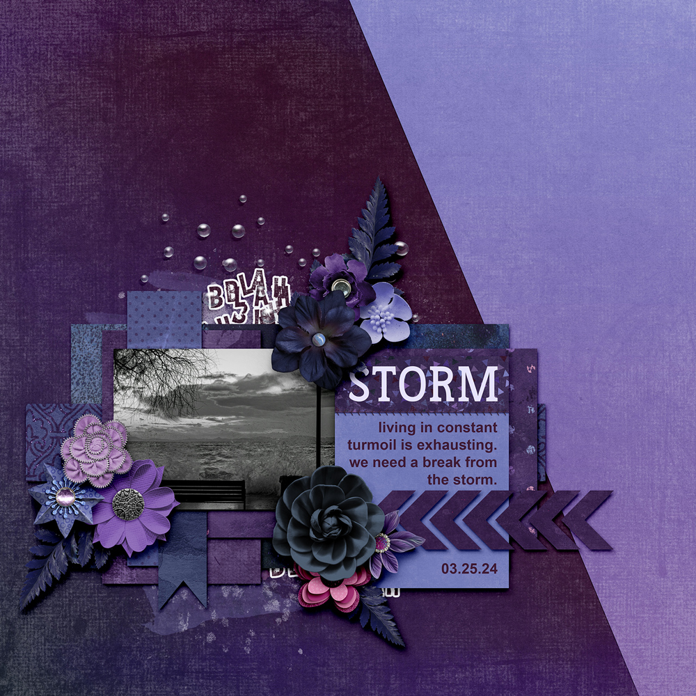
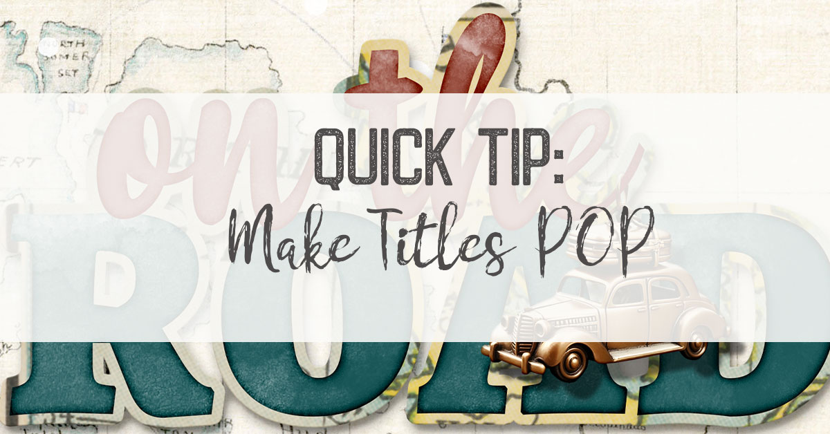
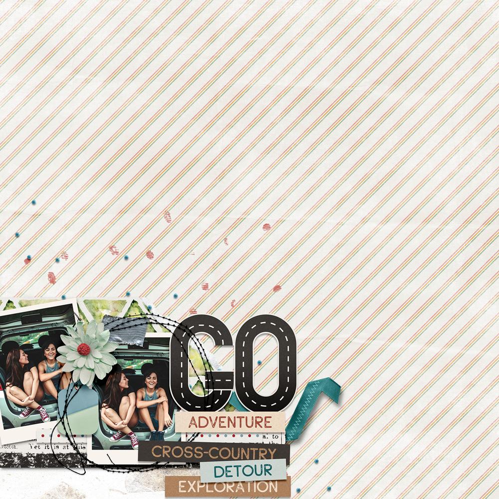
This is the easiest and quickest way to pair two fonts. A serif font has the little line attached to the end of the stroke, and a sans serif does not have any stroke embellishments. In the sample below, I used the serif font as the larger (Frontenac Bold), and the sans serif for my journaling (Arial Bold). (This layout uses pieces from the LAD: Stormy Skies MEGA as well as Stormy Skies Collections from both Blue Heart Scraps and Aimee Harrison Designs.)
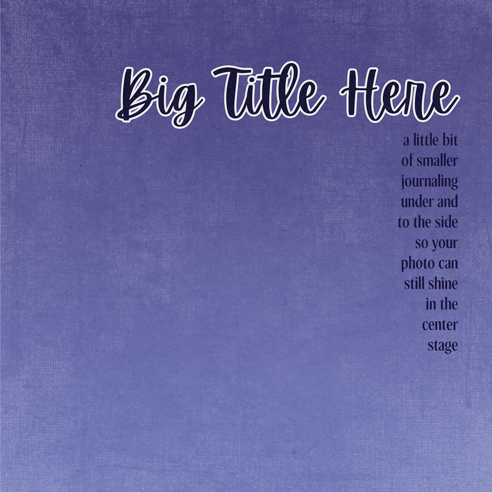
2. Contrast your font sizes
If you’re going to use different fonts, make sure you can tell the difference between your fonts. Using contrast in size is a great way to showcase your title and your journaling, and create movement on your page. (I used Apricots for my title, and Benito for my journaling.)
3. Don’t mix different moods
While it’s so fun to pick from all the different fonts out there, be careful not to mix different ‘moods’ of fonts and make them clash. For instance, you wouldn’t want to take a ‘spooky’ font and mix it with a ‘script’ font. They would not flow well together and would just confuse your eye on your page. Stick with fonts that contrast, but that play well together.
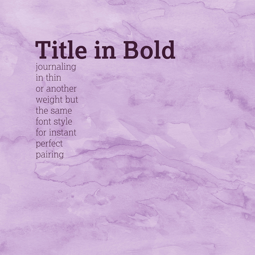
4. Use the same typeface in different weights
Make it easy on yourself, and try mixing an extra bold version and a light version of the same font. You’ll rest easy that it will pair perfectly, and it will be beautiful on your page. (My font choice was Lexia.)
5. Stick to two typefaces at a time.
Keep it simple! Pairing just two fonts at a time (or at MAX, three), helps keep things clear and easy to understand on your page. This also keeps things from getting too overwhelming.
That’s it! Now, you can check out this FREE font duo called Bali Sunrise from FontBundles.net that takes some of the guesswork out of the pairing for you. It has a beautiful bold sans serif font with a lovely script font, and it would be just stunning as a two word title.
Be sure to check out the beautiful pages in the LAD: Stormy Skies event to see how everyone is pairing their fonts on their pages today for even more inspiration!


I love my fonts! I’ve had hundreds through the years! And they do take up room so I delete as soon as I have uploaded! Thanks for tip!!
Thank you so much Chere Hile.
Thank you so much
I am late thanking you for this needed March font-pairing tutorial. I love fonts and have to admit that I am addicted. Now, I can more easily pair complementing fonts with more confidence although they are from different designers. I definitely needed this refresher. Thanks Chere, you are fantastic!! 🙂
Thank you so much