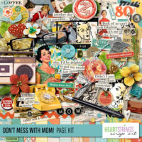
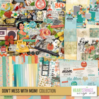
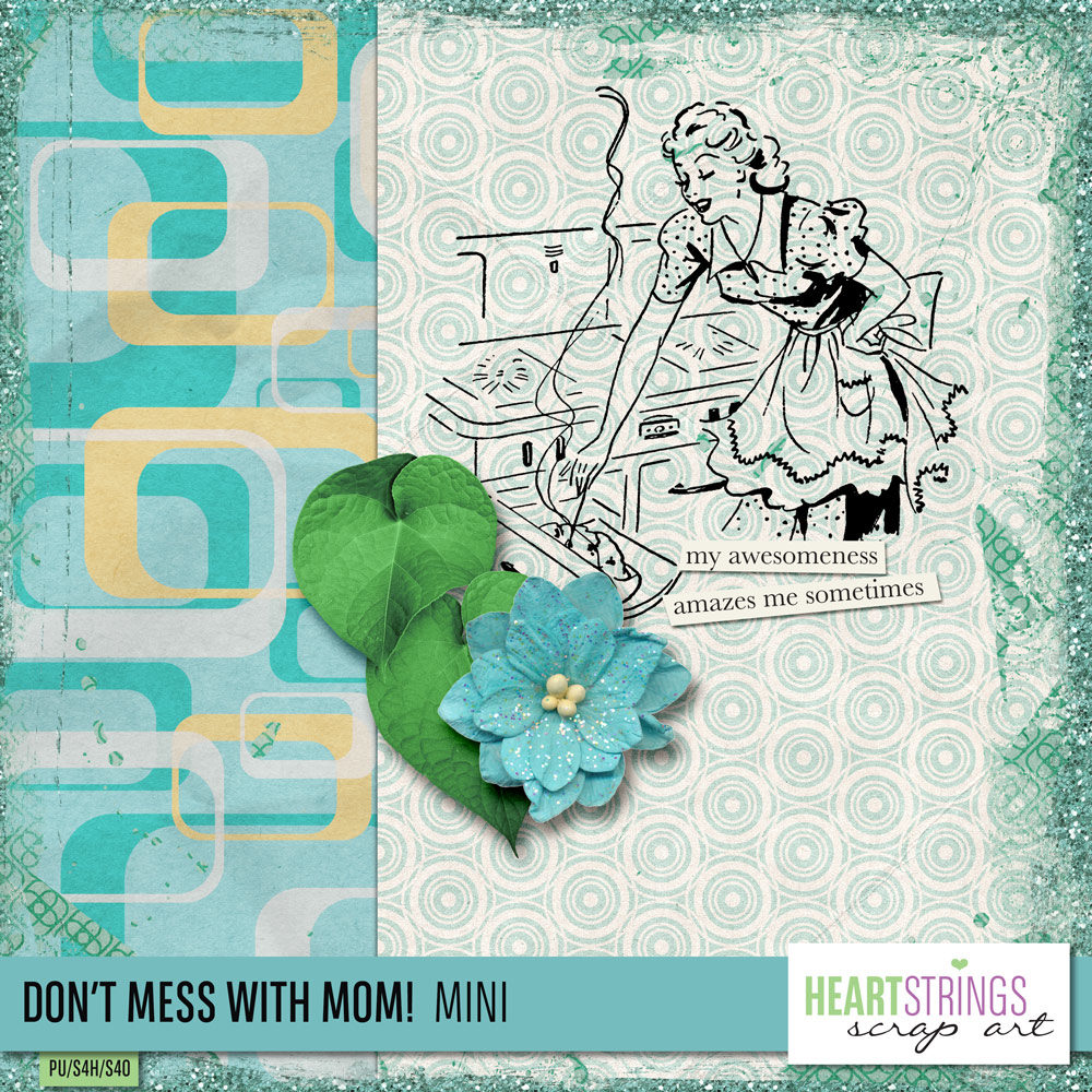
Bryony, Heartstrings Scrap Art, has a new collection out I absolutely *had* to play with. Don’t Mess with Mom is me. It’s funky, retro, fun & a little bossy. Me. I love it!
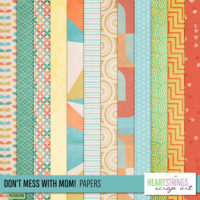
As I started playing, I waffled between papers. I am sooooooo in love with these & I wanted to use them all. However. Using them all on just one layout doesn’t work. I think. Maybe it does, but I didn’t get that far today.
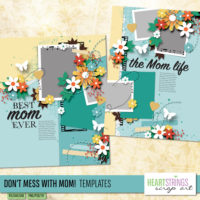
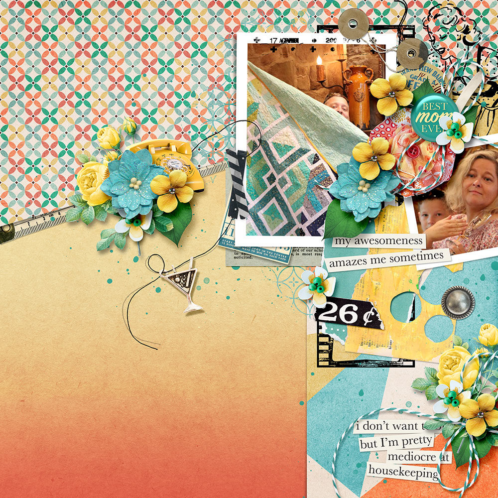
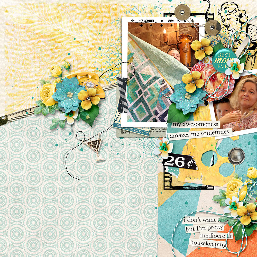
I don’t usually scrap about me, or with me in it. Today I did, the collection is after all Don’t Mess with Mom. I jumped immediately to the uber gorgeous orange & yellow flower & built my layout around that flower. I also used Bryony’s template because I am a template girl.
One of the things I love about using just one kit is it makes mixing patterns so incredibly easy. Even when they are funky patterns like the retro ones here. Review my Quick Tip: Mixing Patterns for a quick how-to. You can see I’m using almost all the tips in my layout today.
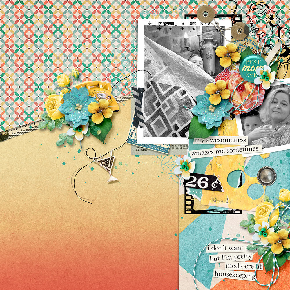
I love the layout, but I don’t love it with the pictures I chose and now I’m deadset on using these pictures. The patterns, with the quilt pattern in the picture, is too much. My usual fix is to go black & white (see
Black & White Photoshop Tutorial).
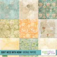
It’s still too much. I feel it’s mostly the extra pattern on the top left. I’ll swap that out for one of her vintage patterns instead, and add the color back to my photo’s. The layout is about the quilt. It seems silly to black & white it.
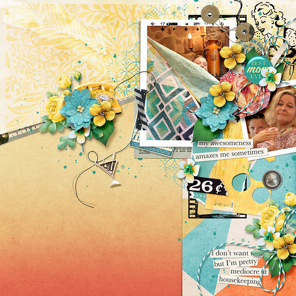
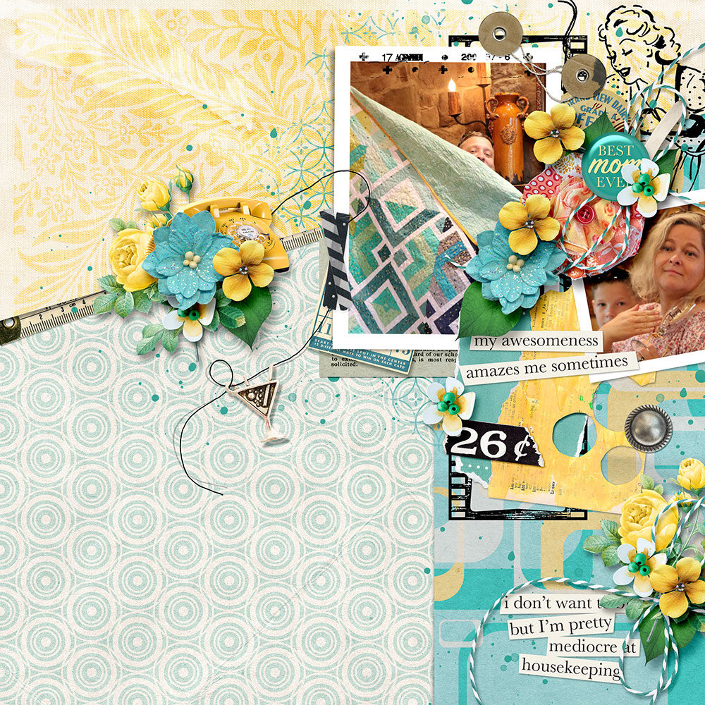
Better but now I feel the orange is unbalanced & too heavy at the bottom. As much as I love, love, love the ombre paper, I’m going to swap it out for a subtle retro pattern. The retro pattern is what drew me to this collection in the first place.
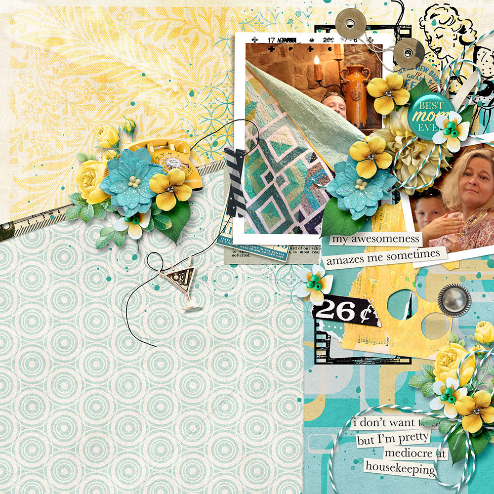
Oooooo I’m really, really starting to love this. That orange is continuing to bug me, even though orange is my favorite color! Or it’s blue. It depends. Still, in this layout the orange is bugging & there are other retro patterns I love. Swap time!
I’m over here laughing out loud, all by my lonesome. I guess it’s good I work from home? That one element I fell in love with? The gorgeous orange & yellow blossom? It doesn’t go. Luckily there’s a gorgeous blossom that does go & I swap that out for the perfect finish.
-
-
Don’t Mess With Mom Page Kit
-
-
Don’t Mess With Mom Collection
-
-
Don’t Mess With Mom Papers
-
-
Don’t Mess With Mom Vintage Papers
-
-
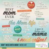
Don’t Mess With Mom Word Art
-
-
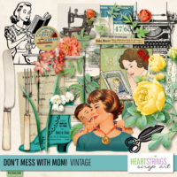
Don’t Mess With Mom Vintage
-
-
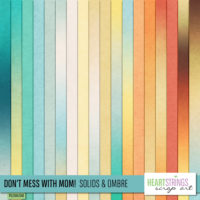
Don’t Mess With Mom Solids & Ombre
-
-
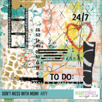
Don’t Mess With Mom Arty
-
-
Don’t Mess With Mom Templates




Fun process post. I’m glad you went w color on the quilt photo! (and omg that word art=LOVE!)
I love seeing your process here. The first layout I loved when I saw it; I’m drawn to all the oranges. But then seeing your progression, I love the end result the most. Cool!
Very cool!! I loved the one with the little orange color, that’s where I would have stopped. I hardly ever think about turning my pics B/W, so that is a great technique when they don’t match the colors of the layout.